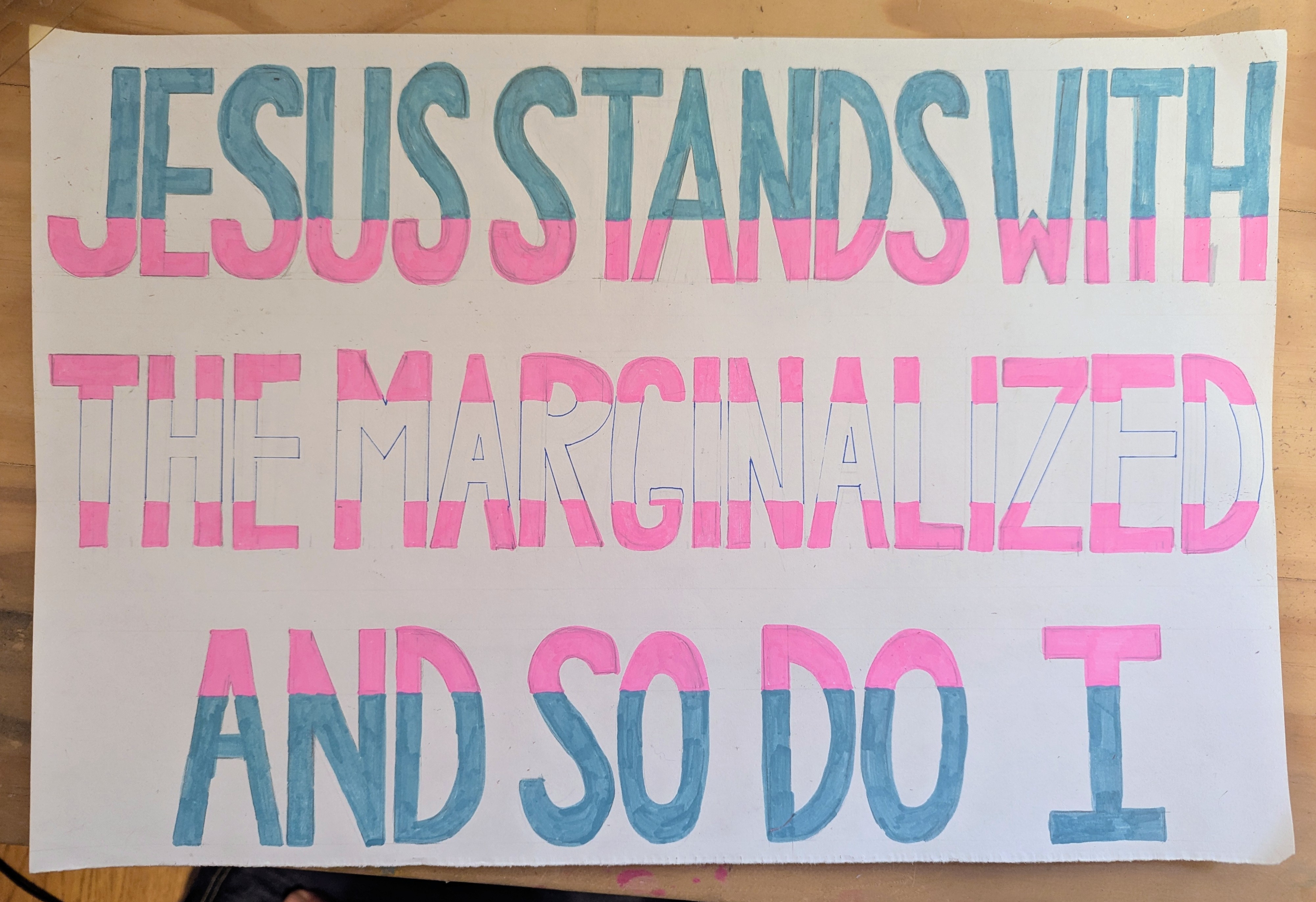
This is a commission and it’s hand lettered so I guess I should put it here. There is some controversy at a local school district and those TPUSA d-bags will be there to scream about how their religion requires them to hurt marginalized people, so of course the Coyote, who is also a one of those radical priests who think Jesus wanted people to feed the hungry and welcome the immigrant and support the marginalized will be there too, wearing his collar and carrying this sign.
The Girl, who is now a young woman working on her mother’s hydroponic farm, asked me to draw this gag, which I did, 98%, and then just…forgot? It’s the brain fog.
I love this joke because it is accessible to an absolute tiny percentage of people. But it is very relevant if you like internet memes and you work on a hydroponic farm.
The book and the story are forthcoming. It’s not entirely clear whether this illustration will also be forthcoming in the actual book. But I had a little inspiration after reading it and created something I really love.
The otters are based on a photograph I took at the Arizona Sonora Desert Museum in 2022. He was doing these elaborate backflips every time he passed the underwater viewing window, and I saw the golden ratio in this one. My entire conception of the illustration was centered around that memory.
The purple plastic gorilla cup gave me the most trouble. I vaguely recalled their existence but not well enough to accurately reproduce one, and I couldn’t find a single photo anywhere on the internet. Believe me, I tried. I spent as much time looking for an example of a purple plastic gorilla cup from the 20th century as I did drawing the rest of the picture. My google-fu is powerful and I usually find what I’m looking for, but these cups were instant trash the moment you finished consuming their sugary contents. I doubt anyone saved one let alone posted a photograph of it 40 years after the fact. So I kind of had to make them up. These are not the plastic purple gorilla cups that you would get at the zoo in the ’80s and ’90s, they are just a tribute to those cups.
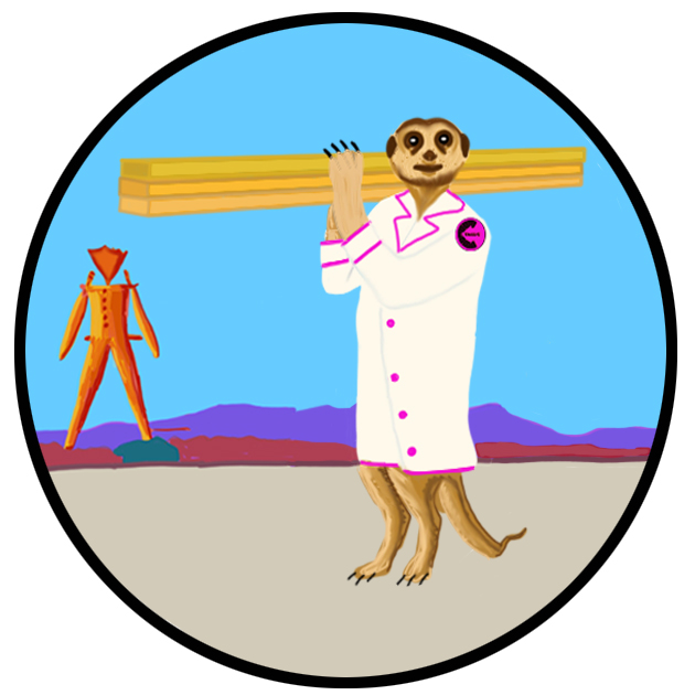
At long last, we have come to the final meerkat. Construction meerkat has a lot of heavy lifting to do, but I am setting my stylus down for a minute.
Have no fear! I will not abandon this blog for months on end. Not any time soon, anyway. Later today or early tomorrow I will share the project I did this week (marker on foam core) and by the end of next week I hope to share pages from my new comic book, Bonnie Jo Campbell Comics Volume 5.
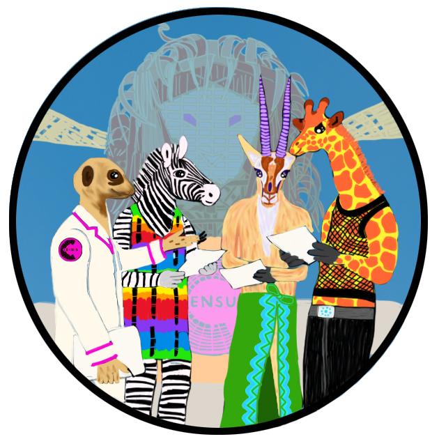
Can you believe how many meerkats I crammed into this sticker? Originally it was a more diverse group of creatures, to wit, a kangaroo, a llama, a panda, an elk, a sloth, and an ostrich, all wearing cool Black Rock Desert garb, but the client requested…moar meerkats in lab coats.
The name of this vehicle is the Databeast and it’s a real truck, somewhere.
I’ve been diverting 100% of my creative energy into the new comic book since October but it is still tantalizing in the Zeno’s paradox of incompletion. Very close. SURELY by next month. Unless I break both my hands or fall into a coma or die, it HAS to be done by next month. I just have to finish one interior page and the front cover, inside and outside and also start and finish the back cover, inside and out.
So close.
I took a little break over the last week or so for this small commission of a series of 6 stickers featuring a meerkat in a lab coat at Burning Man.
So that’s what this is: 1 of 6. I’ll try to post them every day until you have experienced the complete adventures of Census Meerkat. And pretty soon after that you can watch this space for Bonnie Jo Campbell Comics Volume 5.
The person who commission me to create this wild interior van wrap asked me to create some window clings, “so my van looks like not my parents’ van.” And thus the rainbow slothicorn rides again. I had a lot of fun with it. Obviously. It took me way longer than I like to admit; I could have fidgeted with the details for another month but given that it’s intended to appreciated while zipping past at 75 mph I guess it gets the job done.
I also designed some banners so they could cover up the vehicle’s logo with a fun rainbow sign sharing the vehicle’s name.
The vehicle is named “The Prideful Sloth.”
For this job, I gave up on using the Lenovo touchscreen to draw directly and went back to the Wacom tablet. It just works better for my purposes. It’s more comfortable to use. I drew a bunch of things without it in the last year and the convenience of not having a second device never outweighed the functionality of the Wacom for my purposes.