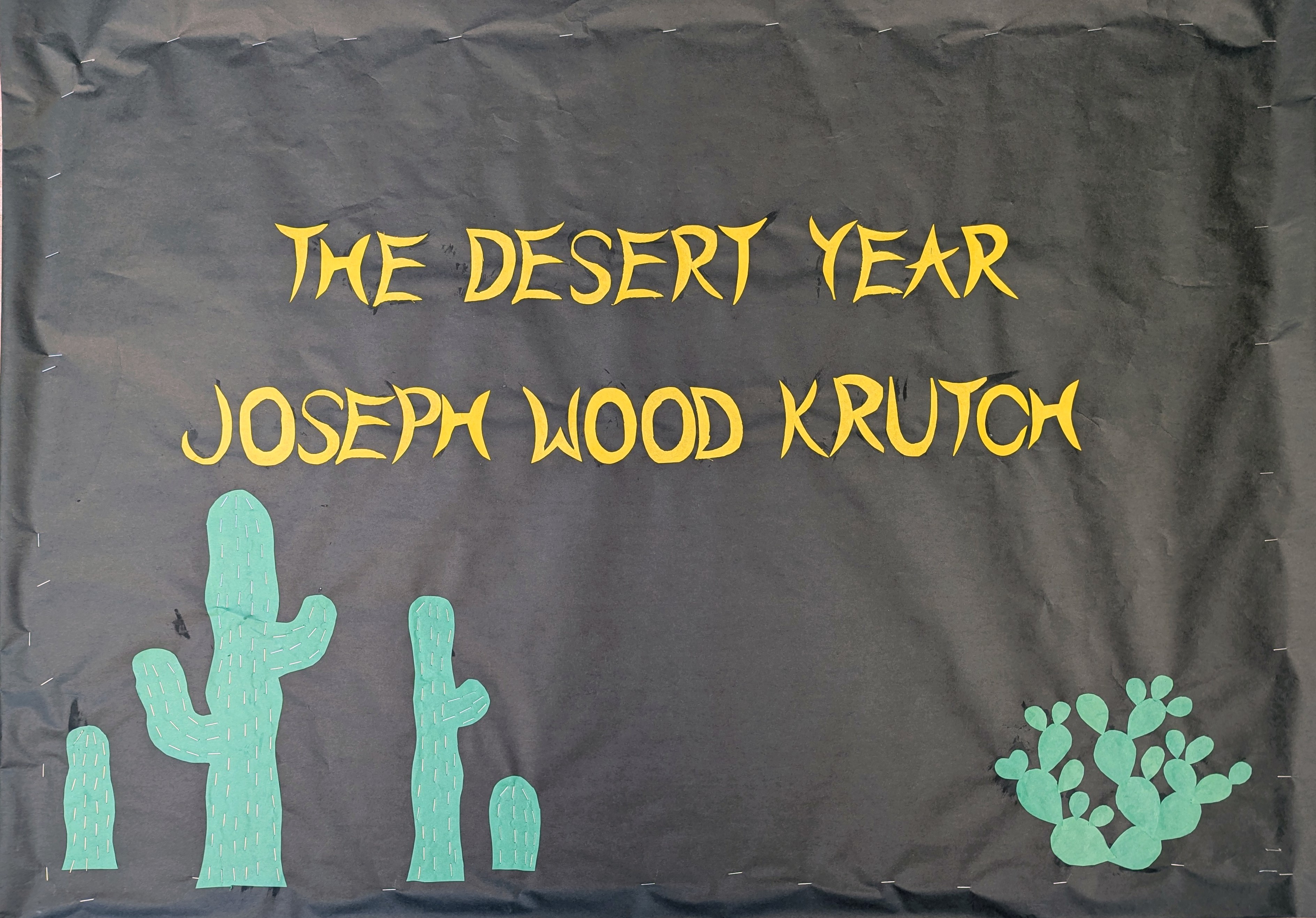
This is obviously just the attribution to the quote, and I was kind of out of steam. But the cactus came out cool. I made the saguaros wavy because that’s actually how they look when it rains. They store up so much water they get little rolls like fat. When they don’t get any rain, they shrivel up and get skinny and look sad. I like them fat and jolly like this.
The prickly pear has one pad shaped like heart, because when you go among prickly pears, there’s always one pad shaped like a heart.
Usually I guess I go a little brighter for the summer bulletin board, but overall I’m satisfied. I know it’s not summertime for most of the country yet, but it’s definitely summertime here in the desert.
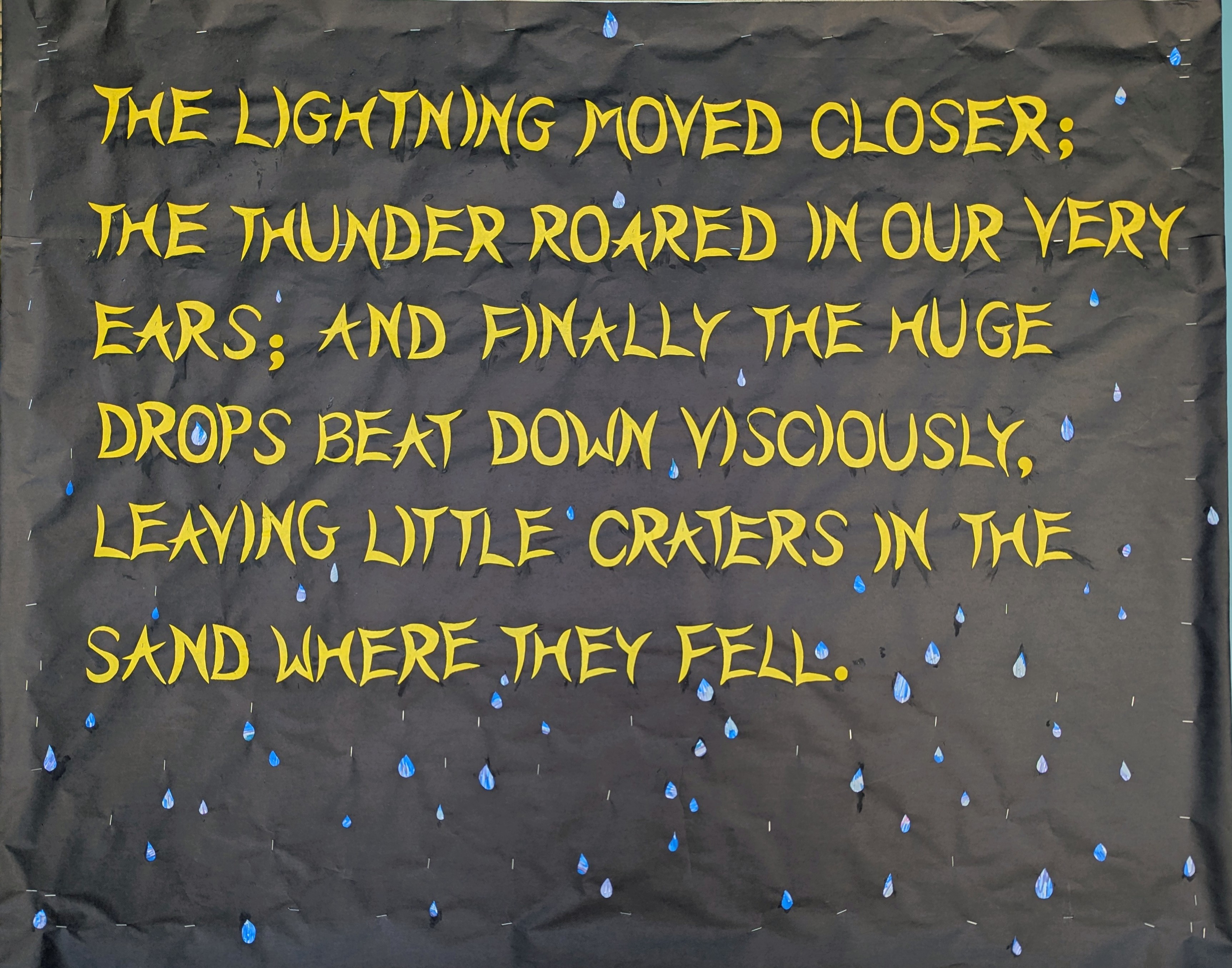
This is the second part of the Joseph Wood Krutch quote from A Desert Year. This image is also kind of minimalistic compared to my other work, and the photo also doesn’t quite do it justice.
If you zoom in you can see that the raindrops have a sort of Eric Carle thing going on. I wanted then to look sort of luminous and I thought I could use use the metallic markers on the black paper but that wasn’t bright enough. So I colored a variety of blues with a bit of green and purple to cover a bit of white paper and cut the raindrops from that, and the effect is pretty good. I added some staples to make it look wetter.
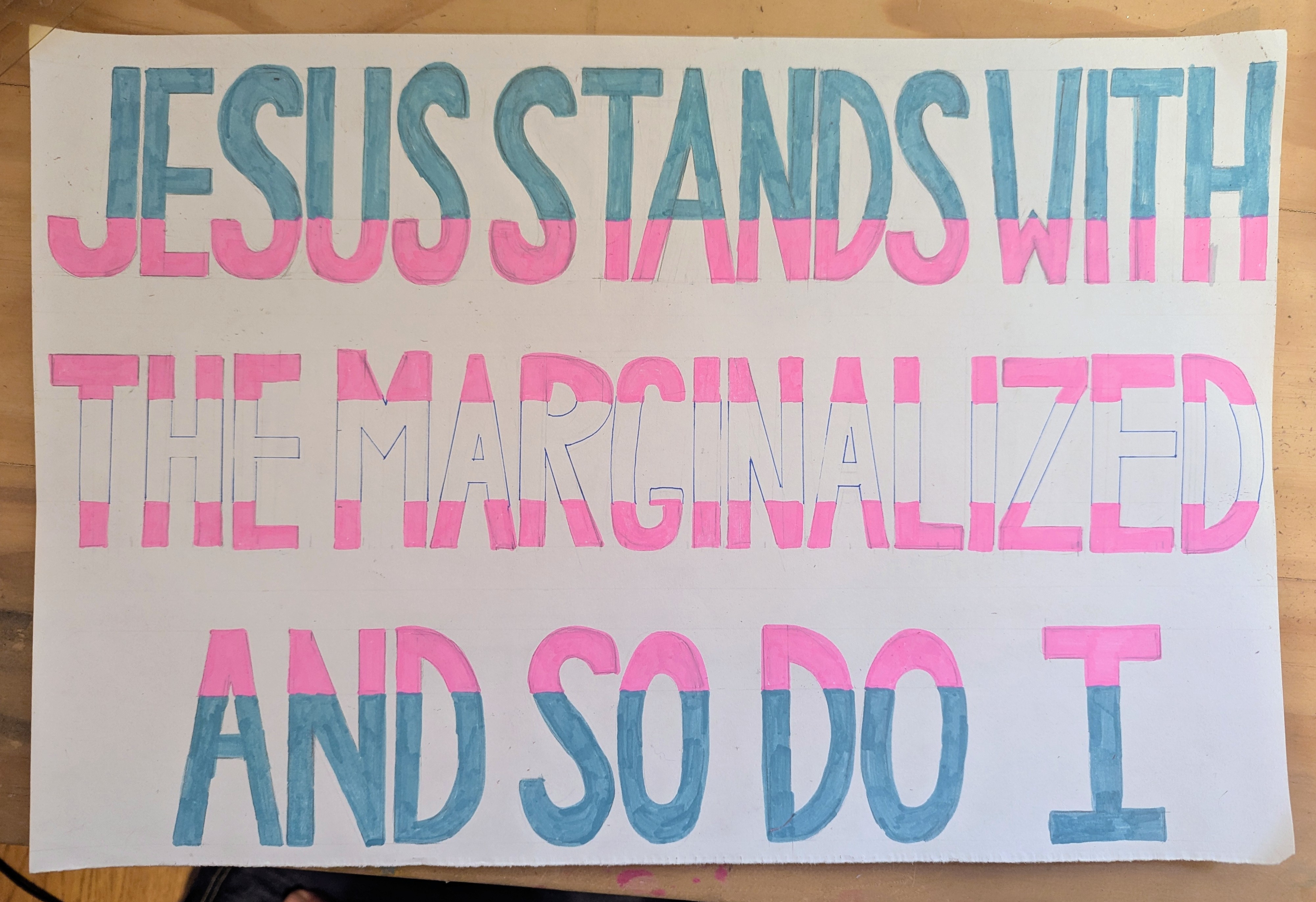
This is a commission and it’s hand lettered so I guess I should put it here. There is some controversy at a local school district and those TPUSA d-bags will be there to scream about how their religion requires them to hurt marginalized people, so of course the Coyote, who is also a one of those radical priests who think Jesus wanted people to feed the hungry and welcome the immigrant and support the marginalized will be there too, wearing his collar and carrying this sign.
This one took 5 days! I mismeasured the letters in both directions so you really have to view the first 2 of these boards together because the text cut off in the middle and spills over.
Sometimes art is about forging forward regardless of existing mistakes.
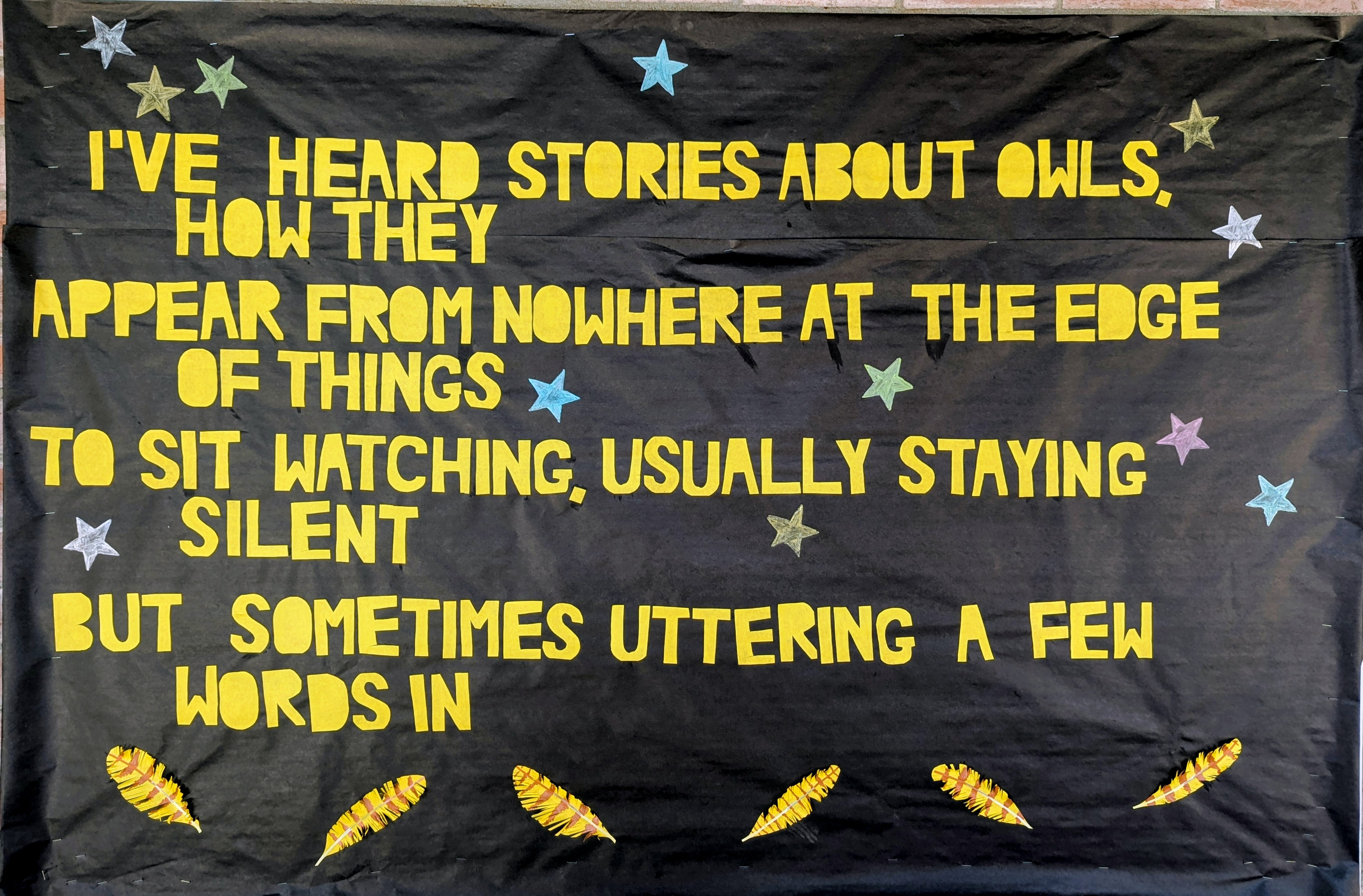
Last week the Coyote and I were skinny dipping when suddenly the sky opened up in a much needed monsoon burst, so we heaved ourselves out of the pool and took cover under the porch, from which vantage porch we observed a juvenile great horned owl appearing to dance in the rain for 5 or 10 minutes.
The Coyote told me that this behavior is intended to keep their wings from being saturated so they can still fly even though they’re wet, but it did look like a lot of fun. Joyful.
I actually made the third panel first, and I absolutely delighted myself with every detail.
I was almost finished Friday and I potentially could have stopped but there was too much blank space, so I came back and added the stars and the blooms.
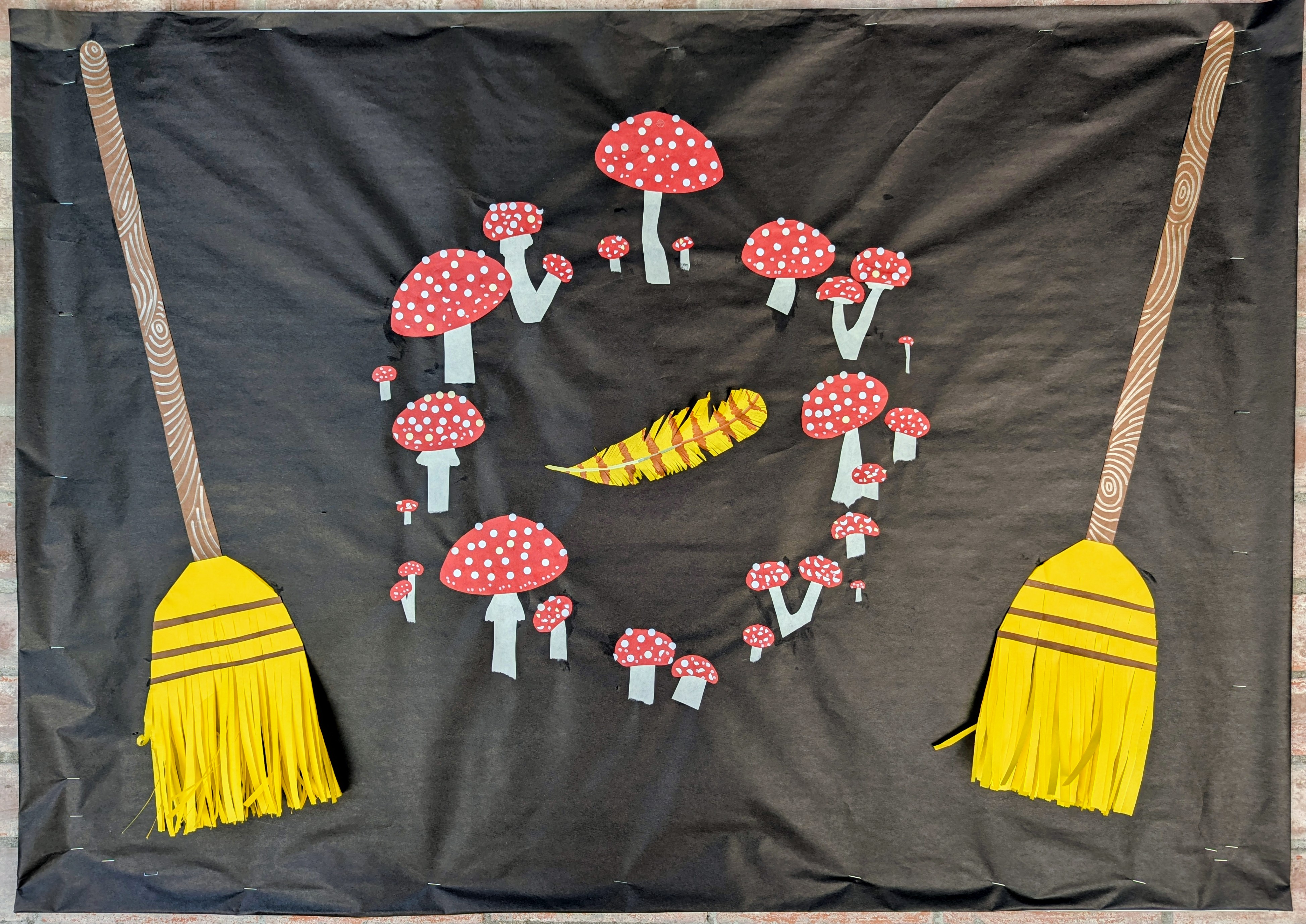
The feathers and the brooms all have 3-dimensional details that the kids may very well destroy but that’s what happens when you make ephemeral art for elementary students.
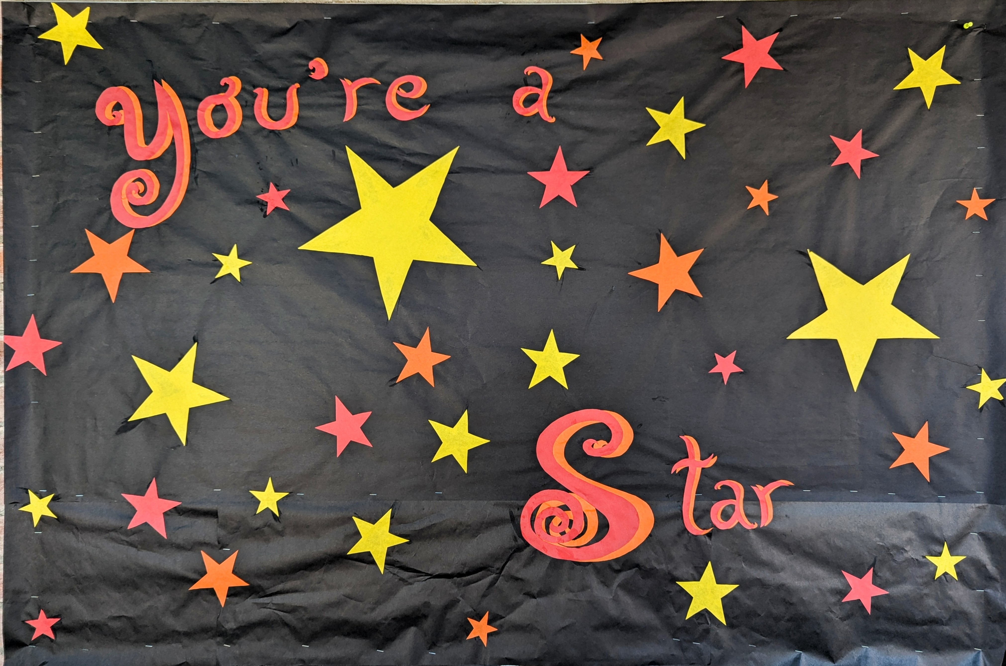
This is a just a little thing I threw together to cover the extra bulletin board last week. I’ll probably replace it with a Halloween-themed one pretty soon.
You might be thinking it’s too soon! It can’t possibly be that time. But here in Tucson, school starts in August. To be completely accurate, it begins tomorrow, August 1.
I didn’t have any inspiration when I walked in the building, but I noticed that someone had chucked a perfectly good bit of fancy paper in the recycling bin. I am forever pulling things out of recycling, sometimes because they are not recyclable, and sometimes because they are reusable by me.
So I got started with the background and the lettering and this pretty foiled paper was just winking at me. Water…ducks…rain…pun. Voila! Plus we’re still inside the monsoon.
Took about 5½ hours total but I stopped for a lot of conversation. Also the air conditioning has been broken since last May and it was 84° in there, which slows you down. I had a lot of conversations about that.
Well I messed up the line spacing but otherwise this is fun and different.
Letters are hand cut based on the Holiday font. I think I might have actually used this one before. Simple shapes, easy to work with. The big spark is also hand cut, and the rest are drawn with metallic markers.
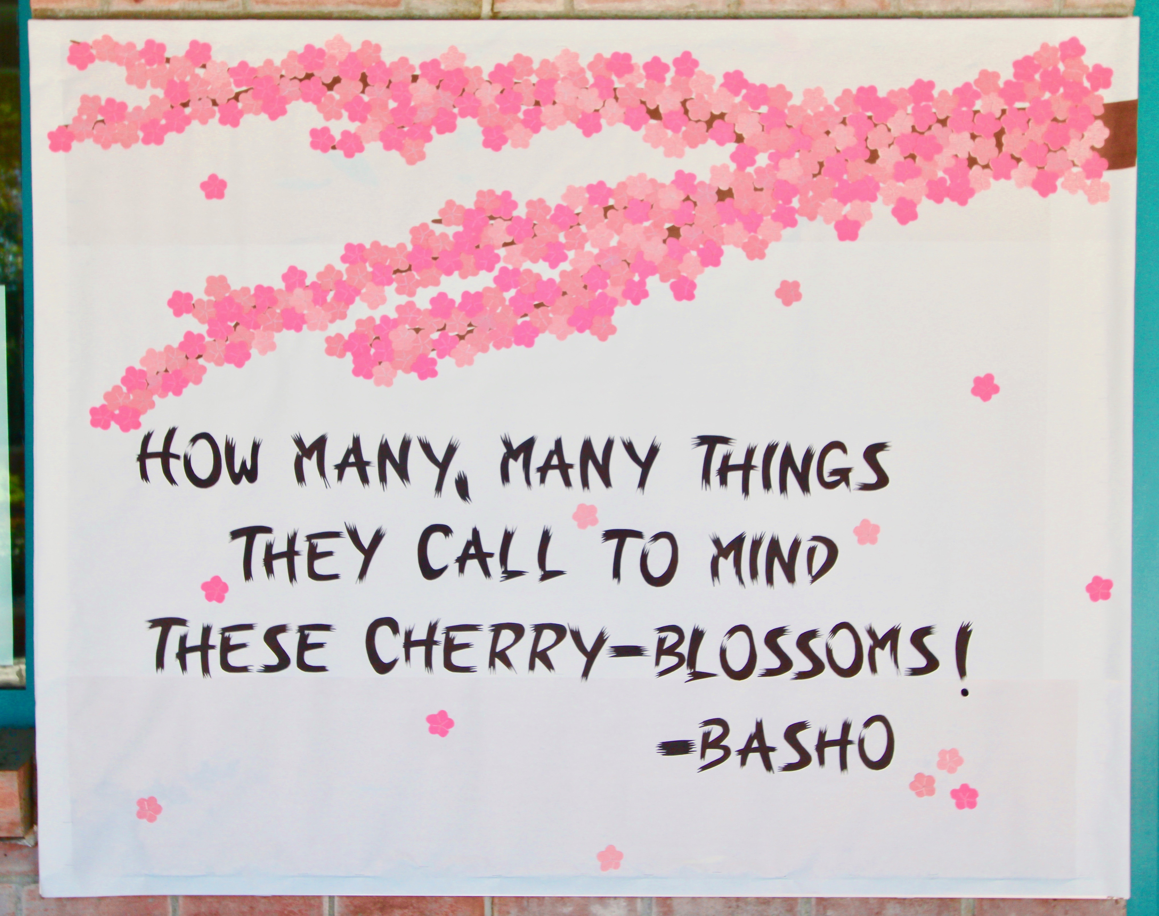
For my spring bulletin board I was inspired by images of lush cherry blossoms. After deciding that I wanted to recreate one branch, I knew that I needed a Japanese haiku to accompany it, and turned immediately to the words of Basho, whose poetry you probably read in school. I considered some other cherry-blossom haikus but ultimately thought this one the most accessible to schoolchildren, although it’s really about the fact that Basho is, at the time he wrote it, an older man recalling his childhood.
I cut the flowers from 4 different types of paper I found around the school. They often change suppliers so I’m never quite sure what I’ll have, but this offered a nice effect. I cut them all from a single stencil, and created the anthers from 5 staples for each flower. I estimate that I used 1500 staples here, so maybe 300 flowers?
First, though, I cut the lettering. I wanted to make it look like it was done with ink and brush, so after cutting the basic shapes, I went back and snipped at the edges and I have to say the effect is perfect. I’m so thrilled with this one and would like to keep it, but I don’t know how to deal with the 1500 stapes, and half the flowers are construction paper, which tends to fade in the sun anyway. Japanese people use the time of the Cherry Festival to reflect not only on the beauty of the cherry blossoms, but also upon their fleeting, delicate, and ephemeral nature.
Last year I was out in the desert with the Fox and he suggested we take a bushwhacking off-trail detour to look at a hilarious piece of graffiti someone left. “Welcome to Chupacabra Country,” it said on the back of same random abandoned building. This is indeed the land of the fearsome goatsucker. And the inscription stuck with me so long that I went out and got some polymer clay and made this plaque for the Fox to enjoy.
This is my first time using polymer clay in this way. I made a lot of mistakes. I learned a lot.
The color is Unicorn Spit, which I had also never used before. Lots to learn.
I made the letters by pressing an old set of refrigerator magnets into the clay. The little dots in each letter were actually formed by the magnet.
Probably will make another plaque like this for myself, but I think I’ll flip the coloring so the background is read and the lettering is yellow.
How can it be summer already? But it is. School here ends May 23rd, and I’m off to present my thoughts about Bonnie Jo Campbell Comics in Michigan, so I decided to clear this off my plate in a simple but elegant fashion before I left. I’ll do something fancier in the fall. I’m trying to dream big, like I did as a kid, and I hope the kids at this school are too.
The top font is called Indie. The bottom I just drew freehand.