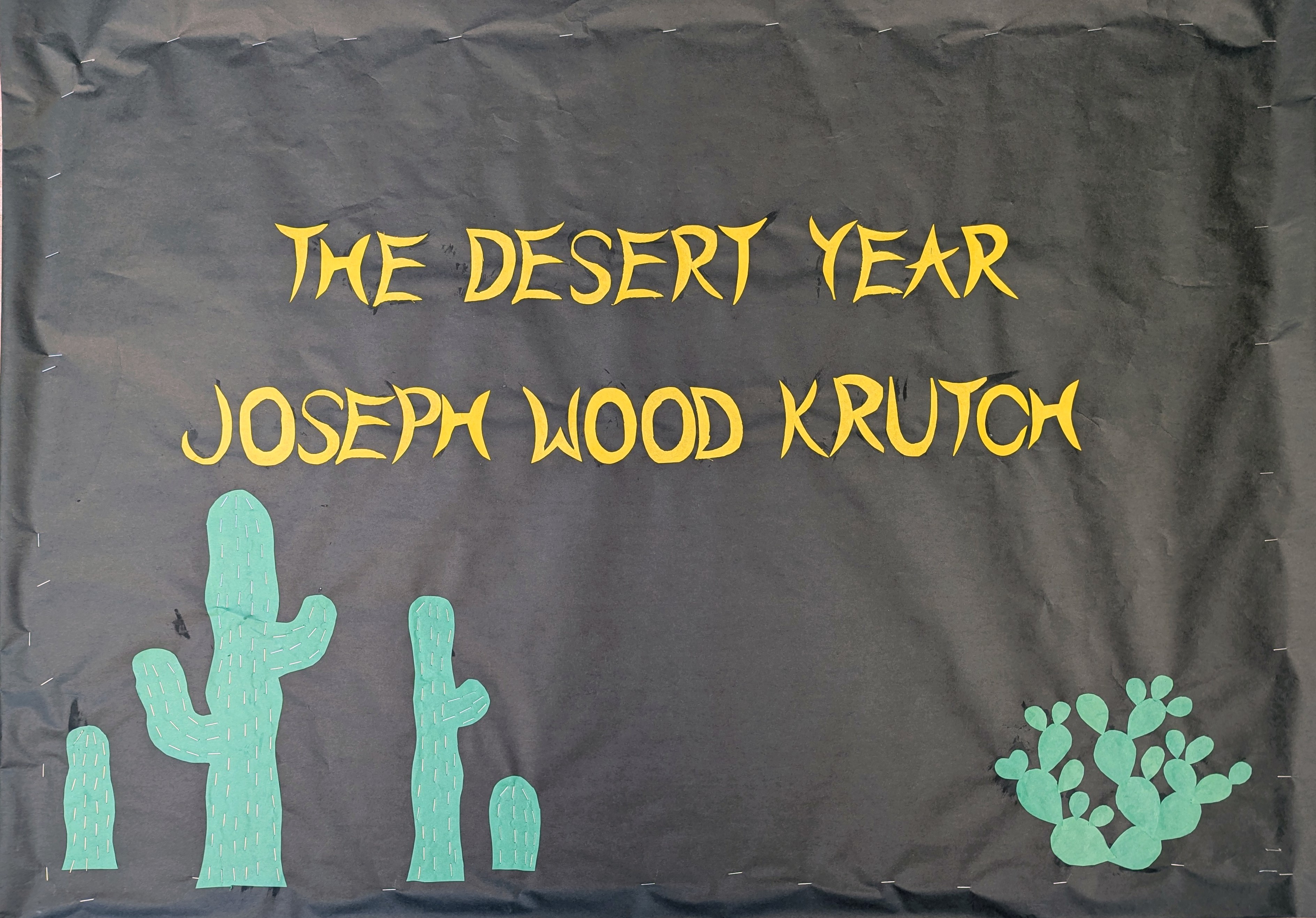
Tag Archives: hand lettering

Feeling Good

Originally, I planned to create this bulletin board in January, as a tribute to the new year. I also planned for it to not be cold and cloudy all year. I also planned to make the letters very fancy and musical. As they say, life is what happens when you’re making other plans. We haven’t got much sun, but I did my best to summon it.

I didn’t put an attribution on this quote. I knew that neither Muse nor Michael Buble was the original author. For a while I thought it was Nina Simone, but it turns out that some people I never heard of wrote it in 1964, the year before Ms. Simone made her recording, and frankly their names (Anthony Newley and Leslie Bricusse) were long and I wanted to go home.

The whole thing is kind of slapdash but I’ve learned that if I try to make things perfect, I fail, but it I start out making things wabi-sabi, the finished product LOOKS perfect.

Courage!

I didn’t put a mask on the lion because lions don’t wear masks.

Well, all things must come to an end, and that includes the waking nightmare that was summer of 2020, and now children are heading back to school in whatever ridiculous configurations are necessary to educate the populace without killing it. In this district, there will be distance learning, with teachers teaching from their homes and children learning in theirs (except for a small number of economically disadvantaged children who will be distance learning in one big, happy, k-12 classroom, with a single aide to watch over them).

I made this bulletin board for those unfortunate souls who do have to be in the building 5 days a week.

The lettering is based on the free font Andhibath Demo. The lion face is based on a stuffed animal my aunt gave me 40 years ago.

Summer Dreams

IMG_7677

No more pencils, no more lame excuses for overdue books, no more kinder hugs

As usual, I left my final message of the year to the last possible second. Did this one Wednesday day and Thursday of last week (just uploading now because I was on a writing retreat) in about 6 hours. School ended for the year at 2:45 Thursday and I hung this thing up around 4 p.m. Miss Kitty showed up (with an art commission) and helped me get it up a bit faster. I knew I wanted something sort of cooling, so I went for a nighttime theme. The cactus depicted here is the night blooming cereus, also known as Queen of the Night. The flowers bloom one night a year (the blooms are sort of clustered, so you might have a cactus in bloom for a couple days, but each flower lasts only one night). They’re pretty stunning.

The lettering is an ersatz version of a brushstroke font called Wanderlust, which I have inelegantly reproduced here in metallic Sharpies. I hope it keeps the people who have to be there over the summer feeling cool, and I hope all their summer dreams are realized.

I have so many comic scripts written. With a little focus, I hope to get back to actually drawing and posting them again.

Spring Is the Mischief in Me

IMG_20180221_154833337

And then you have to read the next couple lines in the poem.

With the comic finally put to bed, 11 days late, I managed to get a seasonal bulletin board up; the image hadn’t been changed since mid-December and now it’s basically spring in Tucson, even though the weather has been unseasonably cold.

The quote is from Robert Frost’s “Mending Wall,” which was first published 104 years ago, yet presciently questions the point of a meaningless wall.

The letter art for the word “spring” is all original, of course, although I did look at some animal alphabets for inspiration on the S and the G. The S is supposed to be a vermillion flycatcher, the P is a lemon bud, the R is a monarch butterfly, the I is a desert marigold, the N is a long-suffering saguaro, and the G is a gecko. The small block letter are just the easiest style to cut by hand, and the lettering of “mischief” is based on a Harry Potter inspired font called “Mischief Managed.” The other animals are a hummingbird, a jackrabbit, some kind of fish, and a gambrel’s quail. I feel like it needed more animals, but The Man wanted me at home and the school is closed until Monday (in Tucson we don’t celebrate President’s Day, but we get 2 days for Festival of Vaqueros: the rodeo).

Maybe I should go back Monday and give the rabbit some whiskers, and take a better picture. We’ll see. My massage therapist also suggested that I should let my creating hand rest a little bit.

Sexy

IMG_20170402_191604

With a little touch up in Photoshop, this could be a RedBubble design.

This is a card I made for a friend’s lingerie-themed bridal shower. The dark red edging around the letters is Sharpie and the rest of the design is cut origami paper, some leftovers from my 1000 paper cranes project. The word “sexy” is also cut paper. It was almost one contiguous piece but I ripped it the tiniest bit while cutting it out, and then ripped it again trying to fix it.

I’ve been mostly working on another project while obsessing over the future of humanity. Part of me felt defeated by reality and overwhelmed with helpless terror, but then I read this New York Times article and thought about what Rabbit keeps reminding me about samizdat and it’s like—yeah, one tiny voice against a hurricane, but also, a million tiny voices against a hurricane. Some people think Trump wanted Bannon off the security council because he resented the media’s implication that Bannon was pulling the strings. I drew this comic after being tagged in a Facebook status that suggested cartoonists portraying Bannon as a puppetmaster could help limit his influence by appealing to Trump’s grandiose sense of being the most (only?) important person in the world.

I’ll draw webcomics again, I guess, but 4-5 a week isn’t going to happen at least until I finish the other project. In case you’re wondering, it’s called “Close Encounters of the ∞ Kind.” I didn’t name it; it’s a collaboration. I should probably talk about about it later.

E Pluribus Unum

img_4315

Of course, she did much more than most people, with much less than most people. 

Usually, my holiday bulletin boards are sort of cheerful and joy-themed, but last night, while considering my intentions, I decided that there was a message that everyone needed to hear. E pluribus unum; one nation, indivisible, a house divided against itself cannot stand; we are one. If we can’t find a way to come together, to heal the rifts between people that brought us the most polarizing and depressing election of my almost-42 years on this planet, we can’t expect to achieve much of anything.

After settling the theme of “unity,” I researched for a while and found a lot of wonderful quote, most of which were a bit sophisticated for my primary audience, a number of whom are still learning to read. This Helen Keller quote summed up the intention in words that your average 8-year-old can understand.

Before anything else, I had already decided I wanted to go font-heavy, to use fancy lettering, which takes 4 times as long, but used to be a mainstay of this genre for me. Once I had settled on the quote, I chose the typeface by searching “19th century fonts” and “victorian fonts.” These letters are based on  Longdon Decorative. I smoothed out a few of its peculiar bumps, but otherwise feel like this cut letters are pretty faithful representations.

No visual imagery really jumped to mind, except maybe hands, reaching or helping. Maybe I’ll go back tomorrow and add a picture if one comes to mind, but I doubt it. Had I more time, I could have come up with something, but I was already 45 minutes late to help the Girl with her report about Jane Goodall, plus getting sick due to the overwhelming stench of the laminating machine. Someone said that they might have changed the type of plastic used in this machine, because they’d actually relocated it to the next room and it still smelled twice as bad as when it was behind the library desk. My head still hurts from those noxious fumes. At any rate, it seemed important to have this bulletin board and this blog post available first thing Wednesday morning.

So, what do you think? Can we just try to love each other? And if that’s too much, maybe acceptance? Tolerance, at a bare minimum. Can’t we just tolerate one another?

Alphabet of Desire Part 1

Title for the Alphabet of Desire. The lettering is based on Gothic Versals.

Title for the Alphabet of Desire. The lettering is based on Gothic Versals.

I don’t remember where I first heard the term “Alphabet of Desire,” a magical device invented by artist Austin Osman Spare, but it was something that synchronistically popped up here and there, until it occupied a firm space in my mind. I went so far as to sketch out the ideas I would use in my own Alphabet of Desire, and would find them every couple months or so.

The first initial cap for my acrostic novella. The wood symbolizes the Tarot wands and the concept of generation. A sprouting stick signifies new beginnings and earthly ventures. The snake represents the mystic male generative principle.

The first initial cap for my acrostic novella. The wood symbolizes the Tarot wands and the concept of generation. A sprouting stick signifies new beginnings and earthly ventures. The snake represents the mystic male generative principle.

At the same time, I had also been long kicking around an idea of writing a story whose plot was based on the Tarot’s journey of the Fool (i.e. a work of twenty-two segments, each based on a Major Arcana).

For every chapter of the Alphabet of Desire, I also do a page of hand drawn letters in various fonts, which serves as a centering exercise.

For every chapter of the Alphabet of Desire, I also do a page of hand drawn letters in various fonts, which serves as a centering exercise.