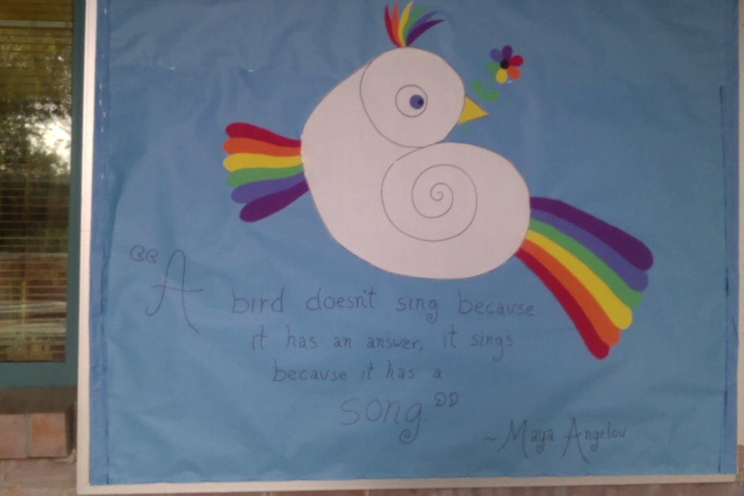
Winter 2013. I had the idea for the bird first and found the Maya Angelou quote after I did the image.
For the last four or five years, this bulletin board has been my baby. While the wind has, on more than one occasion, ripped my work from the wall, while a PTA mom has, on more than one occasion, tried to hijack my real estate with badly rendered licensed characters, this space, where I create ephemeral works of art for children, is regarded as mine, and most staff and students seem interested in seeing what comes next.
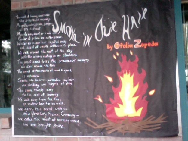
Winter 2011, One of my favorites. The poem is by a local poet called Ofelia Zepeda. At the time, my husband worked at the same university where she teaches and, unbeknownst to me, forwarded her this image! She wrote back that she found it beautiful. I was a little embarrassed, but 2 years later when I happened to meet Ofelia Zepeda at the Tucson Festival of Books, I was glad to have a funny story to share with her.
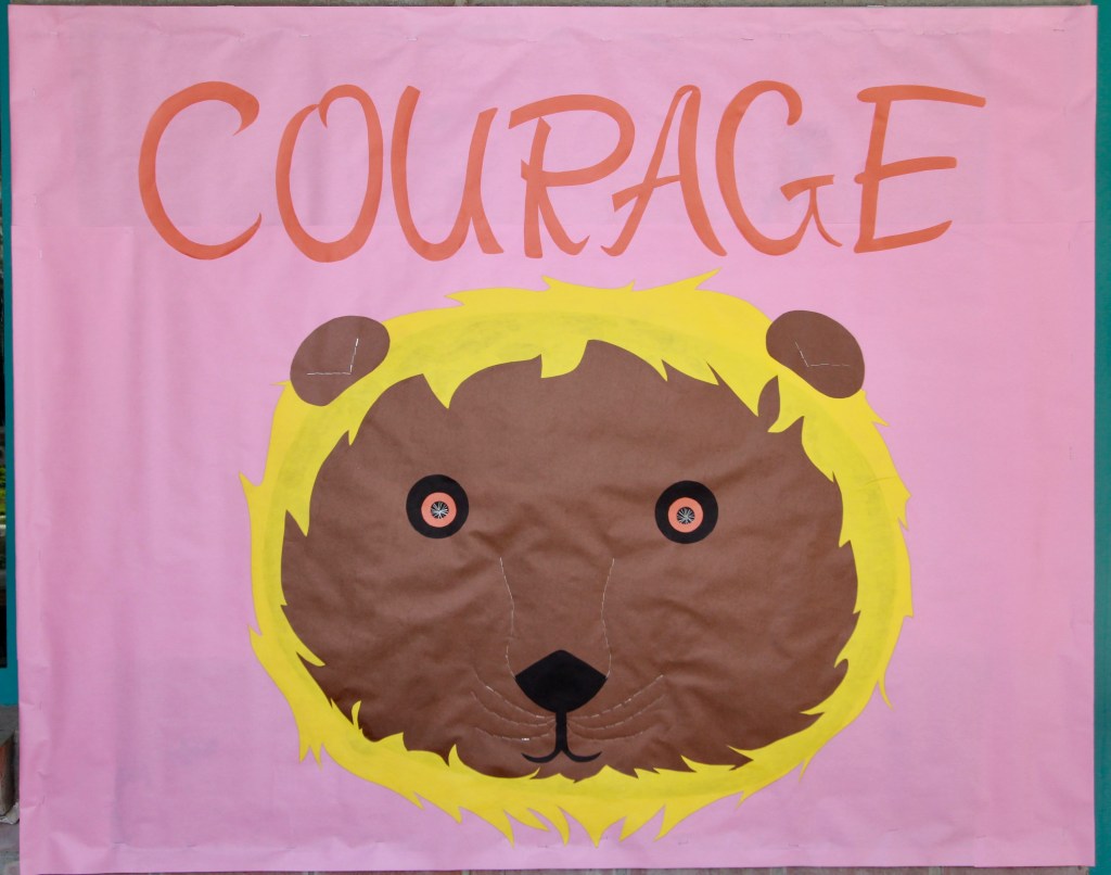
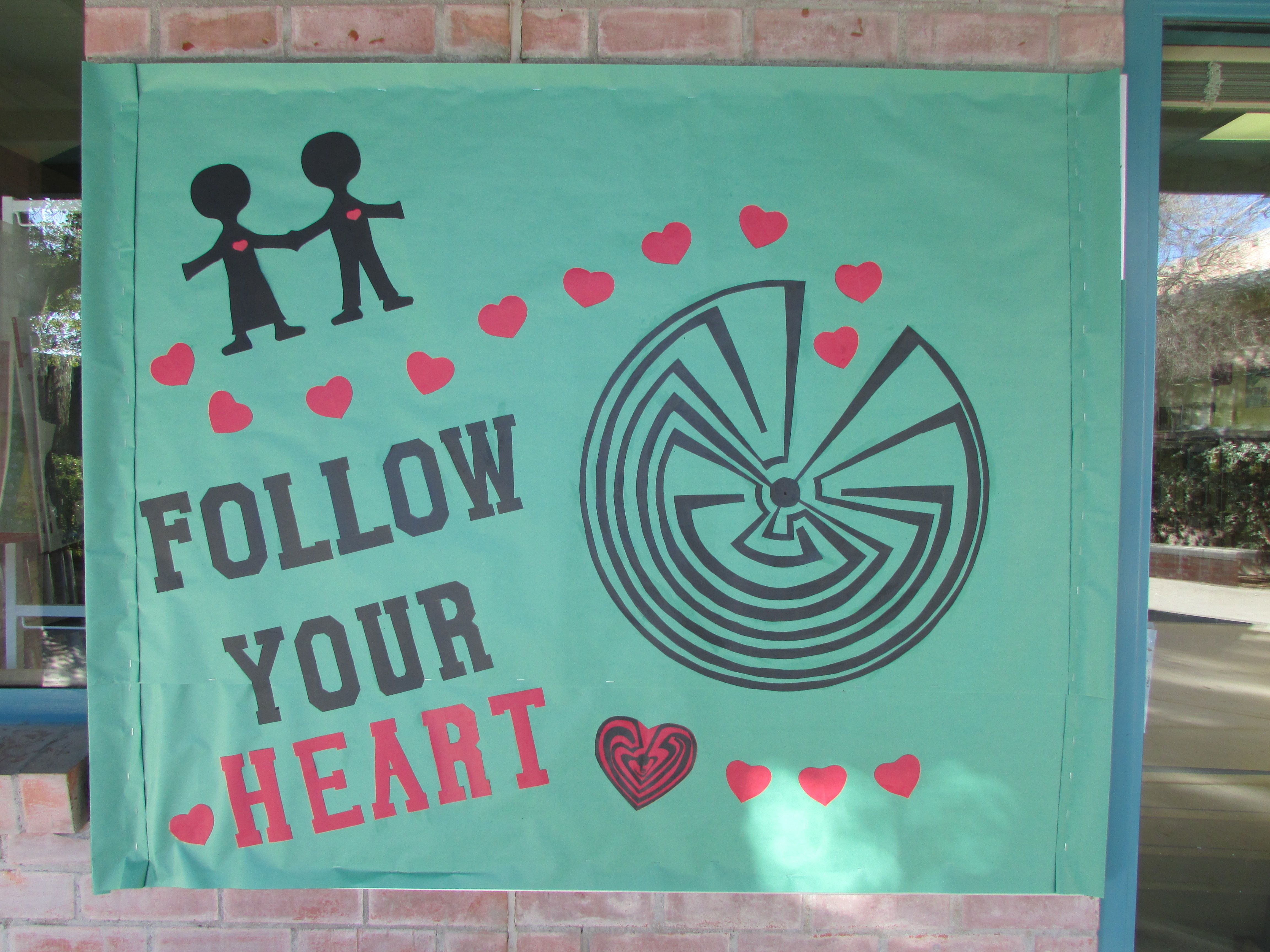
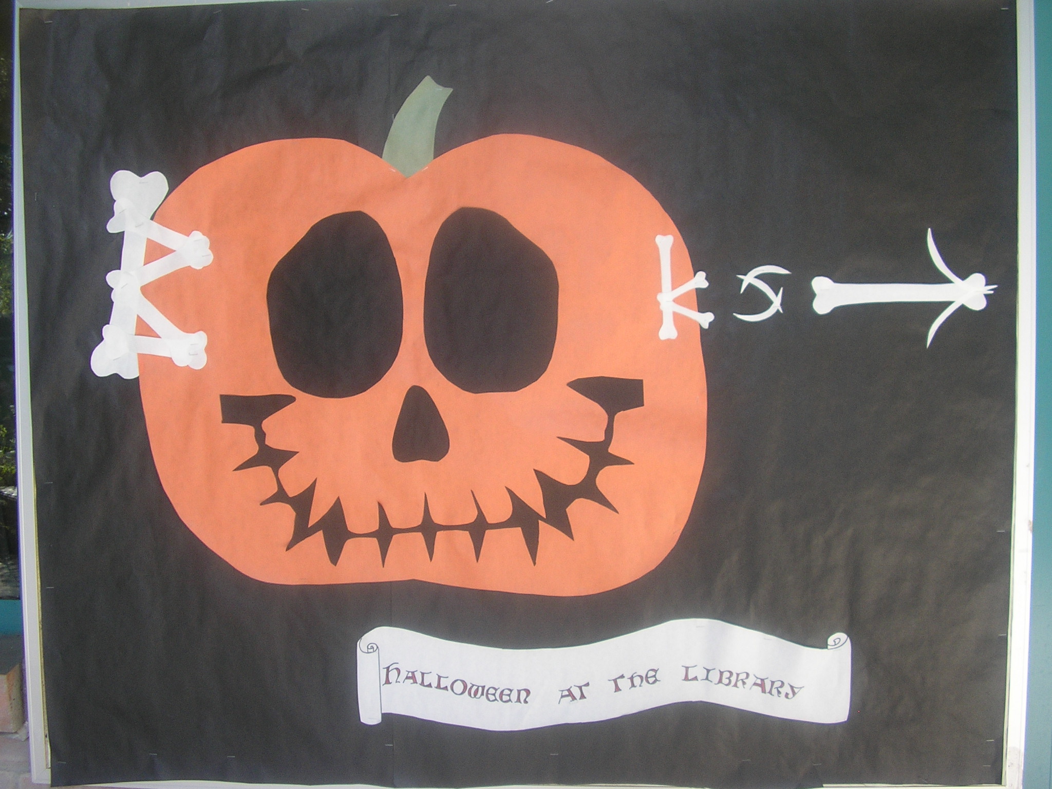
I work almost entirely in cut colored paper, either the butcher type paper that comes in a long roll, or sturdy sheets of construction paper, using rubber cement and staples. Periodically, the work requires other elements (paint pens, string), but generally it’s just the paper, the glue, and the staples. Since these murals are exposed to the elements, the colors fade quickly and need replacement every six or eight weeks. All the letters are hand-drawn and hand-cut. Some of the fonts come from books, others from my own mind. Most bulletin boards take around six or eight hours to complete. The most complicated one (the Tohono O’odham Man in the Maze) took about fourteen hours.

Winter 2014, the Tohono O’odham Man in the Maze