The Girl, who is now a young woman working on her mother’s hydroponic farm, asked me to draw this gag, which I did, 98%, and then just…forgot? It’s the brain fog.
I love this joke because it is accessible to an absolute tiny percentage of people. But it is very relevant if you like internet memes and you work on a hydroponic farm.
I’ve been diverting 100% of my creative energy into the new comic book since October but it is still tantalizing in the Zeno’s paradox of incompletion. Very close. SURELY by next month. Unless I break both my hands or fall into a coma or die, it HAS to be done by next month. I just have to finish one interior page and the front cover, inside and outside and also start and finish the back cover, inside and out.
So close.
I took a little break over the last week or so for this small commission of a series of 6 stickers featuring a meerkat in a lab coat at Burning Man.
So that’s what this is: 1 of 6. I’ll try to post them every day until you have experienced the complete adventures of Census Meerkat. And pretty soon after that you can watch this space for Bonnie Jo Campbell Comics Volume 5.
Up to this point, every logo commission I’ve gotten, the client has said, “Please draw me X and Y and make it Z,” and then I drew the thing they described and was done. For this logo, commissioned by an Independent Catholic charitable organization that feeds unhoused people…that did not happen.
The client showed me another logo they liked as a suggestion, but didn’t want to me to copy it or anything. Then we had a long discussion about the whole thing and I drew a totally different logo they didn’t like, and then this one. And the client said, “It’s just what I had in mind even though I didn’t know it.” So yay!
i overscheduled myself and budgeted my time poorly and burnt out and forgot my inspiration…so I ended up knocking out this little axolotl and then never going back to give them an environment or an interesting quote. It’s just an axolotl. The kids love axolotls.
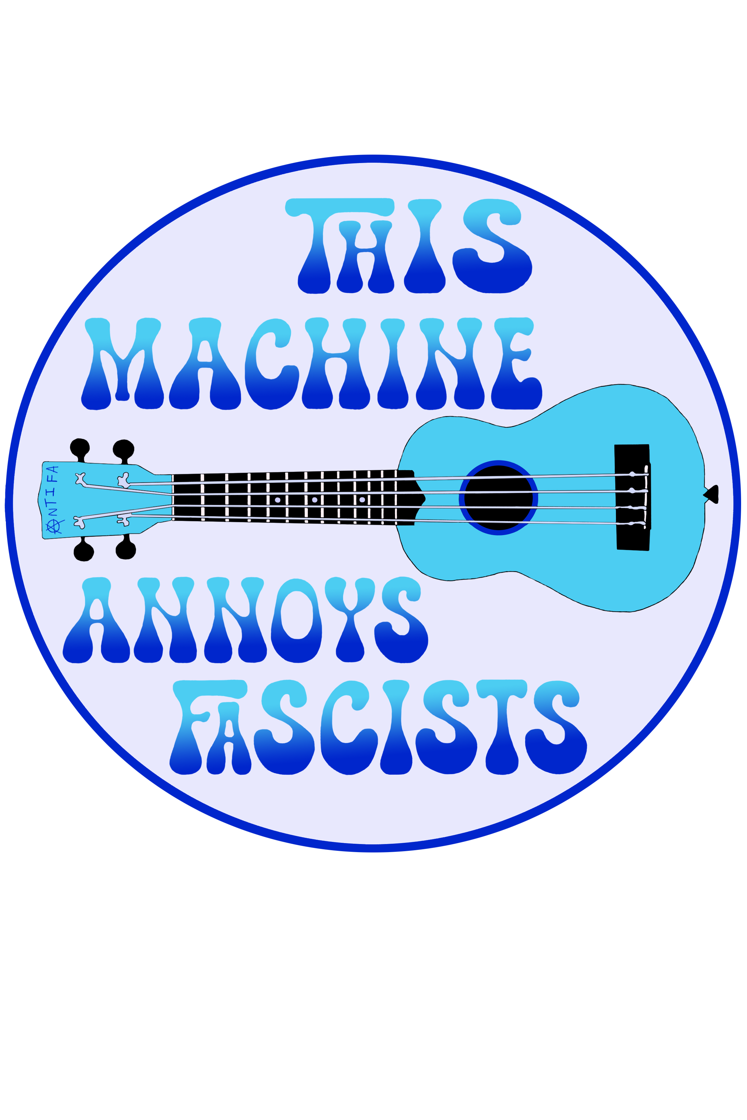
It probably annoys other people, too, but we’re aiming for Fascists.
I once read that after writing “Night Moves,” Bob Seger fell into a deep depression, fueled by the belief that he had hit the pinnacle of his career and would never write another song as great and meaningful as that one. Personally, I prefer “Old Time Rock and Roll,” but when I look at this image, I think to myself, “You might as well retire from graphic design because this is the greatest thing you’ll ever do.”
But Bob Seeger didn’t retire and neither will I. People are already asking for T-shirt versions of “Respect Your Local Monsters,” so that’s what I will make next. Plus I have another cool commission in the works.
The quote here is, of course, a riff off Woody Guthrie’s, “This Machine Kills Fascists,” message, which the folk singer wrote in black across his acoustic guitar. And the ukulele being a sort of baby guitar, its power is not as lethal, but still shots fired against the enemy.
As it’s looking more and more likely that this country is willing to go full Fascist in the next couple years, and Gen X is old and has back pain, and this is about the level of resistance I’m able to muster currently. I personally plan to get shot in the face in my own home if they start hauling off antifa. I’m Jewish and don’t have the stomach for going quietly.
Well, I know nothing whatsoever about live sound engineering, but I do know how to draw things that people describe to me, especially if, like this client, they very helpfully say things like, “Make the logo look like this Velvet Underground album cover,” and then also send me a picture of the album cover. But I didn’t make it look too much like the album cover to avoid a repeat of the time I got a DMCA takedown notice for a design in which one of my original characters cosplays as Billy Gibbons from ZZ Top. I thought that was very unfair. Anyone can wear a knit hat and sunglasses and a very, very long beard and the comic was quite specific in identifying it as NOT Billy Gibbons from ZZ Top, but as someone simply dressing like him (against their will, even; the comic ends with the character deciding to shave), plus parody is protected speech.
However, as I point out in this comic, Fair Use only applies to people who can afford copyright lawyers, and even though I’m pretty sure I was in the right, I am not one of those people. So for this project I drew a totally different VU meter than the one on the Velvet Underground album. The client requested “an amber glow,” and I wasn’t 100 percent sure what that meant until I started looking at images of VU meters and saw one with an amber glow. I mentioned it to The Man and he explained that amber glow was a retro aesthetic that would fill tech nerds with nostalgia for old analog equipment. He knew what I was talking about without the visual (because he is a tech nerd). Creating the amber glow was fun, and very simple in Photoshop.
Amber Glow would be a good name for a pop star.
Another problem I had to solve was the font, which the client wanted to look similar to the album cover as well. Now, I know at least one word nerd who probably can identify fonts just by looking at them, and I was about to message them, but then I thought, “Hey, it’s 2022; surely there’s an app for that.” And there is. There are many apps for that. And then I said, “Well, if there’s an app for it surely there’s a website for it.” And there are many of those as well. It was easy to upload the image and find the name of the font.
The website I used also helpfully offered to sell me the font for $26, which is a RIDICULOUS price for a font, in my opinion, and to sell me the entire font family for $86, which is laughable. It turned out that I already owned some of the fonts in that family (Century Schoolbook) and while I didn’t own the specific one, I think I got pretty close.
The client wanted to use this logo for a few things, but since they specifically wanted to make T-shirts, I used my T-shirt template, which is…large. So this is a big, sharp file, but it should print out well in full size. I think it’s a stunning marketing tool. This guy has been in the business for a couple decades. You should definitely hire him for live sound engineering.
And I just got another logo commission! But first I have another, potentially high profile commission that I’m not sure if I’m supposed to talk about. But I’m very excited about both of them.
Last year I was out in the desert with the Fox and he suggested we take a bushwhacking off-trail detour to look at a hilarious piece of graffiti someone left. “Welcome to Chupacabra Country,” it said on the back of same random abandoned building. This is indeed the land of the fearsome goatsucker. And the inscription stuck with me so long that I went out and got some polymer clay and made this plaque for the Fox to enjoy.
This is my first time using polymer clay in this way. I made a lot of mistakes. I learned a lot.
The color is Unicorn Spit, which I had also never used before. Lots to learn.
I made the letters by pressing an old set of refrigerator magnets into the clay. The little dots in each letter were actually formed by the magnet.
Probably will make another plaque like this for myself, but I think I’ll flip the coloring so the background is read and the lettering is yellow.
Layers! Onions have layers; reality has layers. You get it.
This is a proof of concept drawing for my next big project about which I am stoked and can now discuss: collaborating with the always-amazing Linda Addison to create 1 or 2 comics for her upcoming book of interconnected short stories, Negative Spaces. Originally, based on the tile of the book, I have envisioned a very different style–much more black, much simpler lines–but after we talked about the project for a couple hours, the layers started to come together.
This image won’t be an actual comic panel: it just demonstrates the style in which the eventual comic will appear, more or less. Still needs some tweaks, but the idea is that each layer of reality has its own weight and solidity.
The background is a manipulated photograph; in the next iteration I’ll leave off the stippling and just play with the contrast and brightness to take it down to line work.
The human character is a pencil sketch, with the interiors filled in with grayscale to pull it forward from the background.
The kid’s imaginary friend is drawn in crayon, then reproduced at 50% opacity so it’s partially transparent but still heavy enough to interact with the kid.
The 5th dimension beings are a 3D polymer clay model set on the scanner bed to make them hyper-real.
These aren’t the actual 5th dimension beings, whose design specs have not yet solidified: it’s 3 different angles on the “chronic pain and insomnia” figurine from my personal demons collection, because it was the only monster I had lying around that seemed as if it would lie easily on the scanner. The actual 5th dimension beings will be flatter, for maximum scannability.
Of course, these comics have to be black and white, but knowing that in advance gives me the opportunity to experiment and possibly understand how playing with grayscale can add dimensionality
Sometimes I think: this could be an element of something really beautiful. Or it could be a cross-section of something really horrible.
Not much to report for this weekend. Added 3newdesigns to my RedBubble shop and started to work on a 4th. Wish I understood more about typefaces, about how designers choose lettering for visual appeal, readability, and emotion. Also, how to design specifically for different article of clothing, versus drawing things as they come to me and then sticking the same image on a variety of surfaces.
This is a tidy little mandala, another amoeba type. They really do fall into simple categories.
Sorry there’s nothing of any depth or substance in here. The Rabbit told me she wanted us to make a business plan, and I told her, “You make the plan and I’ll just do whatever you tell me to do.” I swear to god, a woman came up to me at a party this weekend and said, “I had this idea for a T-shirt and I heard you sell them online,” and then proceeds to tell me that she works in marketing. I’m like, Lady, you don’t need my help. You’ll probably sell more T-shirt than me without even trying. I have no idea how to sell things. I just create the.
Going for the gold, and the silver, and the bronze.
At the same time I acquired 3 pounds of polymer clay, I also picked up another set of Sharpie Metallics to replace the defective ones I bought for October’s Black Cat Bulletin Board. These came from Michael’s, rather than Walgreen’s, and probably hadn’t been sitting on the shelf long enough to completely dry out. Then I got really excited to do a zentangle on black paper, so excited that I somehow failed to notice that this paper was substantially larger than 8 1/2 x 11 (i.e. somewhat larger than my flatbed scanner). So the edges of the design got cut off in the scan, but otherwise this one looks really nice.
Even though this piece was drawn yesterday, I’m still uploading it an hour late today because it’s hard to get back into a rhythm after a vacation, and also other reasons. Needless to say, I never got the chance to actually make anything today, except, of course, breakfast, lunch, and dinner. So now I’m behind on everything.
If you’re going to let a blog slide, December is the time to do it. No one has time to screw around online in December. In related news, my holiday sales are booming: 2 Tshirts and 2 stickers in 2 weeks. Success. Yeah. Please, buy my stuff so I can pay for all these art supplies.