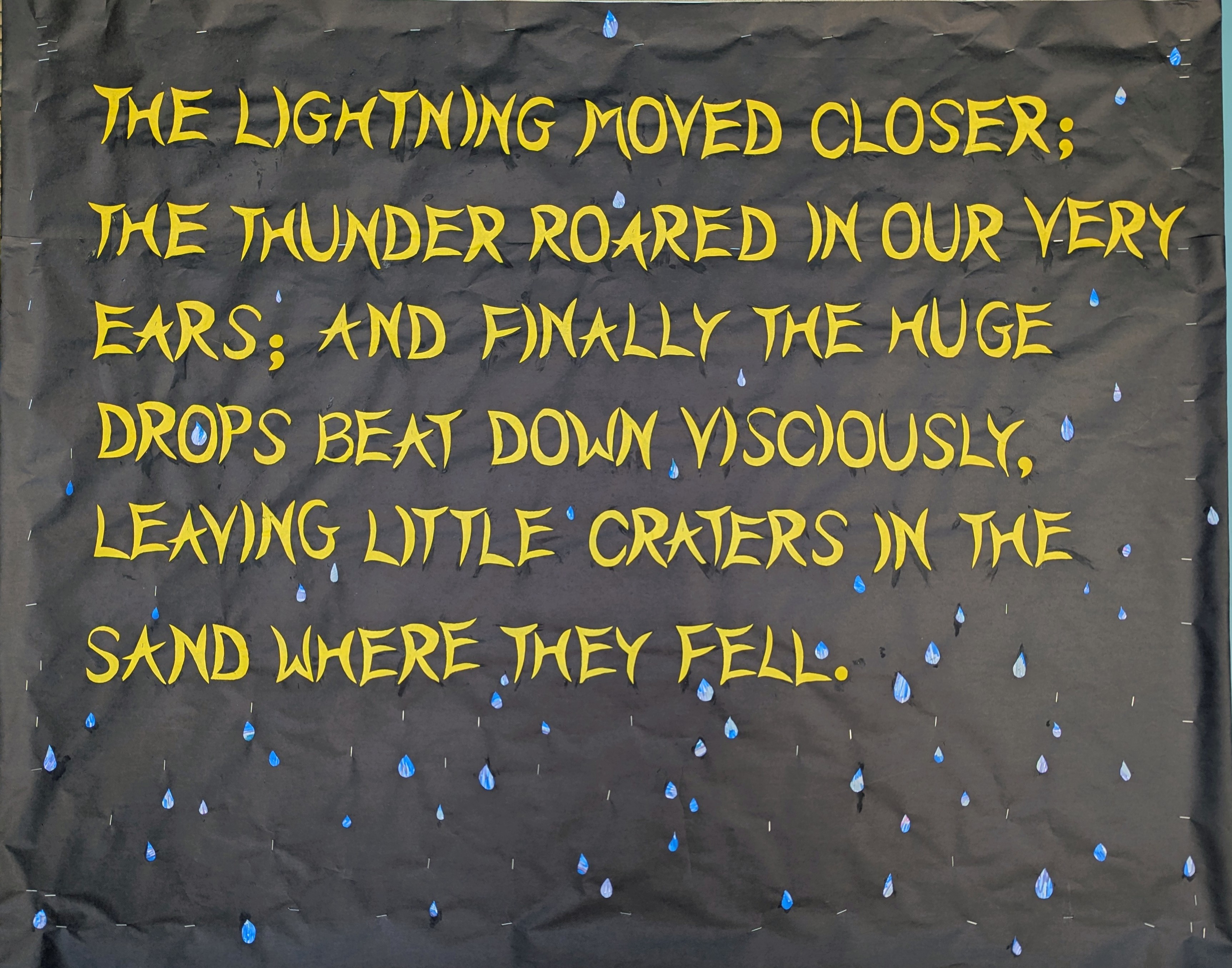
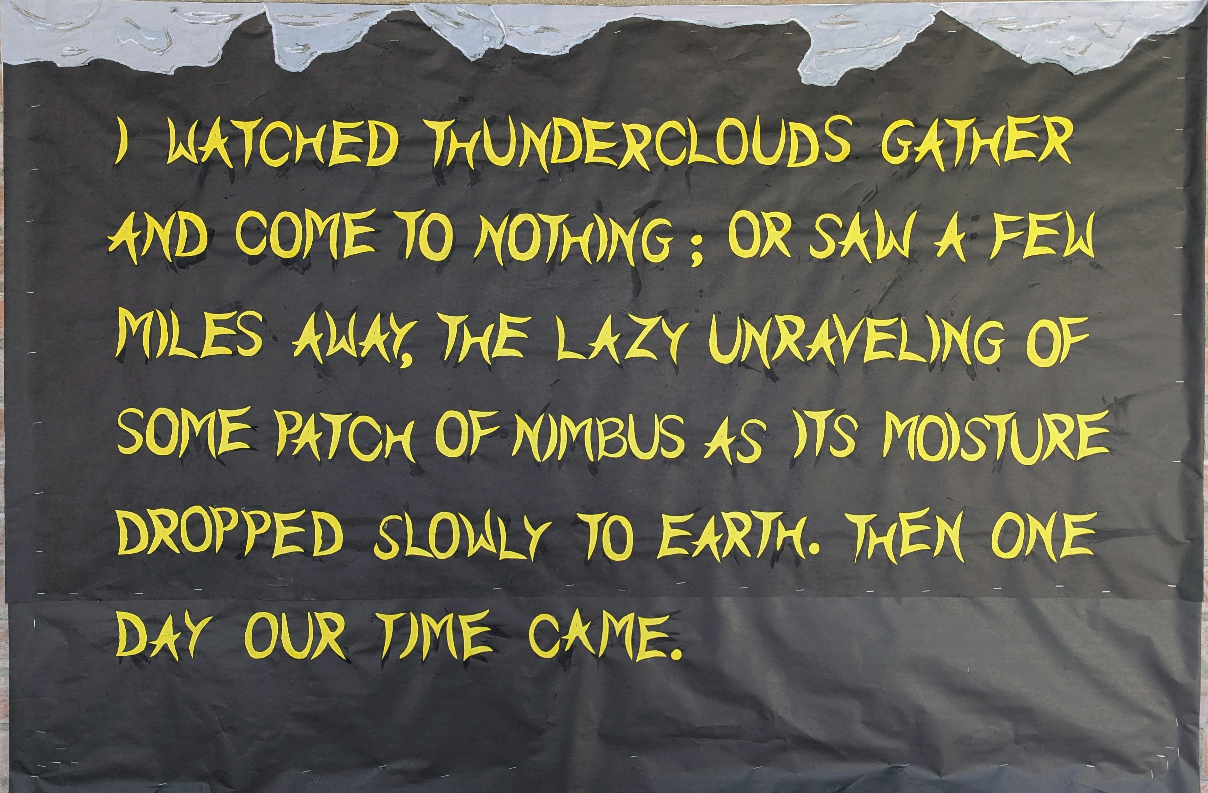
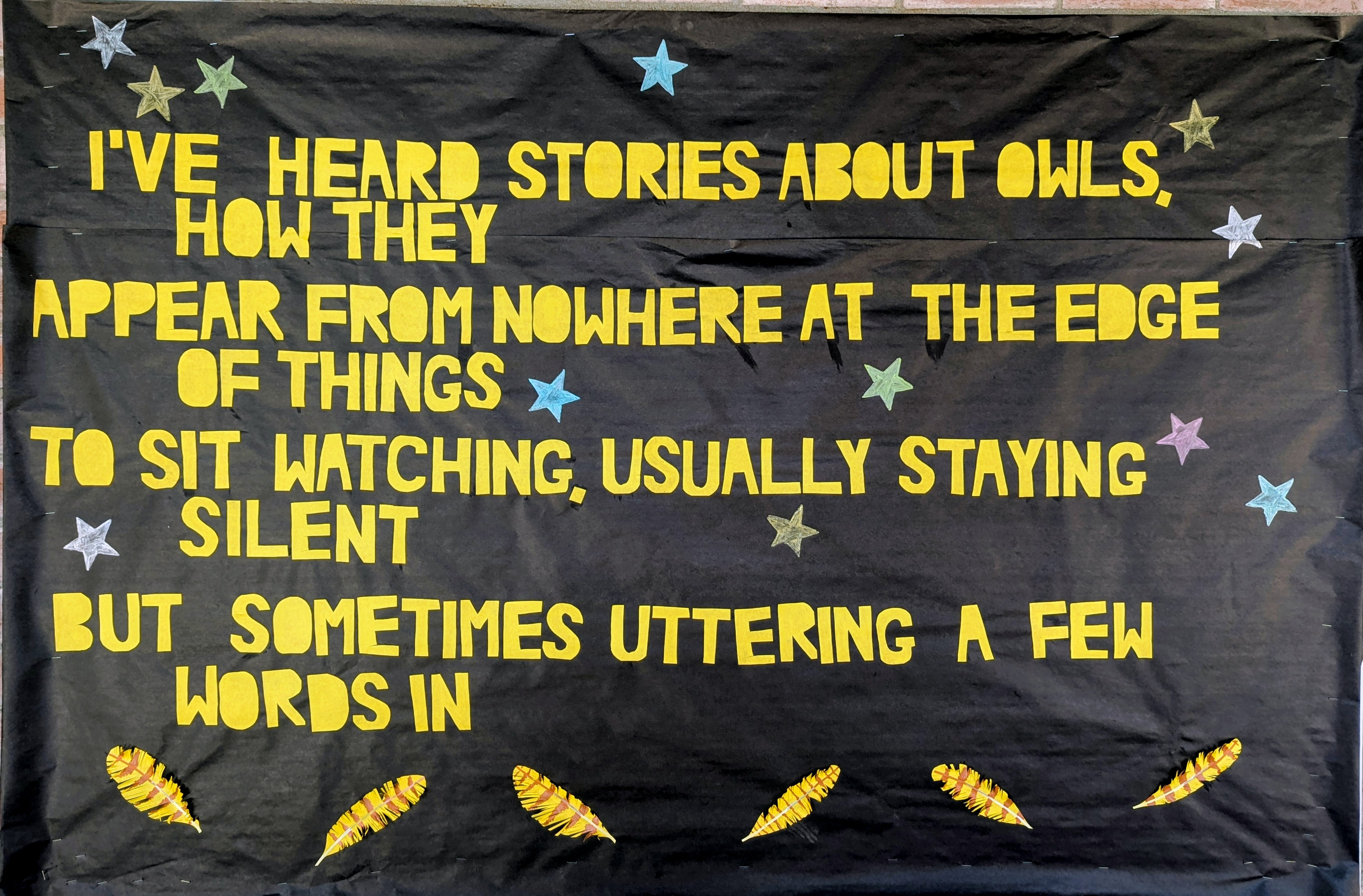
This is the second part of the Joseph Wood Krutch quote from A Desert Year. This image is also kind of minimalistic compared to my other work, and the photo also doesn’t quite do it justice.
If you zoom in you can see that the raindrops have a sort of Eric Carle thing going on. I wanted then to look sort of luminous and I thought I could use use the metallic markers on the black paper but that wasn’t bright enough. So I colored a variety of blues with a bit of green and purple to cover a bit of white paper and cut the raindrops from that, and the effect is pretty good. I added some staples to make it look wetter.
The Desert Year is a lovely piece of naturalist writing originally published in 1952, by a professor named Joseph Wood Krutch. He wasn’t a desert dweller—he was an east coast guy—but he came out to Tucson once and found himself enchanted. So when his next sabbatical came around, he took a year to immerse himself in the Sonoran Desert, joyfully observing the land, the climate, the flora, and the fauna, and recording his observations into this classic work of nonfiction.
These bulletin boards are a bit bare compared to some of my work. I’m not sure this picture does the “clouds” justice. I was trying to make them look textured , with a silver lining. It’s more clear in real life. I could have done more. But I’m presenting my comic to the American Literature Association conference this week and I needed to be reasonable with my time. I was trying to finish this Friday but I lost an hour dealing with my insurance company and that was that. I had to come in today. But this was my last day of the 2026 school year.
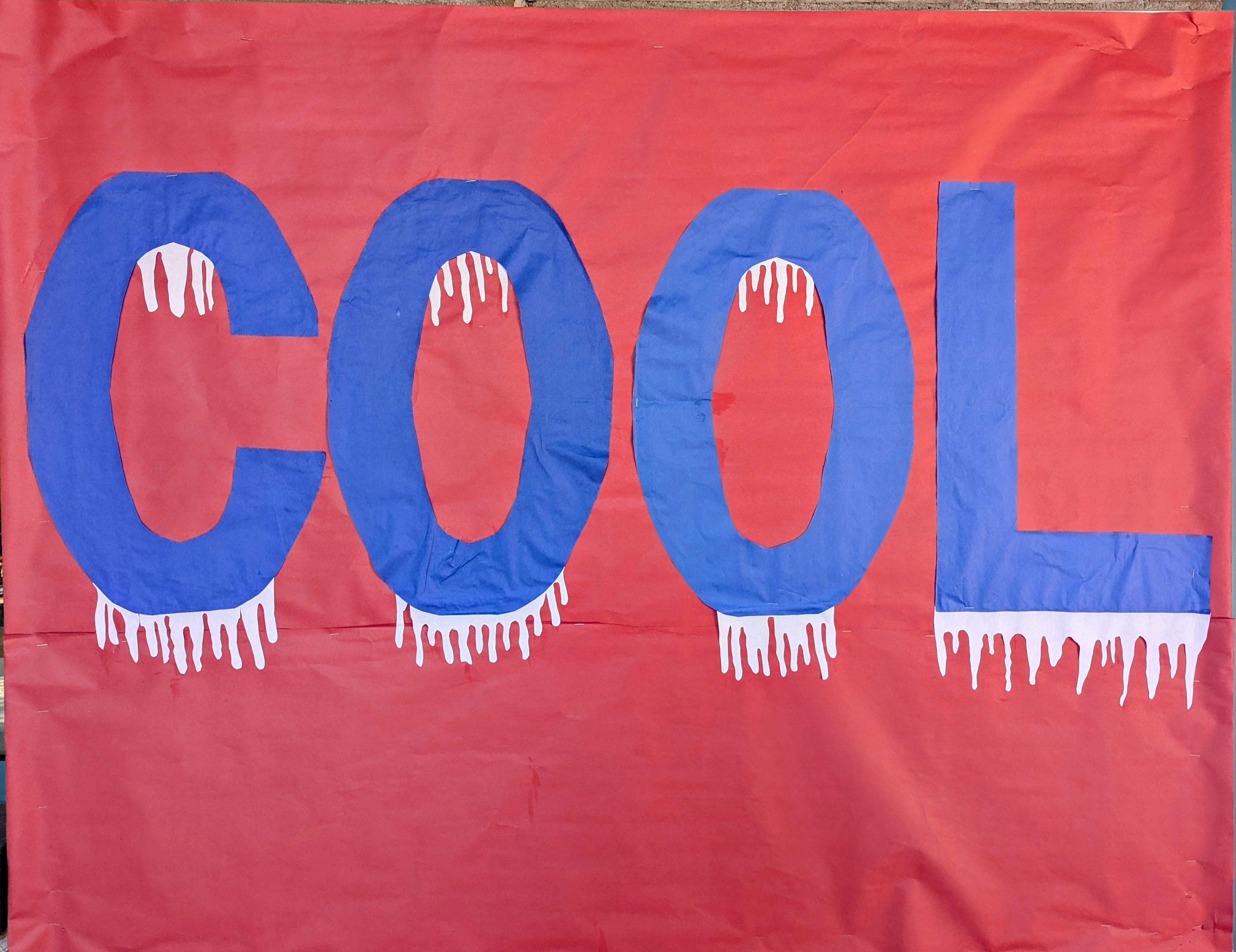
Letters are all cut freehand in a font I just created based on curved lines. I don’t know why H and A came out so much smaller than everyone else but it kind of works.
This is the first part of a quote he wrote about his first glimpse of the monsoon. The second part is on the the middle bulletin board. The monsoon is still a ways off this year, but they are calling for an El Niño year, which can only be good for us if it actually happens
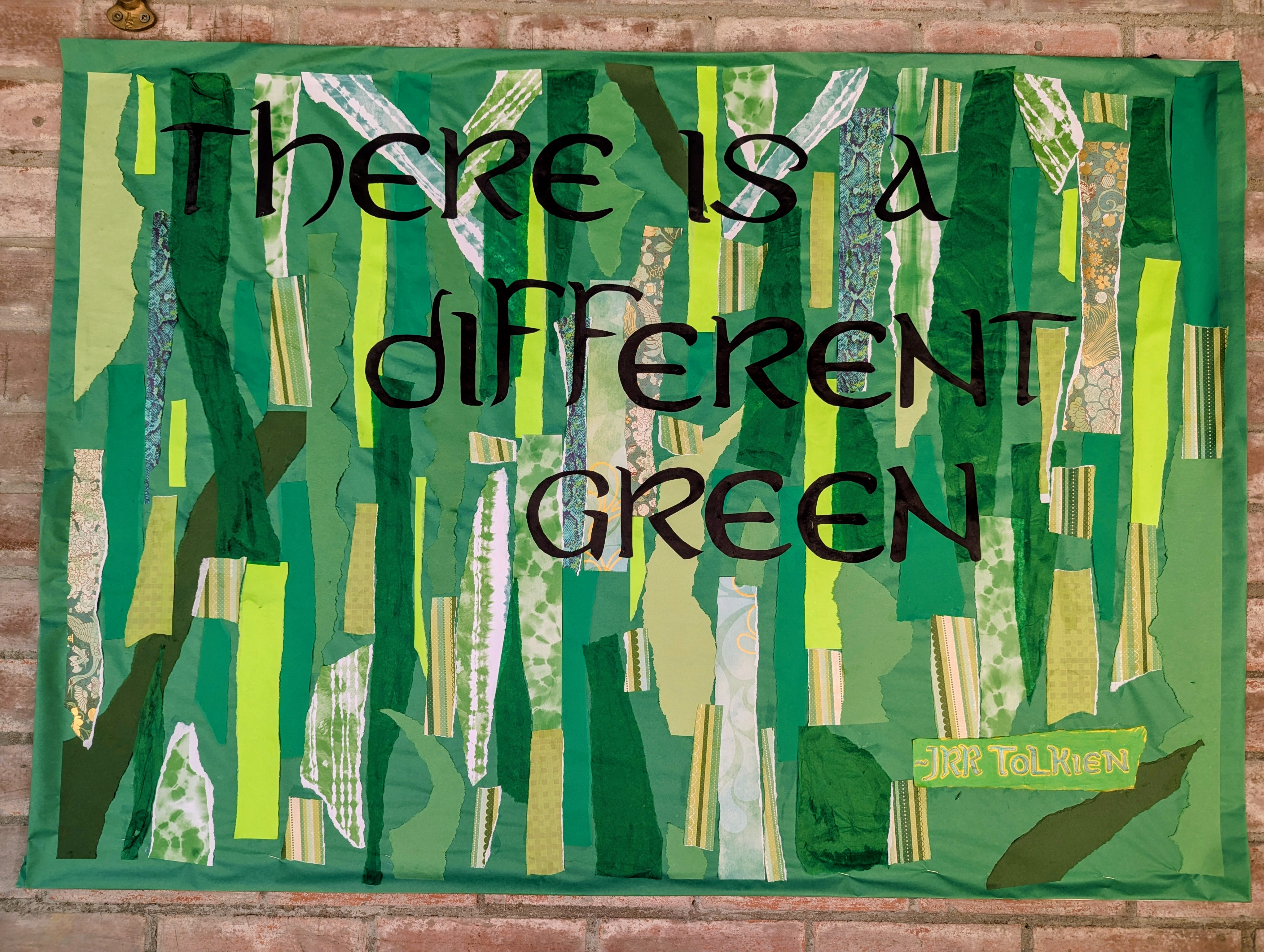
So obviously I had to go beyond my normal sources to get this many different greens. Fortunately, I knew where to go and had many different options available. In the end I think it was something like 15 different kinds of paper: butcher paper, printer paper, construction paper, origami paper, tissue paper, and specialty paper.
The attribution to JRR Tolkien was actually yellow paper but I did the lettering in 2 green marker outlined with green pen and then colored the rest of the paper with a different green marker.
Even though I was just going for strips of green, a lot of people saw a forest in this design. One person even specifically suggested a birch forest.
All 3 of these bulletin boards took about 14 hours.
I recently reread Lord of the Rings, which I think is more relevant now than it’s ever been, being a tale of unlikely heroes compelled by honor and duty to do the right thing in the face of certain death. Like every single character knows their enterprise is doomed to fail but they march grimly toward their own putative demise because that’s what you do when evil threatens to overwhelm your world.
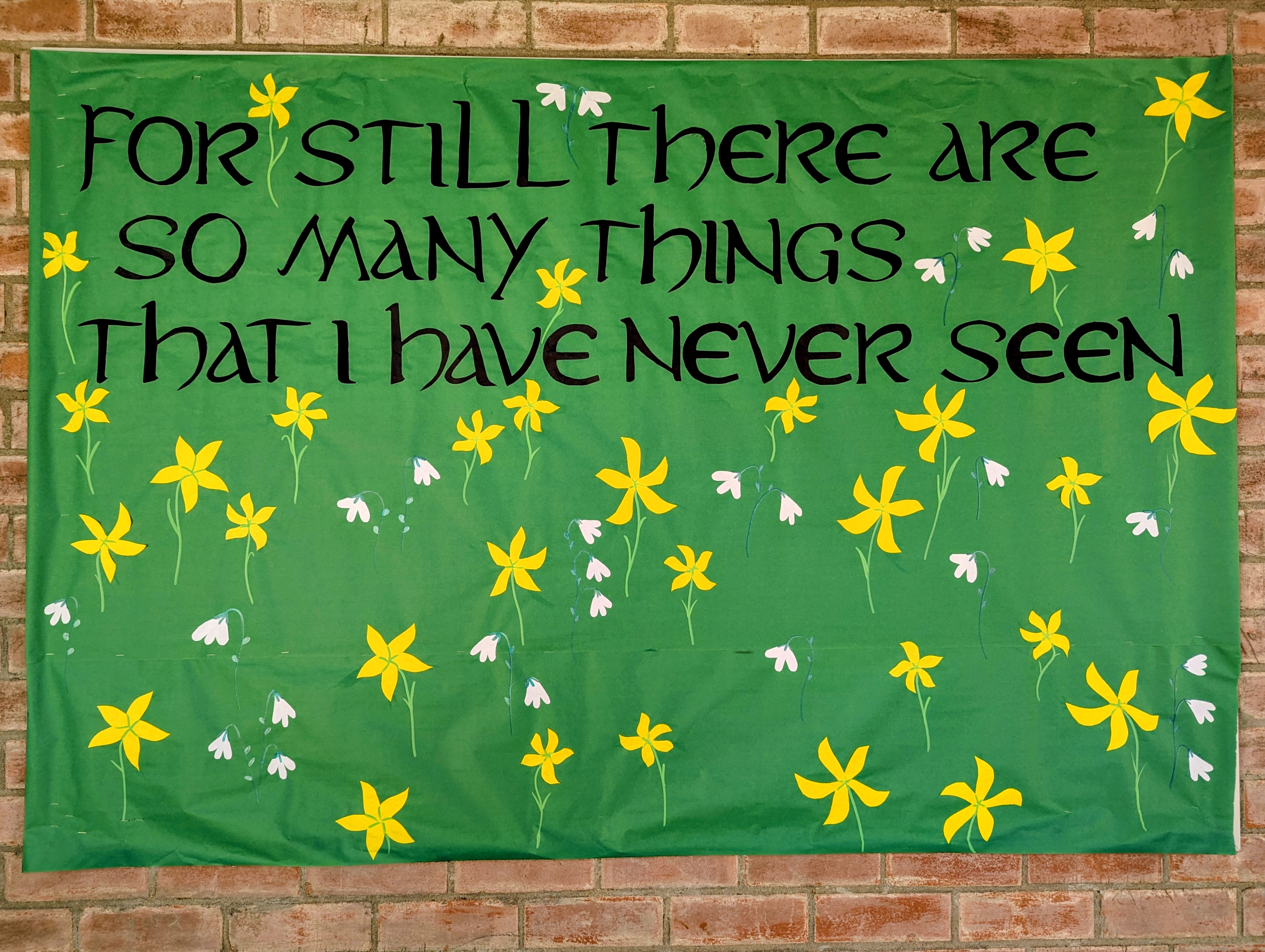
But they have some nice moments mixed in with the doom, like Lothlórien, where the grass is festooned with the golden, star shaped elanor flowers and the white, snowdrop niphredil.
Even though this panel is the first of three, I did the image last.. The flowers and letters are cut paper but the stems and leaves are markers. The font is based on Aniron.
The quote is from a poem of Bilbo Baggins sings to Frodo in Fellowship of the Ring, an old hobbit wistful with nostalgia, watching a young hobbit prepare to make a journey beyond any he can imagine.
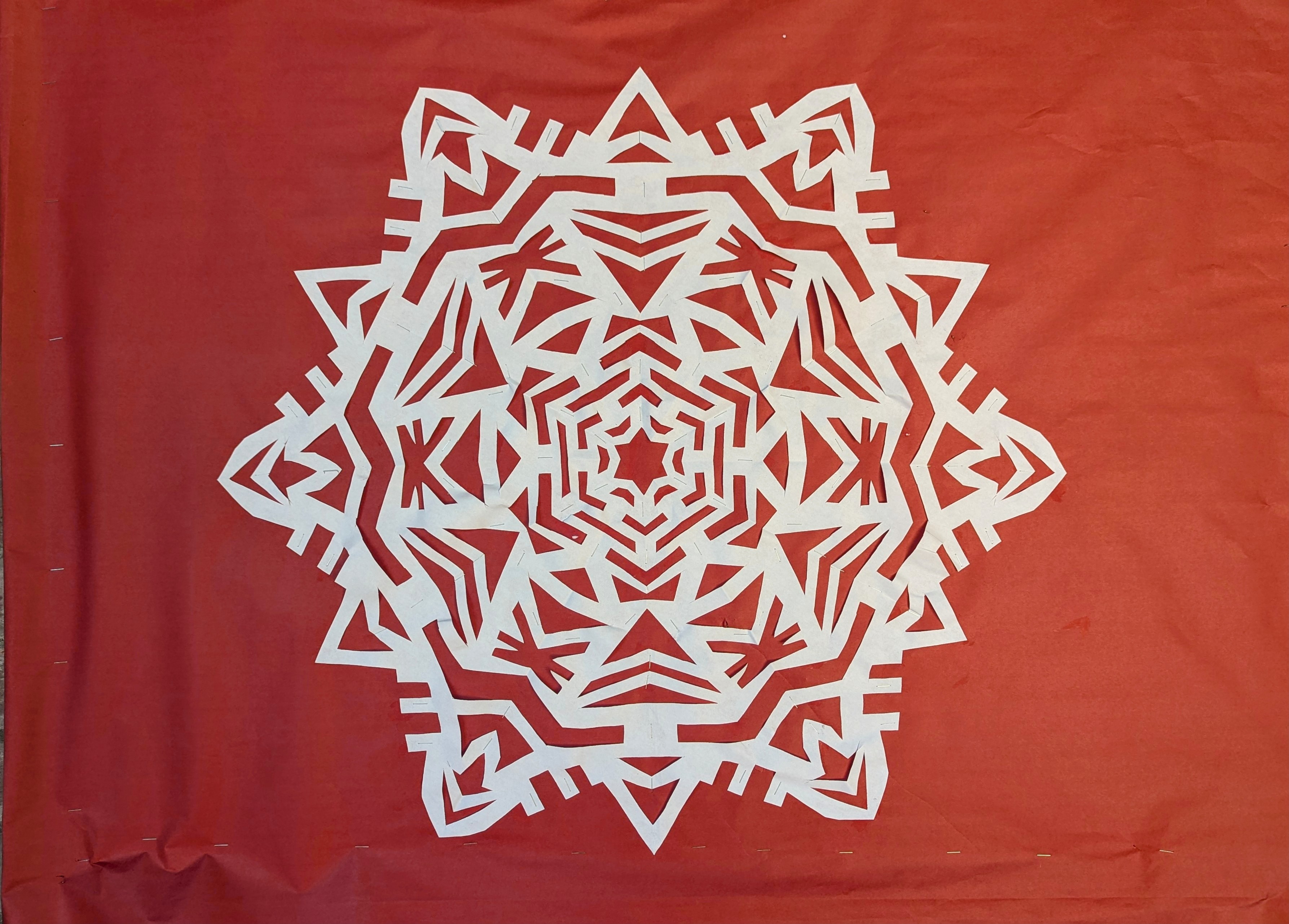
They asked me if I would participate in Science Night and present an activity that combined science and art, so I’m doing snowflake cutting. I’ve wanted to teach a little class on this for a long time, actually. A lot of kids don’t seem to know about how much fun we had making things with our hands before the internet.
This poster presentation took a ridiculous amount of time, like 8 or 10 hours. It would have taken a quarter of that time and looked much sharper if I made it in Photoshop but it’s more fun making imperfect things with your hands.
I only made a couple real mistakes and I was able to mostly fix them.
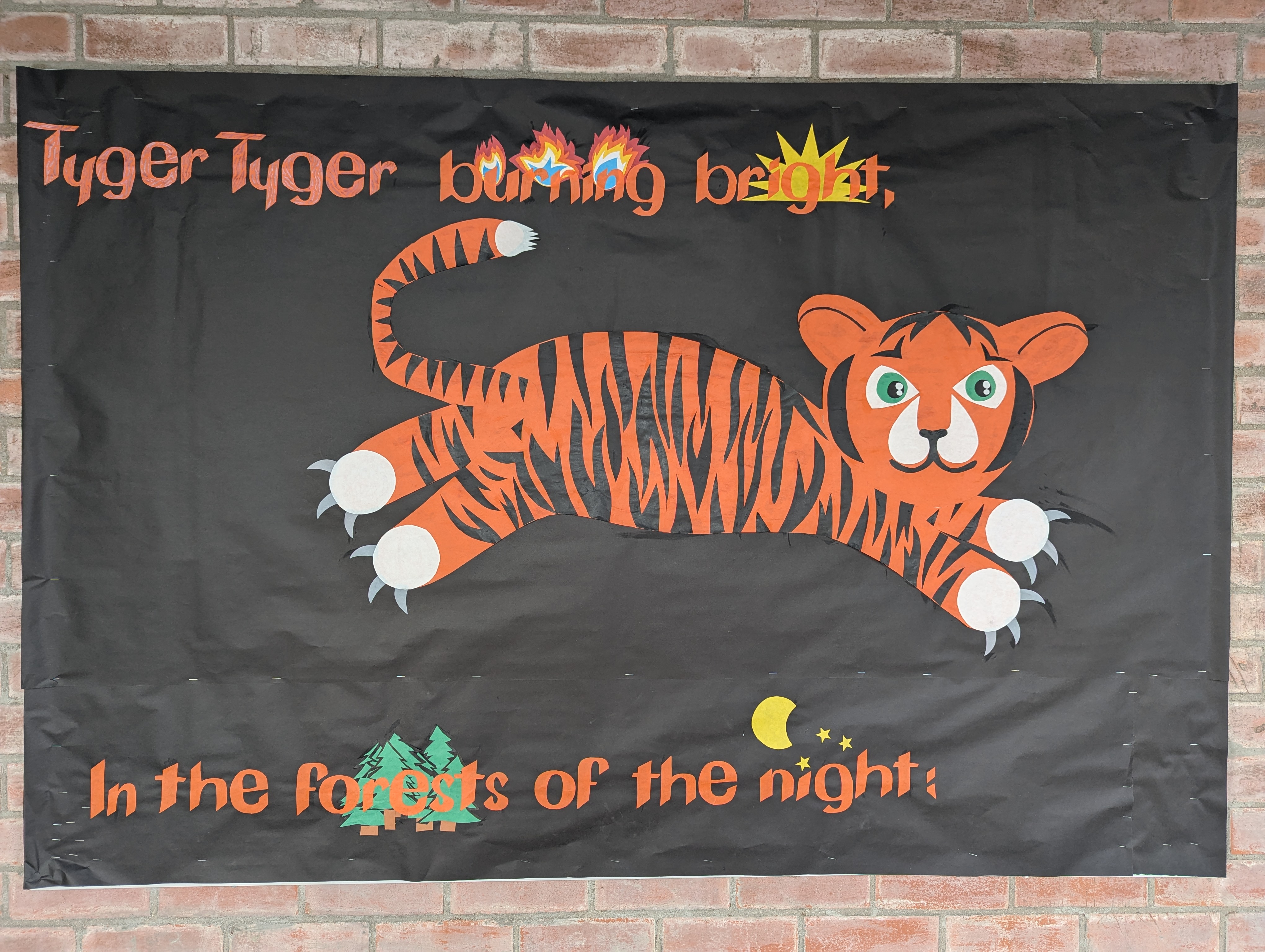
This one took 5 days! I mismeasured the letters in both directions so you really have to view the first 2 of these boards together because the text cut off in the middle and spills over.
Sometimes art is about forging forward regardless of existing mistakes.
Last week the Coyote and I were skinny dipping when suddenly the sky opened up in a much needed monsoon burst, so we heaved ourselves out of the pool and took cover under the porch, from which vantage porch we observed a juvenile great horned owl appearing to dance in the rain for 5 or 10 minutes.
The Coyote told me that this behavior is intended to keep their wings from being saturated so they can still fly even though they’re wet, but it did look like a lot of fun. Joyful.
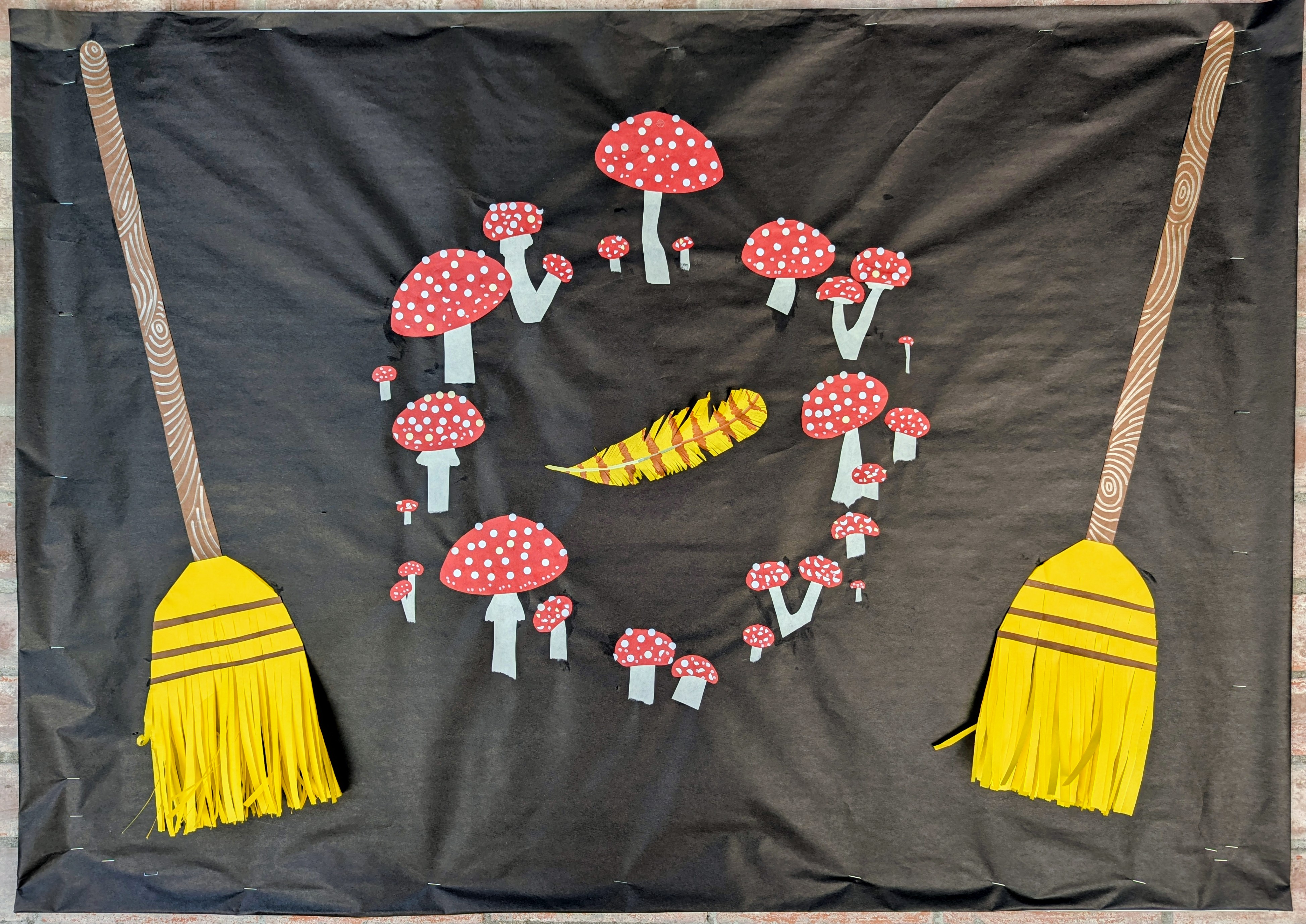
I actually made the third panel first, and I absolutely delighted myself with every detail.
I was almost finished Friday and I potentially could have stopped but there was too much blank space, so I came back and added the stars and the blooms.
The feathers and the brooms all have 3-dimensional details that the kids may very well destroy but that’s what happens when you make ephemeral art for elementary students.
I can’t quite believe it but I decided to act like I did and get the breezeway ready. Originally I intended to come back today (Thursday) but then in Monday I decided I didn’t want to be rushed, and good thing, too. Because it turned out that not only would I be decorating all 3 bulletin boards in the breezeway again, they also wanted me to do the one by the principal’s office.
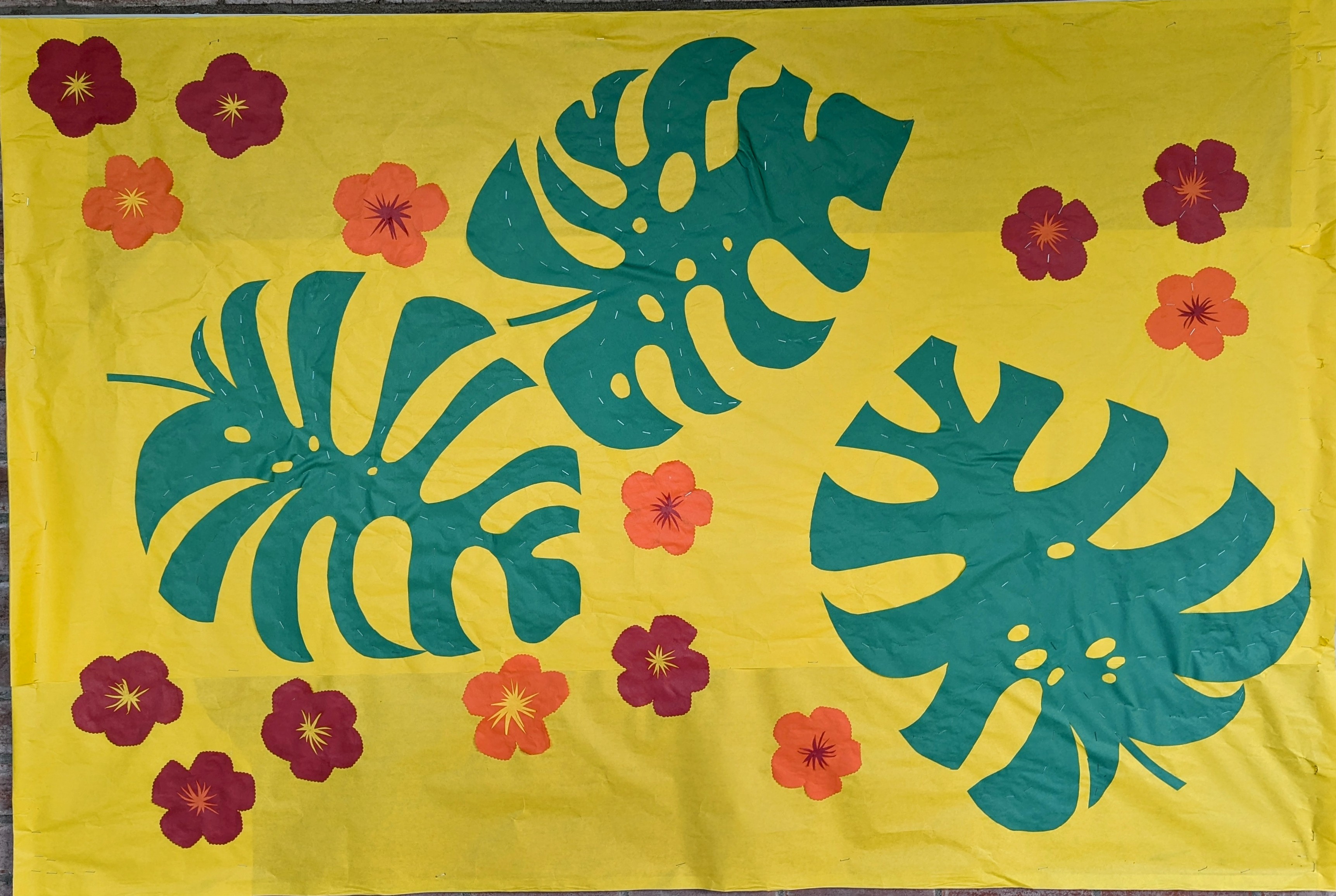
I didn’t have any huge inspiration but I decided I wanted to make a hibiscus and then it just made sense to go along with that theme. Which is hilarious because the breezeway is, of course, in the Sonoran Desert. But it’s frankly as humid as a tropical rain forest this week. So that’s cool.
I could have made MORE FLOWERS or made the flowers fancier or added smaller leaves or other design elements, but I had to go feed the Bear’s cat and then I had to give Miss Kitty a yoga lesson and ALSO I still have a whole day of work on that fourth board tomorrow. A dragon’s gotta pace dragonself.
The lettering is based on the De Latto font. The leaves are monsteras.
I kind of phoned this one in because I had very limited time and was kind of distracted and there were 3 bulletin boards to cover before the end of the year. But the breezeway looks nice for the Cub Club kids and summer staff and any prospective families who come tour the school.
Closer views:
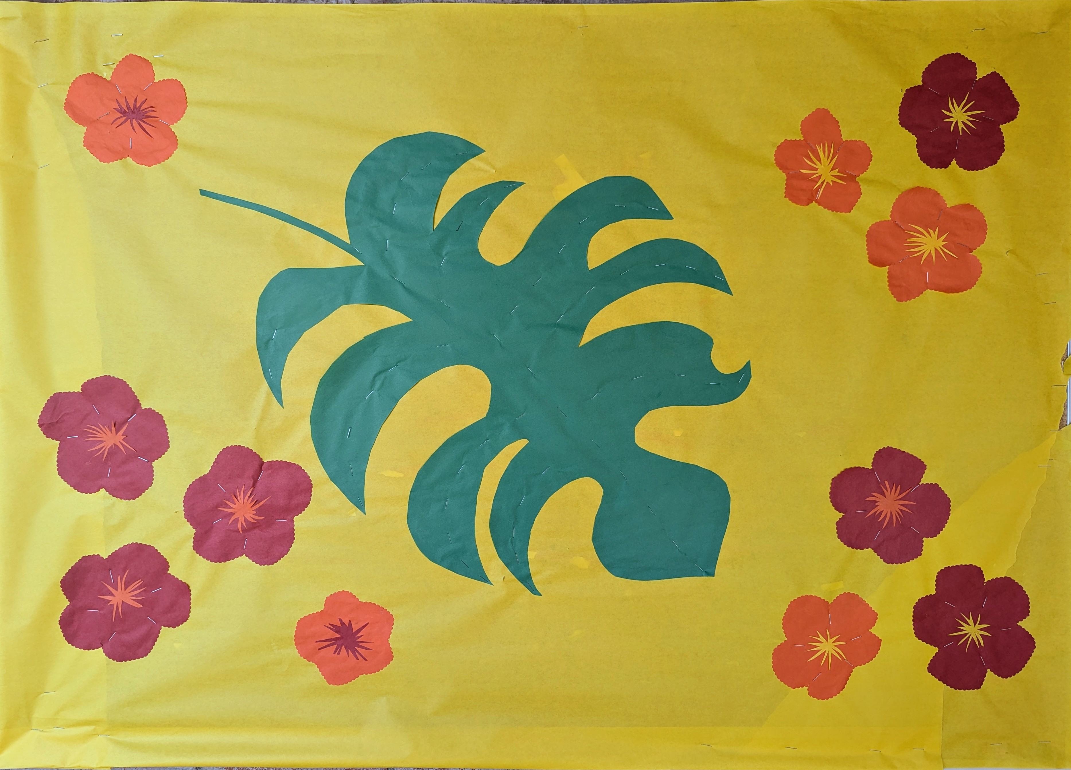
And then there was this smaller bulletin board on the other side of the library door:
Somehow I managed to carve out a couple hours to finish this thing before December swallows the clock whole! I start teaching again tomorrow, so that’s going to eat up my Tuesdays until May. I needed to get this thing done.
i feel like I slightly phoned it in. Mismeasured the last line so that’s annoying but what can you do? I mismeasured where I placed the tyger on the first board and had to truncate his tail. O well.
This is basically a joke for myself and the very few other people who are familiar with this poem AND my work. Because the poem is religiously themed. The whole book is about God, a mystic experience of God, but a Christian God, which I don’t believe in. Obviously, I don’t think my hand or eye are immortal, but the evidence is right here—it’s *my* hand and eye that framed this paper tyger’s fearful symmetry.
So that’s what I created. A meta-tyger to illustrate my mortal and two-dimensional fabrication of a tyger.
I doubt anyone at the school will get it or notice.
I had to go back after I finished and change the scissors. The scissors I was using at the time had black handles, so I made the paper scissors black as well, rendering them invisible against the black background. I hastily patched red handles on top when I realized my mortal mistake, so the second pair isn’t quite as perfectly aligned with the hands and blades as the first, but I think this scans.
This is, of course, an excerpt from William Blake’s “The Tyger” from his book Songs of Experience. This is a famous poem you likely read in English class a million years ago, which explores religious themes about creation. In the book, the poem appears in Blake’s handwriting, accompanied by a watercolor illustration of a tiger, which suggests that William Blake never saw a tiger in his life and had no idea what one might look like (Blake’s tiger looks like a taxidermied sloth-bear-dog) but he didn’t have the benefit of being able to access the sum total of human knowledge from a tiny box from which he could lifelike images of his subject while lounging around the studio in his pajamas.
Not being the religious type, I have a fun idea for the next panel, which I hope to finish next week.
My tiger is also hilariously inaccurate, but in my lifetime I have seen many tigers, real and in images and videos, and I think mine, as comical and cartoonish as I made it, is more recognizably tigerish.
As usual I see a million mistakes I made. But it’s cute. I just don’t have the time or energy to focus minutely on this project lately. I am making a lot of art, and my hand only has so many hours of functionality.