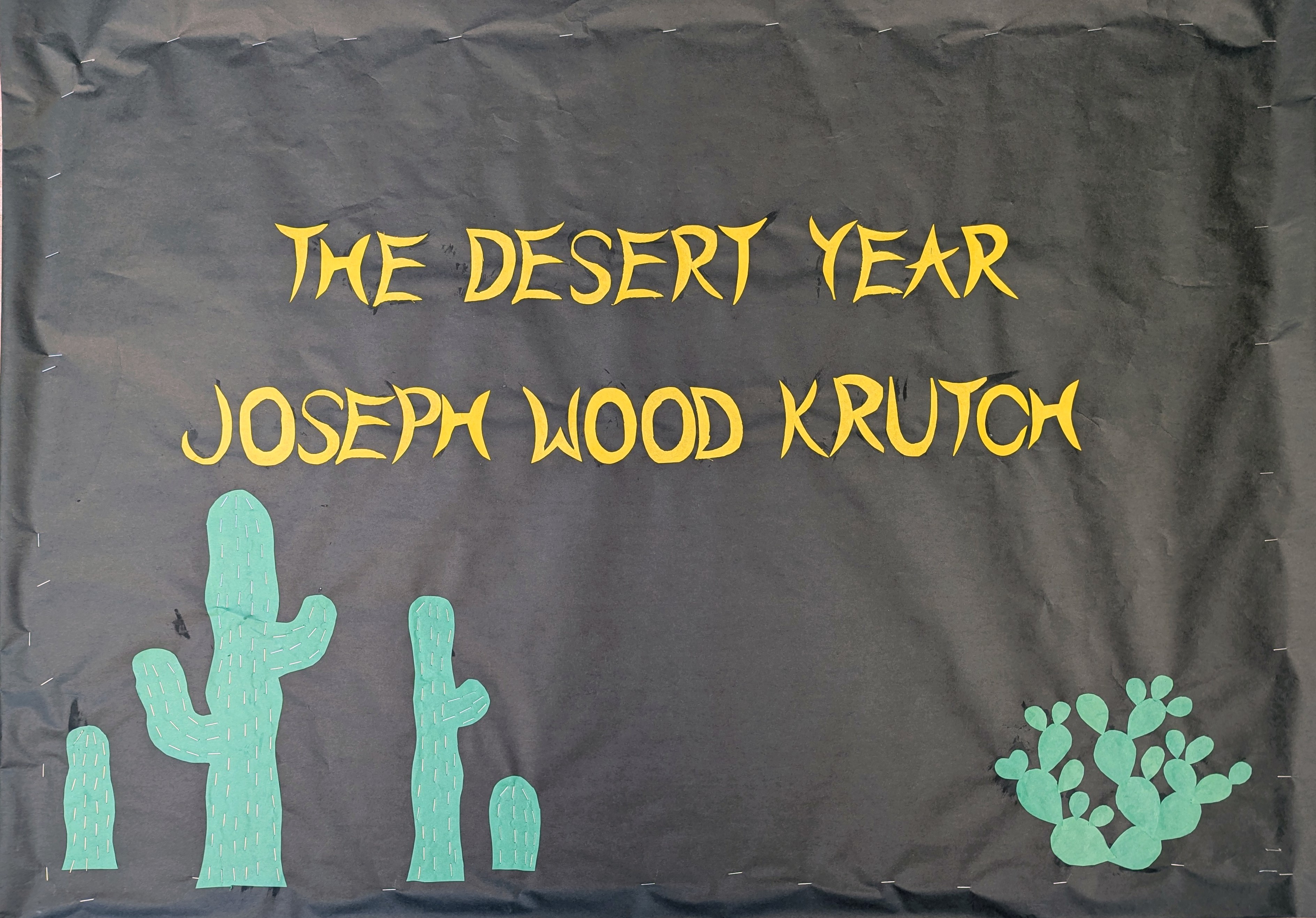
This is obviously just the attribution to the quote, and I was kind of out of steam. But the cactus came out cool. I made the saguaros wavy because that’s actually how they look when it rains. They store up so much water they get little rolls like fat. When they don’t get any rain, they shrivel up and get skinny and look sad. I like them fat and jolly like this.
The prickly pear has one pad shaped like heart, because when you go among prickly pears, there’s always one pad shaped like a heart.
Usually I guess I go a little brighter for the summer bulletin board, but overall I’m satisfied. I know it’s not summertime for most of the country yet, but it’s definitely summertime here in the desert.
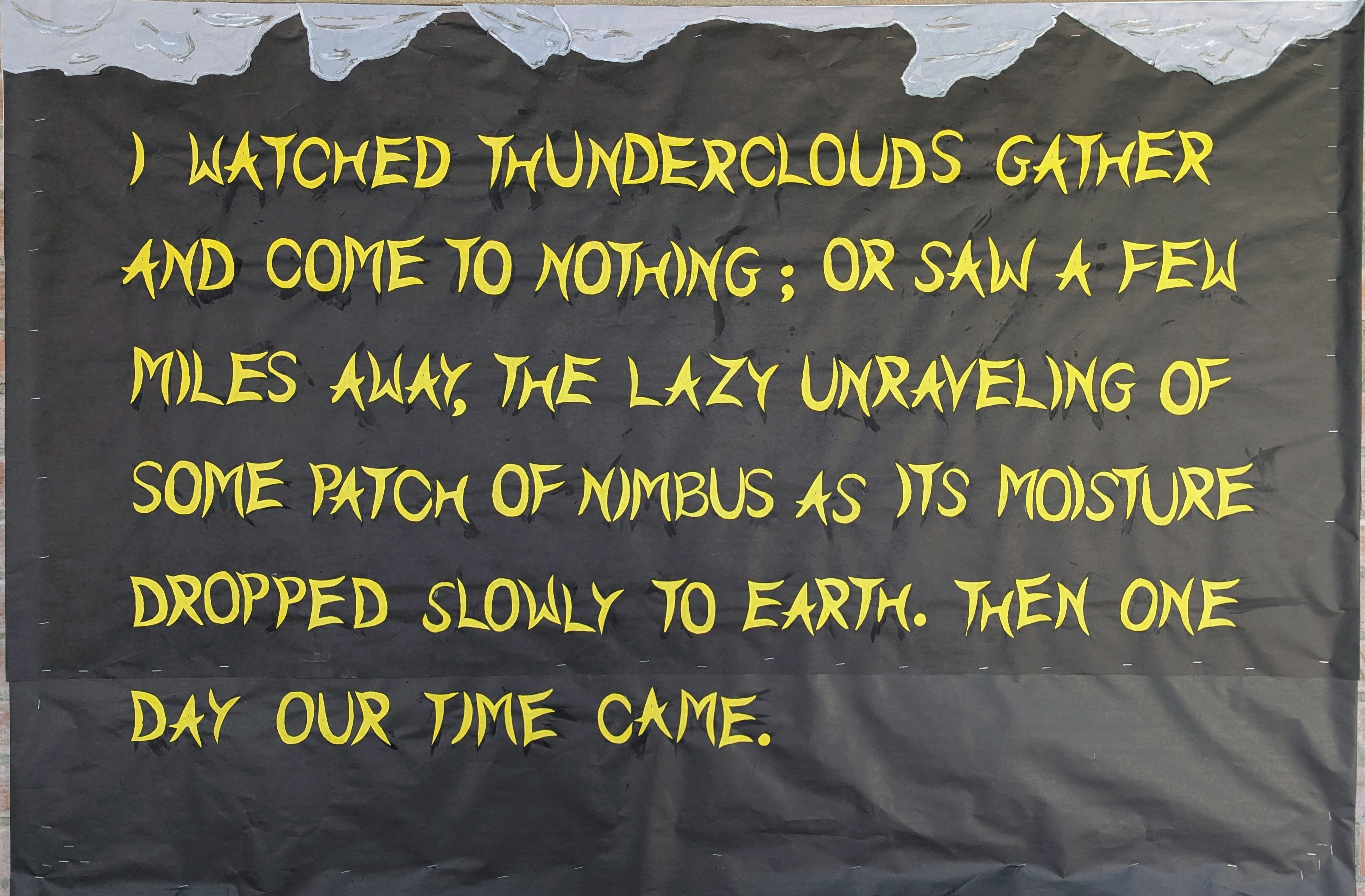
This is the second part of the Joseph Wood Krutch quote from A Desert Year. This image is also kind of minimalistic compared to my other work, and the photo also doesn’t quite do it justice.
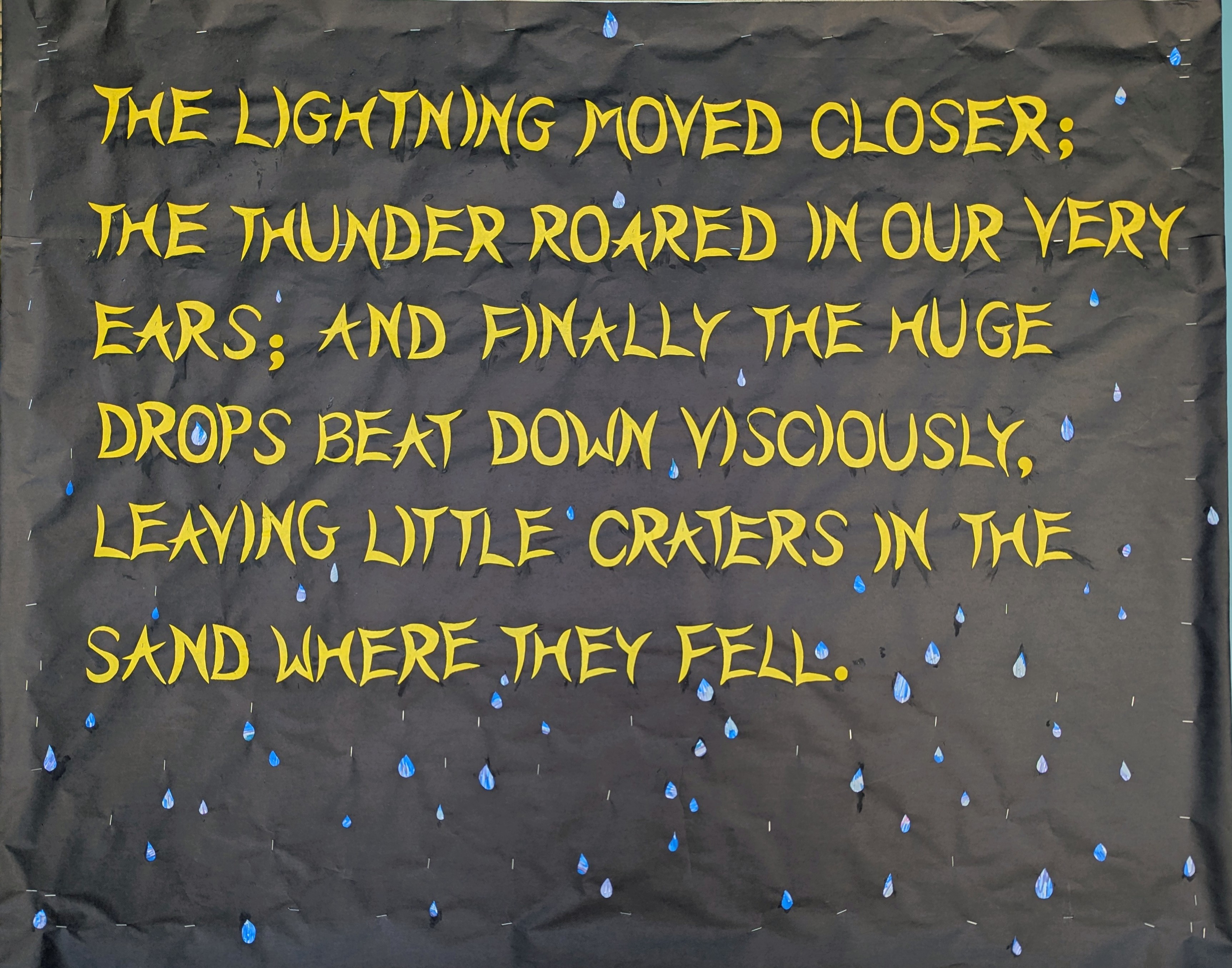
If you zoom in you can see that the raindrops have a sort of Eric Carle thing going on. I wanted then to look sort of luminous and I thought I could use use the metallic markers on the black paper but that wasn’t bright enough. So I colored a variety of blues with a bit of green and purple to cover a bit of white paper and cut the raindrops from that, and the effect is pretty good. I added some staples to make it look wetter.
The Desert Year is a lovely piece of naturalist writing originally published in 1952, by a professor named Joseph Wood Krutch. He wasn’t a desert dweller—he was an east coast guy—but he came out to Tucson once and found himself enchanted. So when his next sabbatical came around, he took a year to immerse himself in the Sonoran Desert, joyfully observing the land, the climate, the flora, and the fauna, and recording his observations into this classic work of nonfiction.
These bulletin boards are a bit bare compared to some of my work. I’m not sure this picture does the “clouds” justice. I was trying to make them look textured , with a silver lining. It’s more clear in real life. I could have done more. But I’m presenting my comic to the American Literature Association conference this week and I needed to be reasonable with my time. I was trying to finish this Friday but I lost an hour dealing with my insurance company and that was that. I had to come in today. But this was my last day of the 2026 school year.
Letters are all cut freehand in a font I just created based on curved lines. I don’t know why H and A came out so much smaller than everyone else but it kind of works.
This is the first part of a quote he wrote about his first glimpse of the monsoon. The second part is on the the middle bulletin board. The monsoon is still a ways off this year, but they are calling for an El Niño year, which can only be good for us if it actually happens
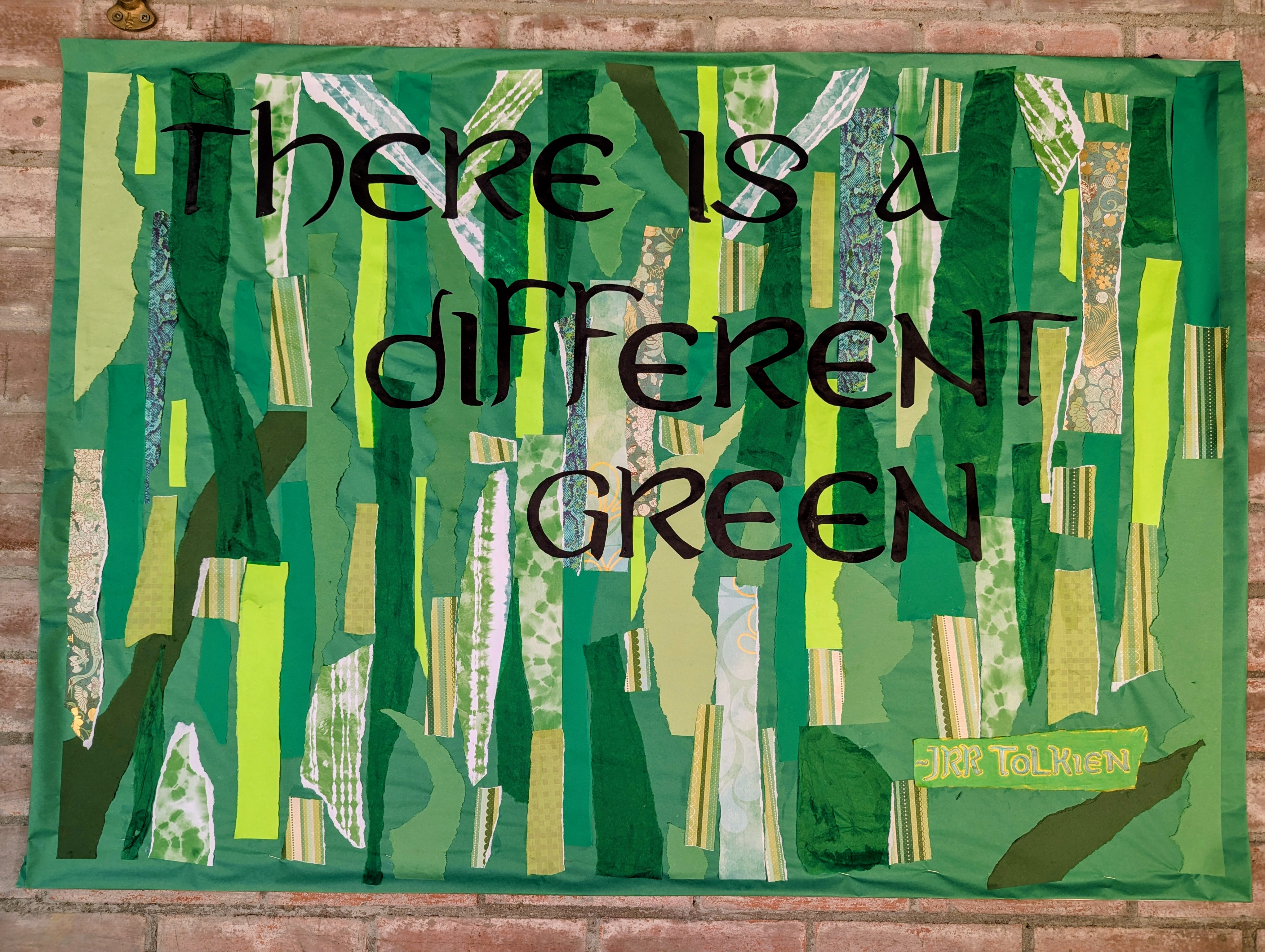
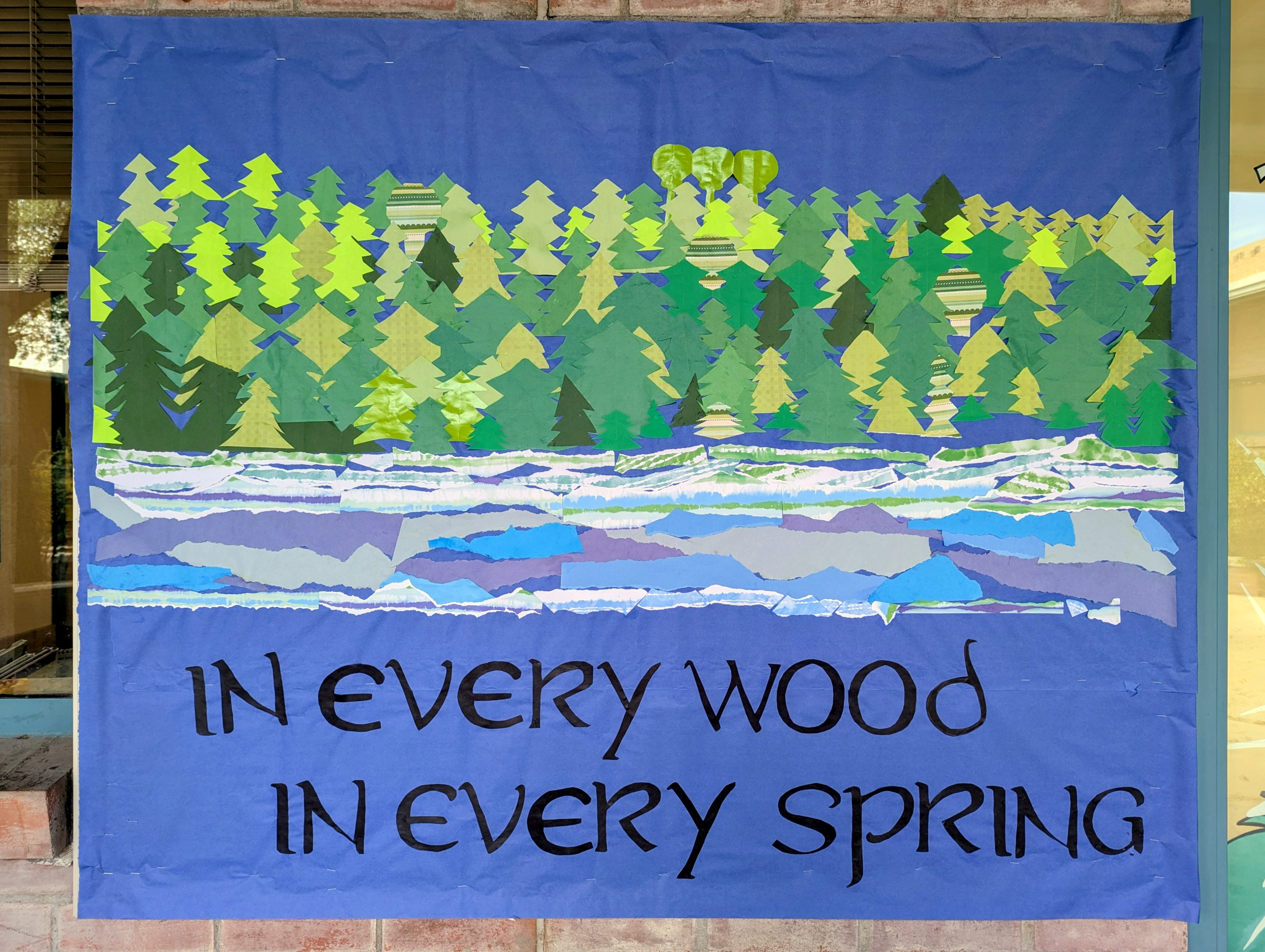
So obviously I had to go beyond my normal sources to get this many different greens. Fortunately, I knew where to go and had many different options available. In the end I think it was something like 15 different kinds of paper: butcher paper, printer paper, construction paper, origami paper, tissue paper, and specialty paper.
The attribution to JRR Tolkien was actually yellow paper but I did the lettering in 2 green marker outlined with green pen and then colored the rest of the paper with a different green marker.
Even though I was just going for strips of green, a lot of people saw a forest in this design. One person even specifically suggested a birch forest.
All 3 of these bulletin boards took about 14 hours.
I’m just posting these all at once so they don’t slip my mind again, because I actually finished them Friday and now it’s Monday. So this is part two of the verse.
This panel was in fact the second one I did, and it was fun cutting a million trees and tearing up paper for the river, at first. After a while it got onerous and I had to throw away so many pieces I messed up. I couldn’t help but think of the giant mallorn trees, but this forest was supposed to be about GREEN and in any case what I saw in my mind’s eye was pine.
I recently reread Lord of the Rings, which I think is more relevant now than it’s ever been, being a tale of unlikely heroes compelled by honor and duty to do the right thing in the face of certain death. Like every single character knows their enterprise is doomed to fail but they march grimly toward their own putative demise because that’s what you do when evil threatens to overwhelm your world.
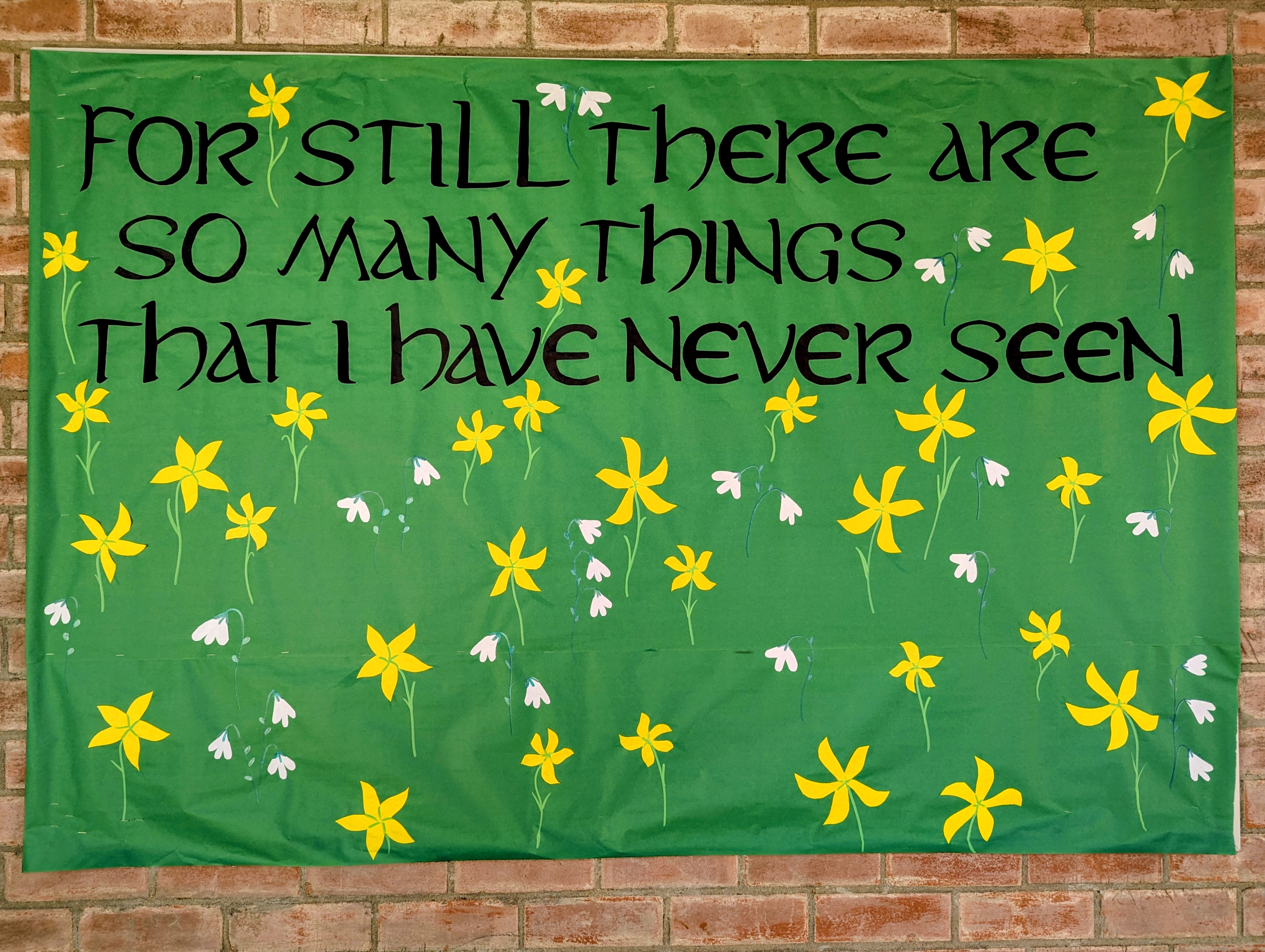
But they have some nice moments mixed in with the doom, like Lothlórien, where the grass is festooned with the golden, star shaped elanor flowers and the white, snowdrop niphredil.
Even though this panel is the first of three, I did the image last.. The flowers and letters are cut paper but the stems and leaves are markers. The font is based on Aniron.
The quote is from a poem of Bilbo Baggins sings to Frodo in Fellowship of the Ring, an old hobbit wistful with nostalgia, watching a young hobbit prepare to make a journey beyond any he can imagine.
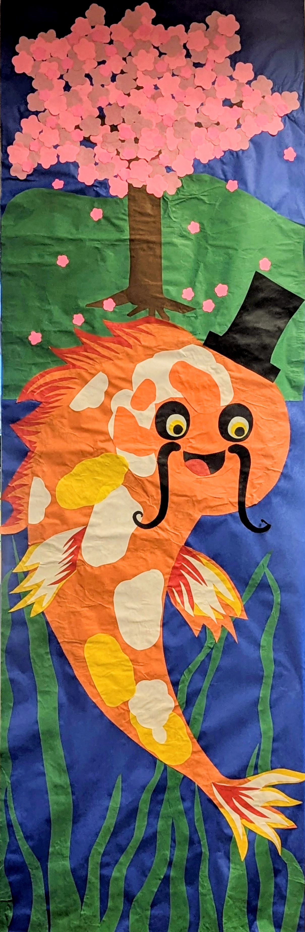
People keep asking me what it is and I’m like, “It’s very obviously a fish with a mustache wearing a top hat.” A fancy koi fish, to be precise. Like how is that not obvious? I feel like, while I may not be the greatest artist in the world, when I make a picture of a fish with a mustache wearing a top hat, it looks exactly like a fish with a mustache wearing a top hat.
It goes with the jackalope and the catterflies. I actually finished it last week but I was so tired I forgot to take a picture of it. He took so much extra time to make because I accidentally put his face on sideways and it was a lot of work to fix it and cover up the mistake.
The sakura blossoms, of course, symbolize the fleeting nature of life, youth, and beauty.
Originally I was going to make 7 of these “part real, part imaginary” banners because there are 7 columns but already there is a giant sun? sunflower? occupying one of them and I think it’s possible I might be asked to create a large Dewey Decimal System poster for another, plus it’s time to change out the bulletin boards and then comes the mad rush to lay out the literary journal and get that to the printer’s so it’s ready for the release party, immediately after which I’m going to Chicago to present my new comic book at the American Literary Association convention.
So, we’ll see. But this fish with a mustache and a top hat is a vision realized. Originally I thought he might also wear a monocle but that would just be silly, right?
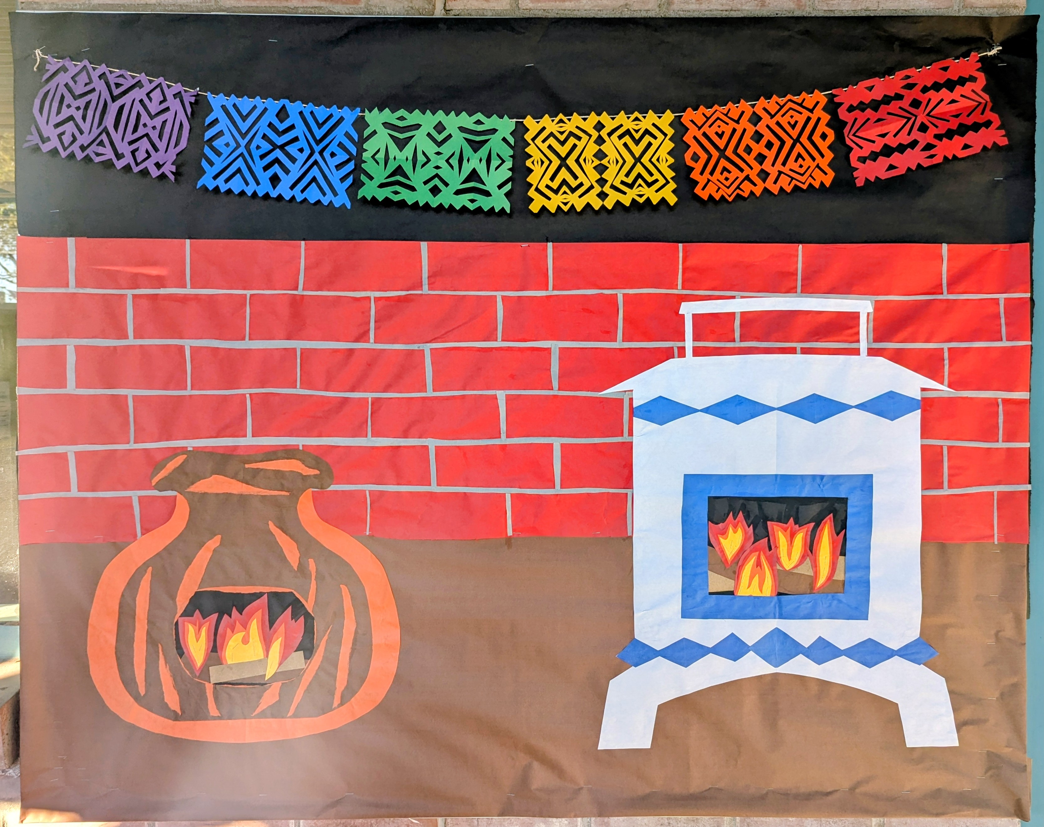
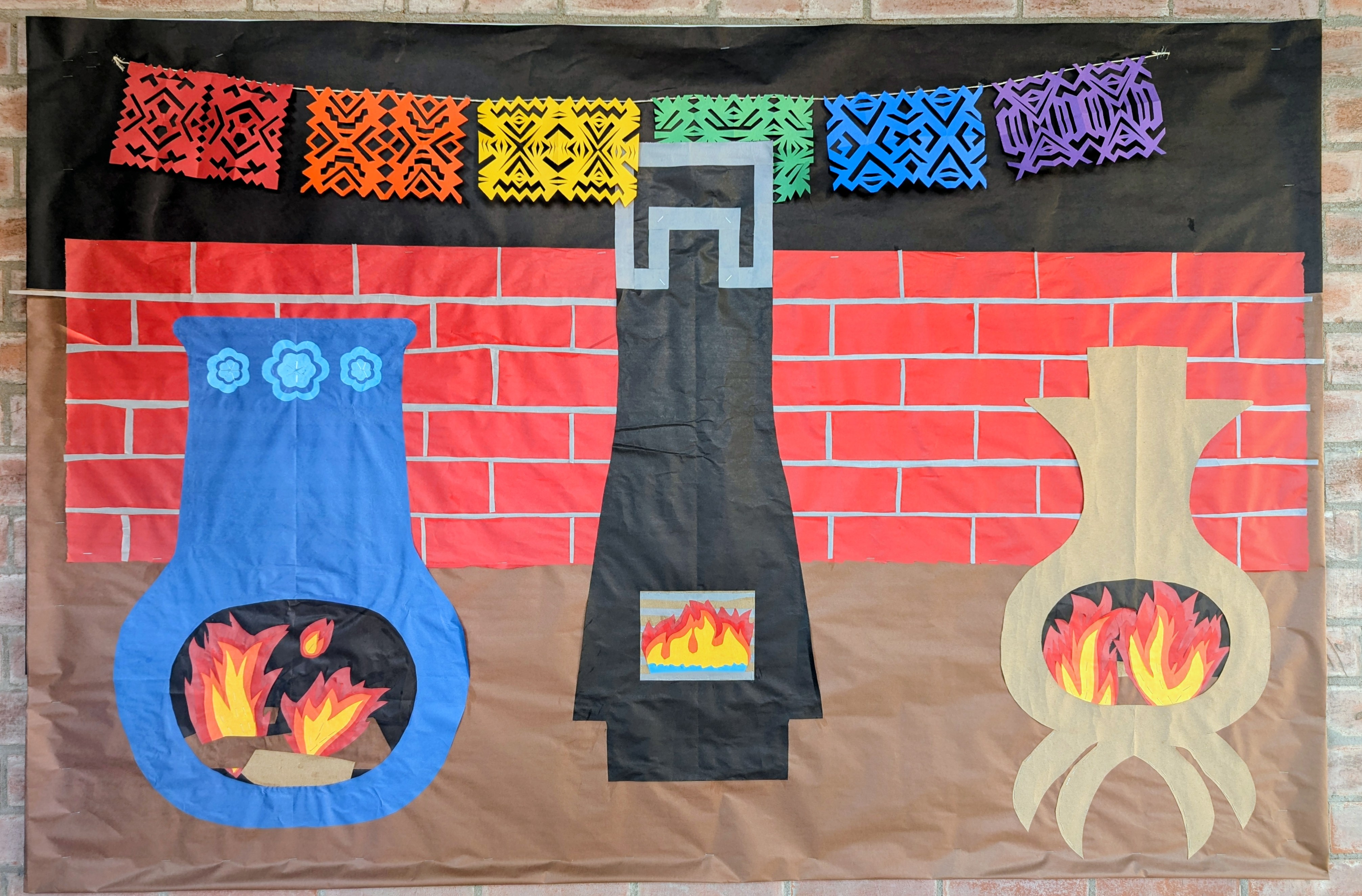
As promised, the second set of fun chimineas and fiesta flags.
And here’s a bonus:
Not much to say about this. I had fun with it but there was so much going on in my life it took me like 3 weeks to finish. Tomorrow is the last day before break.
This is probably the latest winter holiday bulletin board I ever did: Friday is the last day of school and I just got it up yesterday. I’m not thrilled with the fact that the flags are just suspended in space but I needed to be done. I spent a lot of hours on it but I never have enough time.
But this is a very Tucson kind of scene. I love that chiminea on the left and wish it were real and in my back yard.
I noticed the kinders all putting their hands up to the fires like they were trying to warm up. I must add that, even though it was cold when I had this idea, it was 82° when I finished and the kinders were pretending to warm their hands by the fire. That’s Tucson for you.
I’ll post more chimineas tomorrow. The third bulletin board just says “STAY WARM” in big letters. I probably won’t post it at all because it’s not that interesting.
This one took 5 days! I mismeasured the letters in both directions so you really have to view the first 2 of these boards together because the text cut off in the middle and spills over.
Sometimes art is about forging forward regardless of existing mistakes.
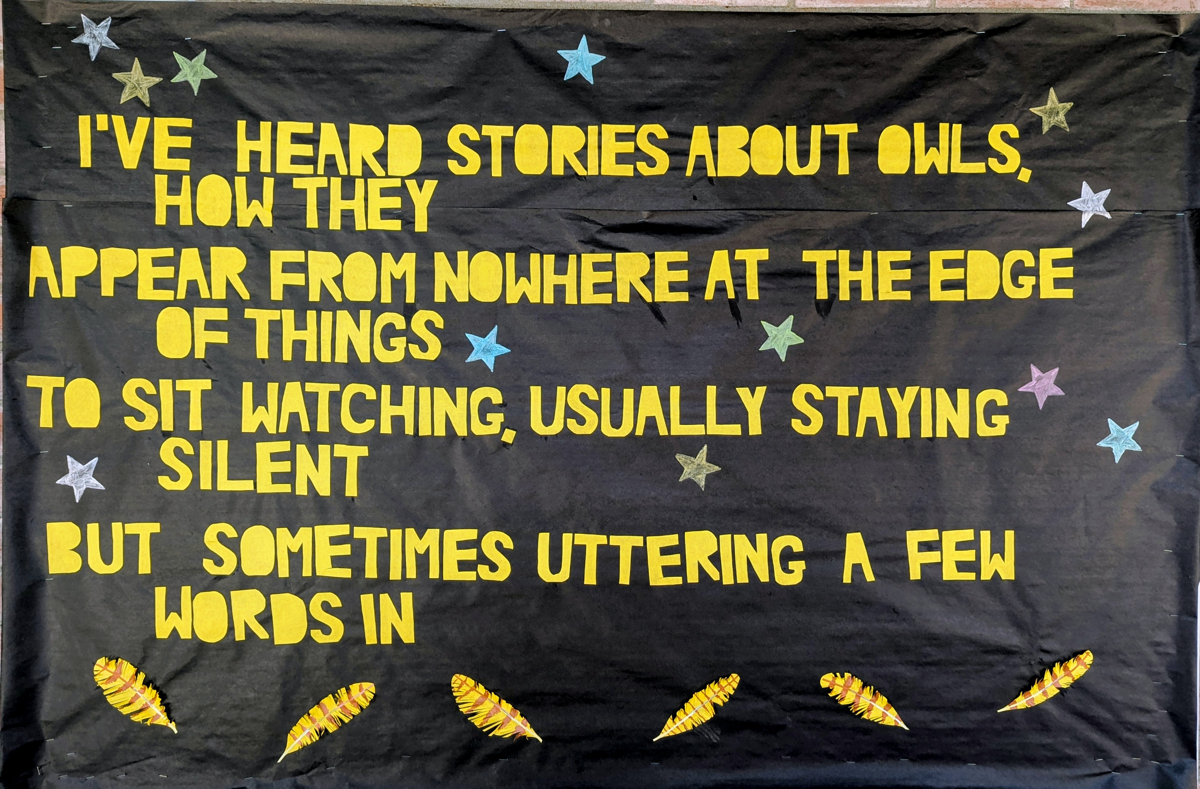
Last week the Coyote and I were skinny dipping when suddenly the sky opened up in a much needed monsoon burst, so we heaved ourselves out of the pool and took cover under the porch, from which vantage porch we observed a juvenile great horned owl appearing to dance in the rain for 5 or 10 minutes.
The Coyote told me that this behavior is intended to keep their wings from being saturated so they can still fly even though they’re wet, but it did look like a lot of fun. Joyful.
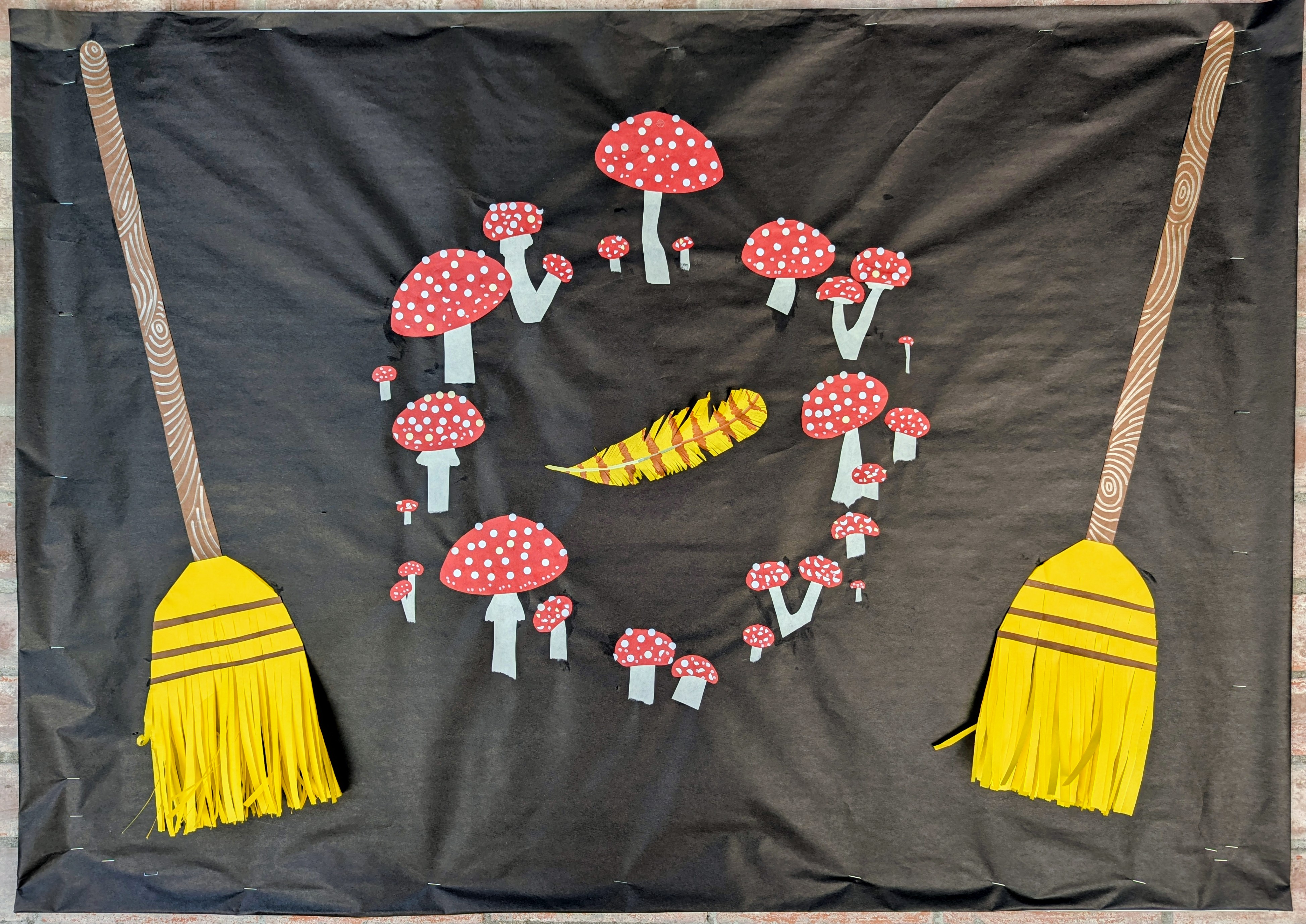
I actually made the third panel first, and I absolutely delighted myself with every detail.
I was almost finished Friday and I potentially could have stopped but there was too much blank space, so I came back and added the stars and the blooms.
The feathers and the brooms all have 3-dimensional details that the kids may very well destroy but that’s what happens when you make ephemeral art for elementary students.