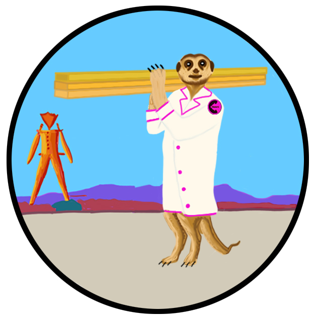
At long last, we have come to the final meerkat. Construction meerkat has a lot of heavy lifting to do, but I am setting my stylus down for a minute.
Have no fear! I will not abandon this blog for months on end. Not any time soon, anyway. Later today or early tomorrow I will share the project I did this week (marker on foam core) and by the end of next week I hope to share pages from my new comic book, Bonnie Jo Campbell Comics Volume 5.
Up to this point, every logo commission I’ve gotten, the client has said, “Please draw me X and Y and make it Z,” and then I drew the thing they described and was done. For this logo, commissioned by an Independent Catholic charitable organization that feeds unhoused people…that did not happen.
The client showed me another logo they liked as a suggestion, but didn’t want to me to copy it or anything. Then we had a long discussion about the whole thing and I drew a totally different logo they didn’t like, and then this one. And the client said, “It’s just what I had in mind even though I didn’t know it.” So yay!
Here’s a delightful little commission I did for the writer Heidi Bell, for the cover of her collection, Signs of the Imminent Apocalypse and Other Stories, forthcoming from Cornerstone Press, October 2024.
The way it was explained to me, one of the stories features a critter that Bell refers to as a gopher, and thus the designer chose a gopher as one of the images for the cover. But as it turns out, it’s not a gopher. Bell sent me a picture of the animal to which she was referring and I ran it through Google image search, and learned about 13-lined ground squirrels, which, in some parts of the US, are colloquially/regionally/demotically called gophers.
Perhaps coincidentally, the gopher picture chosen by the designer was drawn in a style very similar to work I’ve done in the past. After looking at the original gopher drawing and 50 photos of 13-lined ground squirrels, the work began.
On my first attempt I made his tail WAY TOO FLUFFY, so I had to erase it and start again, but otherwise it went smoothly. I am still getting used to my new computer, which has some odd glitches that I am working around for now because I have no idea how to address them (if I set the stylus down in the upper left quadrant of the screen, it makes random dots in other parts of the screen, but I can’t draw, although if a line starts in another part of the screen and continues into the upper left quadrant it works fine). I was so used to the old Wacom that drawing directly on the screen still feels weird, but I’m getting acclimated.
Also, the stylus that came with this computer apparently runs on batteries? Which died an hour after I started using it? And rather than live at the mercy of technology that could betray me at any vulnerable moment in that manner, I decided to work with a capacitive stylus. And rather than actually go out and buy a capacitive stylus, I have just been using some random pen with a little rubber nub at the end that doubles as a capacitive stylus. I got it for free at some festival over a decade ago. It has an advertisement for a private k–12 school on the side. It’s an extremely inelegant solution, but it works. It works much better than when I had to draw 3 mosquitoes with my finger on a touchpad last year.
I think it’s the exact sort of complication that helps you bloom in adversity.
if you’re like me, after you accomplish something, you completely erase it from your memory banks because my brain only allows me to recall egregious mistakes. Doesn’t want me to get puffed up and egotistical, I suppose. So I completely forgot about this kickass commission I drew at some time in the misty past, like August or September. It was a birthday present for the client’s partner, and I promised not to share it until said partner’s birthday, which is today!
Happy Birthday, Cam!
The client wanted a design that reflected her partner’s gaming tag, and, if I could fit it in, his zodiac sign. Admittedly, that scorpion didn’t make things easy: scorpions are small and covered in fidgety details in comparison to nice, chunky design elements like giant saguaros and skulls. I had to draw that little dude like 5 times before I was comfortable with him but he came out pretty cute and a little bit dangerous in the end.
In reality, the scorpions around here are itty bitty, like an inch or 2 long, but mature saguaros are like 40 feet high, so everyone got the Alice in Wonderland treatment.
If you follow this blog, you know I can work in many styles and am always thrilled to collaborate with clients on projects like this. Design work starts at $300 for this kind of logo.
I had a few (local) requests for this design on a T-shirt, so here it is. I tweaked the colors and fixed the font, but otherwise, it’s the same design as the Halloween bulletin board that inspired it. And it can be yours on a T-shirt, sticker, mug, water bottle, and dozens of other functional products.
Check out Respect Your Local Monsters in my RedBubble shop. (This is a great time to buy from RedBubble. Pretty much everything is on sale!)
Well, I know nothing whatsoever about live sound engineering, but I do know how to draw things that people describe to me, especially if, like this client, they very helpfully say things like, “Make the logo look like this Velvet Underground album cover,” and then also send me a picture of the album cover. But I didn’t make it look too much like the album cover to avoid a repeat of the time I got a DMCA takedown notice for a design in which one of my original characters cosplays as Billy Gibbons from ZZ Top. I thought that was very unfair. Anyone can wear a knit hat and sunglasses and a very, very long beard and the comic was quite specific in identifying it as NOT Billy Gibbons from ZZ Top, but as someone simply dressing like him (against their will, even; the comic ends with the character deciding to shave), plus parody is protected speech.
However, as I point out in this comic, Fair Use only applies to people who can afford copyright lawyers, and even though I’m pretty sure I was in the right, I am not one of those people. So for this project I drew a totally different VU meter than the one on the Velvet Underground album. The client requested “an amber glow,” and I wasn’t 100 percent sure what that meant until I started looking at images of VU meters and saw one with an amber glow. I mentioned it to The Man and he explained that amber glow was a retro aesthetic that would fill tech nerds with nostalgia for old analog equipment. He knew what I was talking about without the visual (because he is a tech nerd). Creating the amber glow was fun, and very simple in Photoshop.
Amber Glow would be a good name for a pop star.
Another problem I had to solve was the font, which the client wanted to look similar to the album cover as well. Now, I know at least one word nerd who probably can identify fonts just by looking at them, and I was about to message them, but then I thought, “Hey, it’s 2022; surely there’s an app for that.” And there is. There are many apps for that. And then I said, “Well, if there’s an app for it surely there’s a website for it.” And there are many of those as well. It was easy to upload the image and find the name of the font.
The website I used also helpfully offered to sell me the font for $26, which is a RIDICULOUS price for a font, in my opinion, and to sell me the entire font family for $86, which is laughable. It turned out that I already owned some of the fonts in that family (Century Schoolbook) and while I didn’t own the specific one, I think I got pretty close.
The client wanted to use this logo for a few things, but since they specifically wanted to make T-shirts, I used my T-shirt template, which is…large. So this is a big, sharp file, but it should print out well in full size. I think it’s a stunning marketing tool. This guy has been in the business for a couple decades. You should definitely hire him for live sound engineering.
And I just got another logo commission! But first I have another, potentially high profile commission that I’m not sure if I’m supposed to talk about. But I’m very excited about both of them.
I’ve designed a number of logos here and there, mostly for myself and occasionally for friends, but this is a commission from someone who doesn’t even know me, which is always lovely. I enjoyed creating a new design for a new company, DB Media. I didn’t know what they did when I took the gig, but it turns out they create these really stunning FPV drone videos. You can check some of these videos out on their YouTube channel. My favorite is the Crested Butte video. You can also find them on Instagram at @FPVGroove.
If you’re near Denver, I think this company would be a splendid choice to document things like fancy weddings or, if you’re, say, a realtor selling big estates, it would be a spectacular marketing tool. This medium has its own unique artistry (based on its own unique technical skills).
After dabbling with a handmade font based on the client’s signature, the fonts we eventualy settled on are Brush Script Standard Medium for the letters “DB” and Century Schoolbook Bold for the word “Media.” The design is based on Colorado’s Flatiron Mountains, rendered in 2 shades of gray, so it sits nicely behind the text without fading into obscurity.