I am not going to tell you how to color correct images in Photoshop, because my knowledge is insufficient for instruction purposes. Just starting out: I’m just feeling my way and going about it in a rather haphazard manner. A couple weeks back, my friend the Vampire Bat saw a picture I took of a hummingbird and color corrected it, and the difference is sort of amazing, so we talked for 30 seconds about it and I was inspired. I took a slightly less awesome hummingbird picture last week and decided to give it a shot. After I finished, I did a more subtle correction on a picture of an Arizona cardinal.
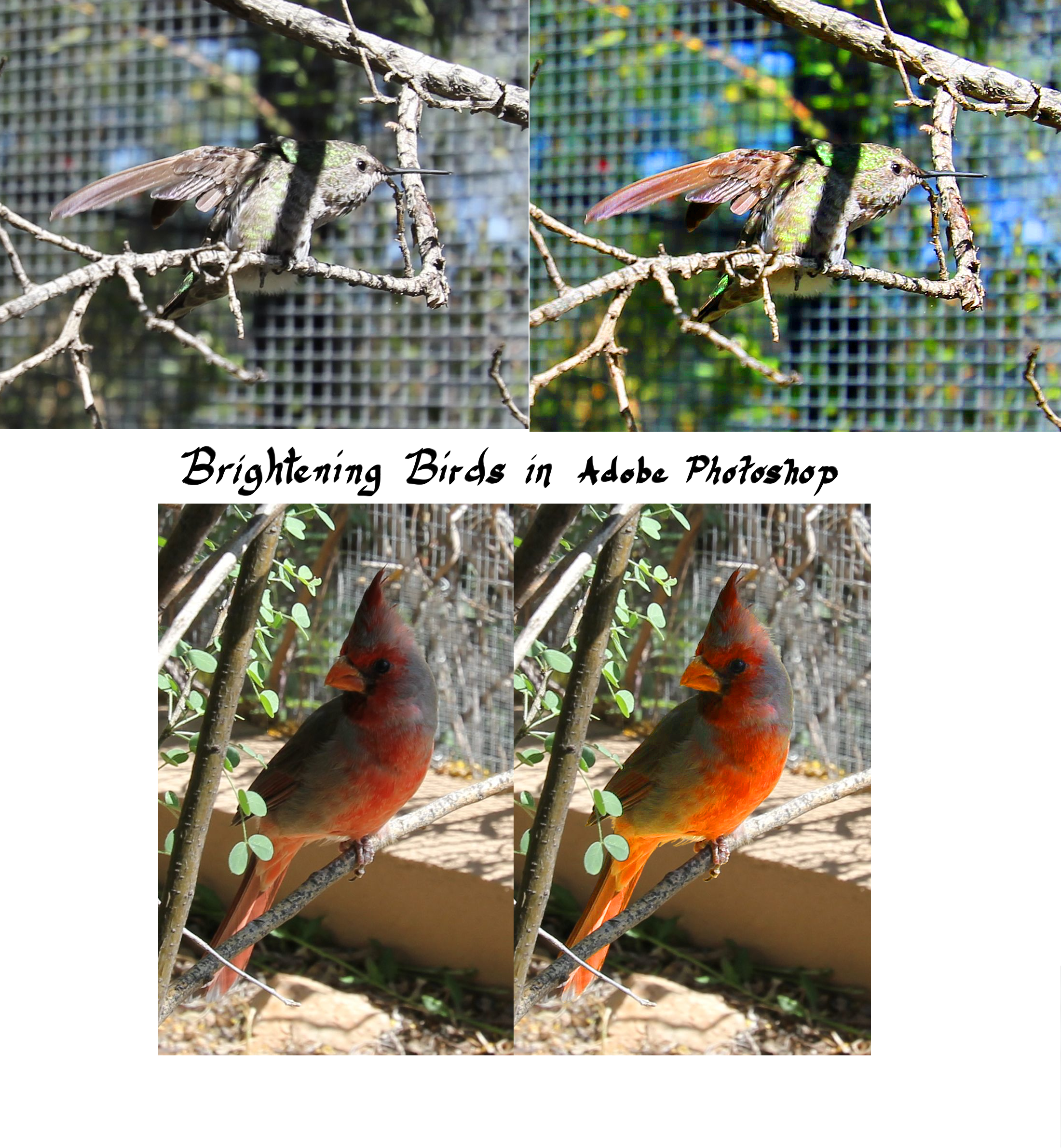
Brightening Birds in Adobe Photoshop; originals on left, color corrections on right.
To my eye, the hummingbird might be a bit too bright and the cardinal could be brighter, but they both definitely look better than the originals. I shifted everything blue-green in the first picture, but I only changed the color of the bird in the second.
I also enjoyed practicing that tiny bit of digital calligraphy, which I tried one time when I first got the tablet and then forgot all about as I struggled to figure out how Photoshop worked. Since most people use that program more for the color correction and less for drawing horrible webcomics, I was really feeling my way and probably not learning things in the same order as other people.
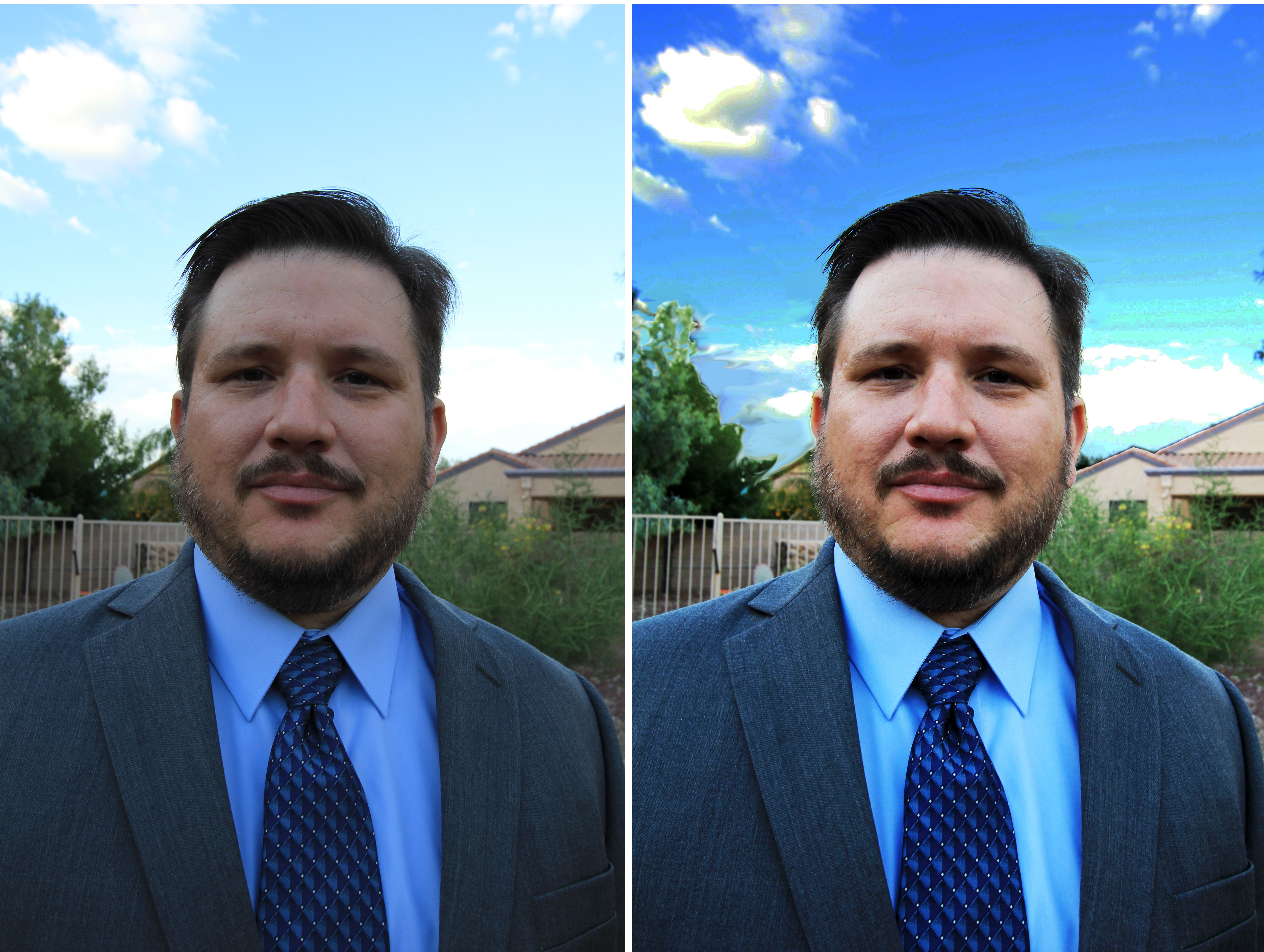
The Man also required some brightening.
Here you can see some sort of over-the-top work I did for The Man, who wanted some professional head shots. I made a few mistakes, including causing the tree to look sort of unrealistic, but he liked it well enough to use it. It’s interesting to see what details pop out; I definitely have many sky photos that could use this treatment. Not sure what to do about his skin, though. For this image, I selected the sky first, played with that, then selected the inverse and worked with that section.
Anyway, like I said, I couldn’t exactly tell you what I did to achieve these results. It was sort of random button pushing, but I think I’m learning.
