How could anyone fail to be charmed by an ermine?
As with last year’s “Daughters of the Animal Kingdom,” I knew that I’d have to only draw animals in this comic, but, as with “Children of Transylvania, 1983,” I knew I’d have to excise huge swaths of the story to fit it into 6 panels, especially if I was going to insist on making the animals the focus of each panel.
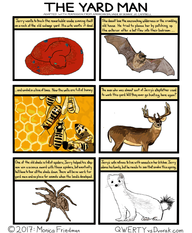
In “The Yard Man” we see one major theme of this book, which I categorize as, “Heteronormative Men Who Really Like Women but Aggressively Don’t Understand Women.” In Mothers, Tell Your Daughters, the main characters often seem crippled by a stunning lack of self-awareness, but in American Salvage the men tend to know who they are and what they want (love), they just don’t understand the people (women) they are trying to get that love from. Anyway, I’d call this story a little sad: Jerry and his wife are living apart by the end. Jerry still loves her, and he’d probably follow her if she asked him to, but she doesn’t ask, and he really, really, really wants to see that snake again.
I have to apologize for that snake. My picture does not do it justice. I probably should have drawn it as a red blur moving through the grass. Bonnie Jo reminded me that snake’s identity is meant to be a mystery, but the snake is not a symbol. It’s just a snake, she said. Pretty proud of that ermine, though.
As I told the Rabbit, I see both sides of the issue. The creatures are amazing. There is poetry to a wall full of honey, to an ermine returning to land where ermines have not been seen in years. But also, you can’t live like that, with bees inside. When I lived in Michigan, I had to help a friend remove bats from his house a couple times, and I had encounters with deer, snakes, and spiders. Never had any problems with honeybees, though, and I’ve never even seen a wild weasel. Once, in Kalamazoo, I was out in the woods. And you know how sometimes you’re walking in the woods and you step on a stick and it makes a loud crack and suddenly some deer, which you never even knew were there, jump out of the undergrowth? I had the opposite experience. I was standing quietly in the woods not noticing some deer walking along the ridge and one of them stepped on a stick and the crack startled me and I jumped a couple feet in the air. I could see the deer peering down the ridge looking at me like, “Isn’t that sad? Poor, dumb animal.”


 So, if you know anything about TUSD, you probably know that, like most Arizona school systems, it’s terribly underfunded. The PTA has to hold fundraisers to buy toilet paper and pencils. Infrastructure upgrades are few and far between and administered at the whim of people downtown who don’t tend to solicit a lot of opinions from those on the front lines, as far as I can see.
 What can I even say about this? Well, I’m all about being not ashamed. So I am not ashamed. Whimsical designs haven’t made my rich. Maybe off-color ones will do the trick. Perhaps small town orgies will by my claim to fame.
