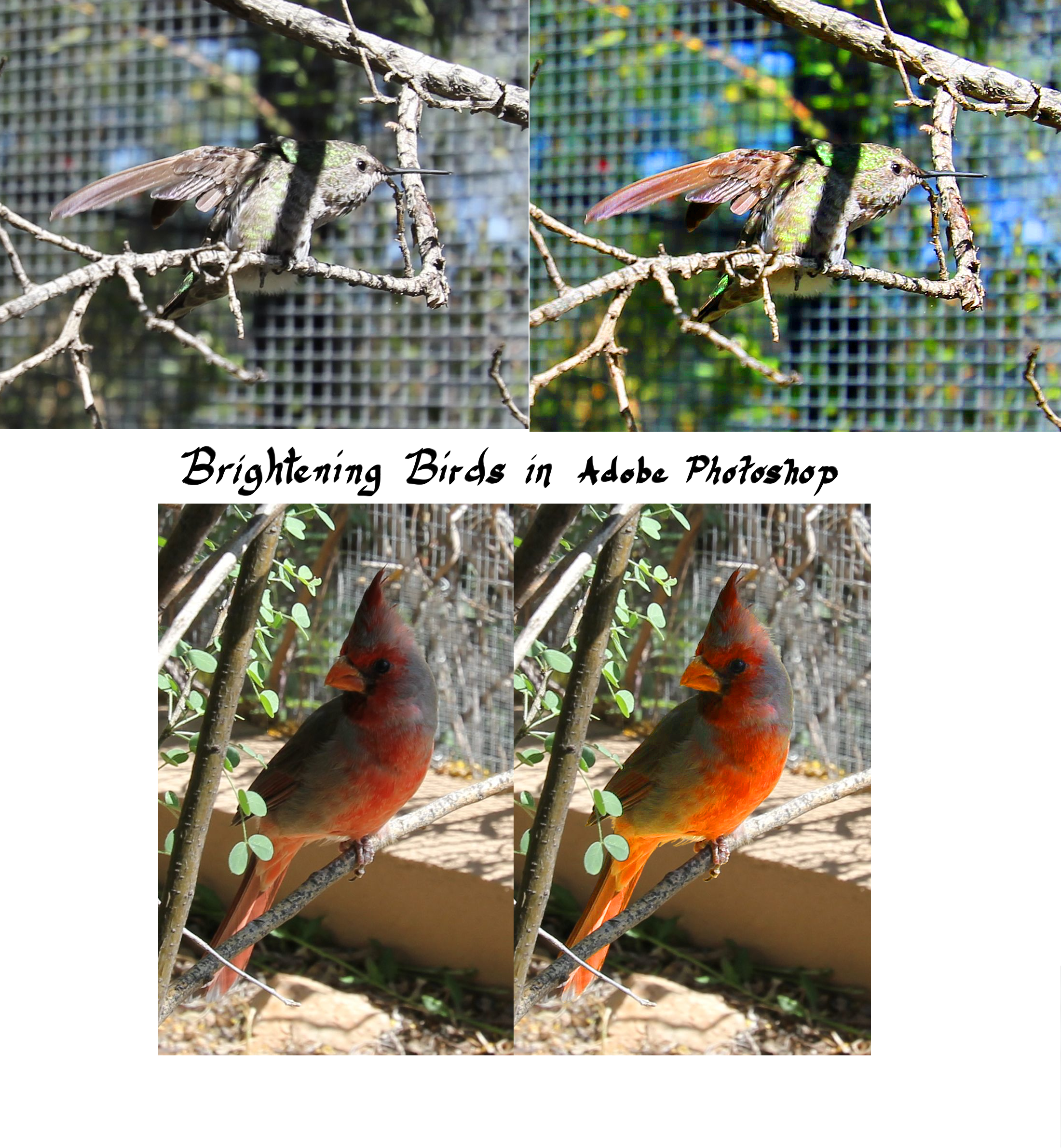
The more I play around with the “Enhance” feature in Adobe Photoshop, the more I question the nature of reality. If a photograph isn’t a perfect visual representation of a moment in time, how can we trust something as subjective as memory?

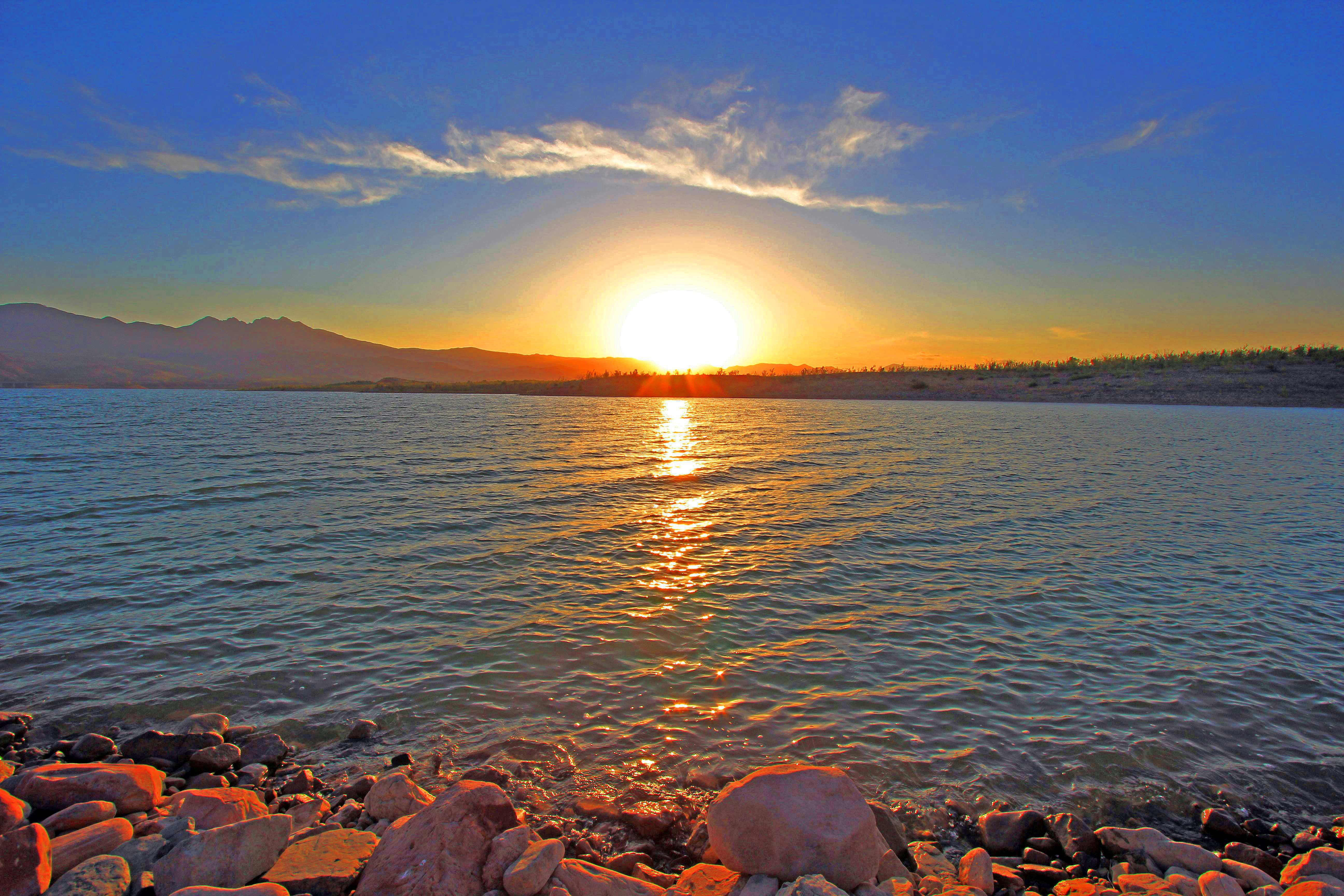
Sun sets over the cove at Long Gulch on the north side of Lake Roosevelt
The Man and I watched this sunset, and I’m certain that every moment was dazzling, and that the stones on the lakeshore truly did glow in the golden light of the setting sun. And yet, the original photograph was flatter than memory. Then I messed with the levels in Photoshop; now the stones glow. Still, did they glow to that degree? The sky probably wasn’t quite so blue, and of course the sun was sharper.
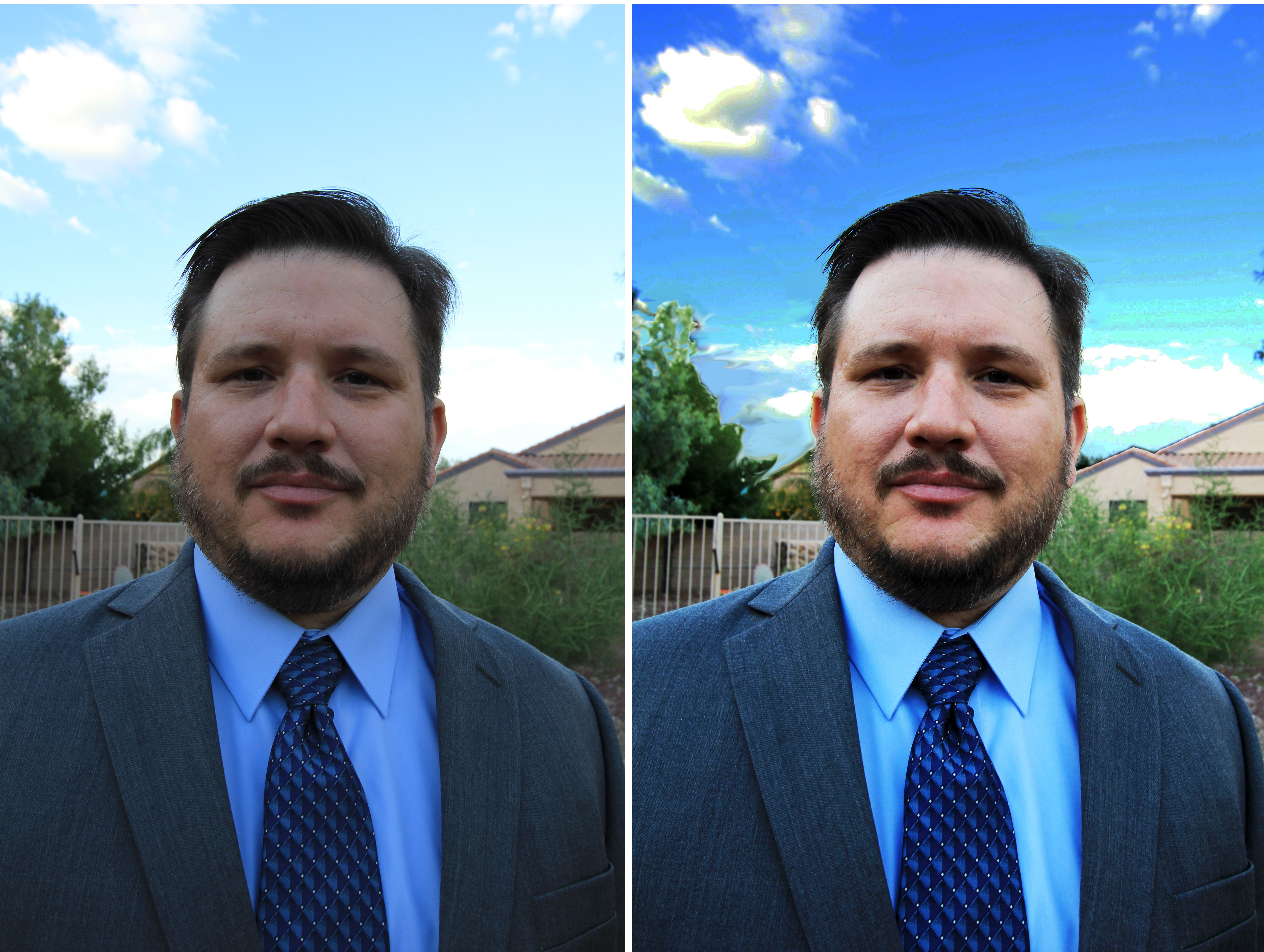
Complicating matters, I have long since stopped trusting my own eyes. My vision gets worse every year; I wear prism lenses to correct some of the problem, further distorting my view of reality, even though my brain corrects back to true, most of the time. In addition, I don’t do anything in natural light without polarized lenses, which sharpen everything and amplify colors. The world looks much crisper, and more beautiful, in polarized lenses.
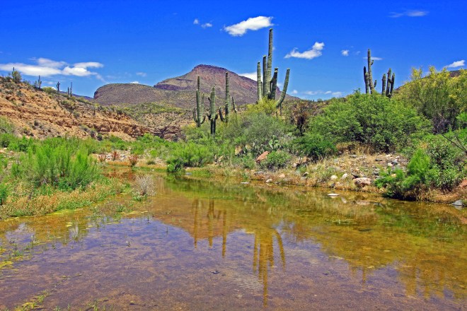
A verdant piece of desert
This one, obviously, can’t be right. It reminds me of a picture postcard from the ’50s, when, I guess color photography was a novelty and all the colors were boosted into glorious technicolor. The sky is even bluer than in the previous image. This was a fast fix; results would probably be better had I worked on different parts of the image separately: the sky, the saguaros, the rest of the plants, the rocks, the water. At heart, I see with the eyes of a child, and the brighter colors delight me. I’ll take paintbox primaries over reality any day, I guess.
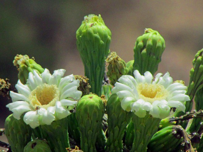
The flower of the saguaro cactus
This is the most confusing one. I still don’t have a zoom lens for the Canon EOS, and if you know anything about saguaros, you know that getting close to their flowers can be tricky. Most of the flower are on the top of the plant, and a mature saguaro can grow as high as 50 feet, while I myself stand only a touch over 5. We spent days looking for a cactus that was either growing below the ridge, or else had a frostbite damaged arm that hung in my line of sight. No such luck on this trip, and the saguaro only blooms for a short while. I had to resort to the Powershot, which has a great zoom feature, even though the picture quality is of course not as details as with the DSLR.
But here’s the thing: the zoom feature is much better than my eyesight, so good that I have often used it in place of binoculars. It allows me to see things in sharp focus that would otherwise appear as distant blurs. So I couldn’t even tell you what these flowers really looked like because I never really got a good look at them myself. I couldn’t even really see the display since the sun was shining directly on it AND I was wearing polarized lenses. This photo pretty much involved just waving the camera in the general direction of the thing I wanted to shoot and hoping for something to line up.
So, what does the world look like? It’s not exactly what I see with my eyes, even with corrective lenses, and it’s not precisely what the camera returns to me, and it’s definitely not what photos look like after hue and saturation and balance. Every image is filtered these days; everything is Photoshopped. We can’t trust the visual world.