
A wyrm type dragon, very chthonic.
These are the other 2 dragons from the set of 4 mentioned in the previous dragon post. While I did enjoy playing with light on the mountains, water, and clouds in the red wyrm image, not to mention the sweet reflections on the knight’s shield, I never liked this image very much. Possibly, I was just unhappy with my color choices. I felt that they couldn’t all be blue and green (by this point I think I had acquired a full set of high quality colored pencils, and wanted them to wear down more evenly) but red and purple, at the time, were very daring choices for me.
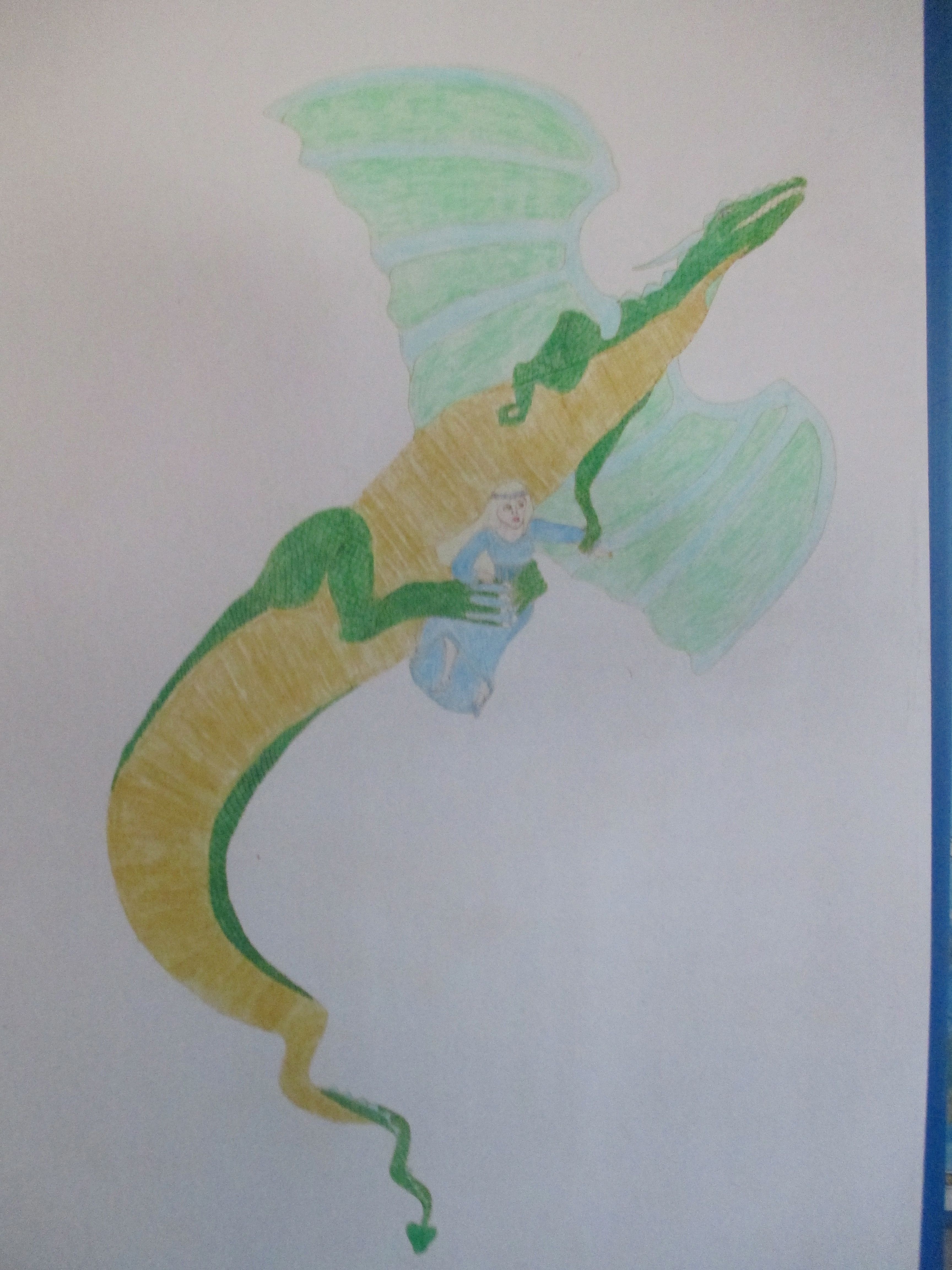
Another western dragon
Here, the princess never satisfied me. She seem cartoony, and I wanted her to look, at the very least, comic booky. The dragon is pretty solid, though. Love that twist at the bottom of his tail. The colors in these images has faded over the years, revealing some of the textural imperfections.

Pingback: Differently Dragonized | qwertyvsdvorak