Feigned Glass Window I

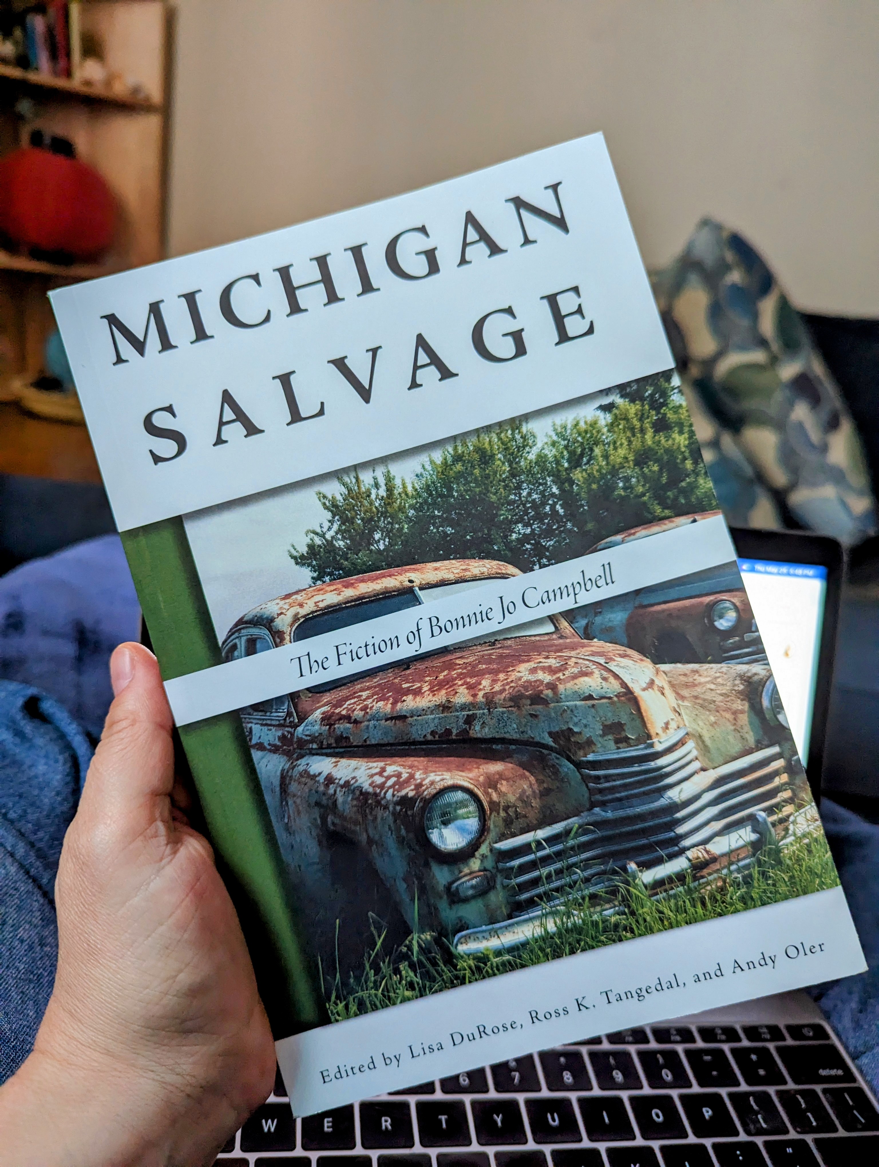
This commission for the Coyote is part 1 of 3. I finished it last night, and would have finished it sooner, but it took 4 days for my materials to arrive. When I finally got the last bits assembled, they looked markedly different from the rest of the work because the glue wasn’t dry yet, so I waited another day to take the picture.

Needless to say, this was difficult to photograph and the true majesty of the colors does not come through. Everything is washed out and leaning toward green. The inside of the mouth is actually purple, but this seemed to be the best I could do with the light available.

The backing is a panel from a tent pavilion, like the kind you can easily set up on the beach or something. The colored part is transparent packaging wrap I got at Michael’s. Every color has a bunch of other colors in it, so you get different iridescent effects in different light, or by layering the colors. I made layers of colors with matte medium in between, which changed the way the light interacted with it. The metallic lines are 1/4″ silver washi tape. The entire work is about 6 feet long and 3 feet high.

This one probably took close to 12 hours because I had no idea what I was doing. The subsequent panels should be much quicker. This project highlights my commercial failings as an artist. Here I have invented and mastered a ridiculous technique that no one else is using, and which I will probably never use again.

Stand by for panels 2 and 3.

It’s been a minute

Yeah, I haven’t posted lately. All my equipment is messed up so I can’t do digital art until that’s sorted, the new BJC comic likely will NOT BE allowed out in public until 2025, and I have a new gig that pays money for my time.

I have started a new painting, and I have a potential new project that might materialize in 2024, and I have this fun activity—I’m helping transform this freestanding tent/pavilion thing into a church by creating faux stained glass windows with transparent plastic wrap and metallic washi tape.

It will be moderately NSFW.

Bonnie Jo Campbell Comics Volume 4!!!

Something’s different here.

It’s here at last! Volume 4 of Bonnie Jo Campbell Comics is now available from Michigan State University Press.

What’s that you say? This doesn’t look like an indie comic? Indeed, Michigan Salvage, edited by Lisa DuRose, Ross K Tangedal, and Andy Older is a academic collection, the first part of which contains scholarly writing about Campbell’s work, the second part of which includes pedagogical essays, and in between the 2, obviously, is a new BJC comic by yours truly, which, of course, straddles the scholarly/pedagogical divide.

In addition to the 15-page comparison of Q Road and Once upon a River, this volume also contains my 5-page comic lesson plan for teaching literary criticism to young people (every chapter has a corresponding lesson plan), as well as a chapter in the teaching section (“Fiction Friction: Teaching Bonnie Jo Campbell to Second Language Writing Students” by Doug Sheldon) that discusses using my previous comics to teach Campbell’s work.

Due to the…professional…nature of the book, I wasn’t able to share this work before publication (I actually did the bulk of it in 2020, during the first 2 months of lockdown) and I gather I still may not share too much of it here, but true fans will certainly want to purchase this lovely volume for their home collections. (It’s academic publishing, so I receive no compensation other than a contributor’s copy, but this was the most labor intensive comic yet; it took 250 hours.)

I made a lot of different decisions with this comic, which isn’t like the others; it’s more of a compare and contrast essay between the 2 novels rather than a simple retelling of short stories. It’s really text-heavy. But I’m pretty happy with it. There was a minor mix-up in the printing process that made the pages…less effective, but I’ve already received an apology and a promise that it will be rectified in the next printing.

And now…well, I really can’t say much about it, but I guess I can reveal that I have the final text for Bonnie Jo Campbell’s new novel, forthcoming from WW Norton in 2024, right here on my very own computer. Like I really may not say much about it, but I think I can say this: it is going to blow people away. It’s going to be included on reading lists and win prizes and inspire articles and discussions. It’s going to make a huge splash. It’s going to have legs. It’s so good. And when it’s released in January of next year, Bonnie Jo Campbell Comics volume 5 will be there, scurrying after it.

Fans of Bonnie Jo Campbell and Bonnie Jo Campbell Comics will definitely want to buy this book. And if you don’t own the first 3 volumes of the comic, they can be purchased ($6 for 1, $10 for 2, $12 for all 3) from monica.ilene.friedman AT gmail DOT com.

Summer Starts NOW

In all the world, there is no time or place like the Sonoran Desert in Summer.

I’m still slowly coming back from my COVID deficits, and haven’t been as productive as I like, but today was the last day of school, and I managed to put this one in in record time, probably only about 3 hours, mostly because the cactus and the bat are the only pieces I cut out of paper, and everything, including the spines on the cactus and all the details on the bat, are drawn with metallic markers, which really look pretty stunning against the black background.

The cactus, is, of course, a saguaro. The bat is a Mexican free-tailed bat, which summers here and gobbles up our local mosquitoes before heading back to Mexico when the temperature drops in the fall.

In hindsight, I realize I didn’t want to put stars in the part that is supposed to be the shadowed bit of the moon. Oh well. It’s not a scientific illustration, although I did make the bat look pretty true to form.

I have one other cool and timely thing to share, but I’m going to make a separate post for it.

Tumbling from Grace

This painting is from before I had COVID and I wasn’t sure I was going to share it, and I’m still not sure as I write this. I’m scheduling it for later so I have time to change my mind.

My therapist suggested I paint “failure” and I couldn’t even cry about it because there were only 90 seconds left in the session so I didn’t have time to lose my shit. I just had to cover my face and swallow it down until composed enough to leave. Anyway, this is what happens when you teach your kids that anything less than perfection is shameful and worthy of punishment/ridicule and they’re grown adults and you still constantly tell them that their lives are meaningless because they don’t make six figures, which is obviously the only measure of a human being’s worth. The image appeared to me fairly clearly.

I’ve shows the actual painting to a few people. The artists always get it. Other people seem to think this image is beautiful, which makes perfect sense, because I’m a beautiful failure at capitalism.

When I showed it to my therapist, she loved it. I thought she was going to tell me to paint “success” next but instead she told me to paint “what it would look like if you loved yourself.” That didn’t make me cry. Just bitter laughter. I also know what that painting should be, but I haven’t found the right thing on which to paint it yet.

How Do You Like to Go up in a Spring Bulletin Board?

cut paper little girl swinging on a swing with Robert Louis Stevenson quote
I like it!

COVID knocked me down, but I am slowly getting up again. It took me a lot of weeks to make this bulletin board, because I got the long COVID and it slows me down. One week I cut out all the flowers, but it was a while before I got to the lettering, which took 2 days, and then the girl also took 2 days. And I still forgot to give her a second leg. In this picture I also forgot to glue her hair down. If it was, you would see that her hair beads are rainbow.I know I’ve done 2 Robert Louis Stevenson poems in a row, but they spoke to me.

Another Sonoran Switchplate

I’m painting a lot lately, and I am working on a bigger canvas all week: it’s about 4 feet high and 18 inches wide. Making a lot of progress and wasn’t done painting for the day, but I needed to let that project rest/dry, so I did another switchplate. I’ve been wanting to do this design for a while. Honestly part of the problem was that I couldn’t find a screwdriver. However, I persevered.

It started out pretty good but then some of the paint pens exploded, and some of the pens weren’t flowing so all. I cleaned it up as best I could but some bits of it were better before. Paint pens are less versatile than actual paints. Still, it’s about what I wanted. I meant to put it by my front door, and put the zentangle that’s there now in my studio, but in fact they’re different plates. The one in the front has 3 switches.

Only 2 blank switchplates left in this house. Gonna have to start painting the walls soon.

Muse and Duende Redux: Trickster’s Hat part 6(a)

If you’ve read this blog from the beginning, you know that Nick Bantok’s The Trickster’s Hat was a huge part of my transitional journey from writer to visual artist, and you may even remember my original take on this concept: the first Muse and Duende poster. For a while, I’ve wanted to do better versions, and this was the result.

This project took about 12 hours total over 6 days of working. I think the originals took 3 or 4 hours.

Oil paint is a medium about which I know nothing and have next to no experience but it’s rich and delicious. (Last year the Otter decided to “learn to paint like Bob Ross” and invested in all the materials and then painted a picture and then decided he was done painting, so I was the lucky recipient of a lot of art supplies I couldn’t afford on my own.) The results are pretty satisfying compared to the original but also…I could improve that much again. I’ll be painting more (working on something else already that ‘s probably more disturbing but less NSFW than this ) but I’m going to do some acrylic stuff before I go back to oils. I love the oils, but the environmental impact is ridiculous and I don’t think breathing the paint or the paint thinner is really doing much for my respiratory issues.

But I think I want to paint more, even though it’s an insanely expensive hobby and I don’t know how long it would take to reach a marketable standard and it’s murder on my back and hands. But oh, that flow…

These paintings were a gift for the Coyote, whose home decor supports this sort of thing.

A Cozy Pretend Fire

I was asked to create a cardboard “fireplace” for an event that will involve children drinking hot chocolate before school. While it usually isn’t cool enough for daytime fires in Arizona, lately it kind of has been, but I guess you can’t have a real fire at an elementary school, so they still will have to sit around the pretend fire.

This piece took a little extra time because it had to fold flat, meaning that I couldn’t just wrap the whole thing up, but had to keep each panel separate. There’s one piece of tape on the back and the whole thing collapses if it’s removed. The fire itself comes out: the grate isn’t attached to anything, and the flames and the wood are stuck into grooves cut into the grate and can also be removed.

Currently, the cozy pretend fire is sitting in the front office next to an artificial Christmas tree. Maybe I should make a pretend Hanukkiah to go along with it. There probably aren’t that many Jewish kids at this school—guessing we have more indigenous kids than Jewish kids—but not everyone is cool with Christmas stuff. I never do overtly religious designs, although I’ve done culturally relevant adjacent imagery, like luminarias.

Picture Books in Winter

Forgot to post my holiday bulletin board last week. That fireplace does look pretty cool but I was kicking myself because I mismeasured somehow, which shouldn’t surprise me because I do it every time, but the chimney’s too short and the rest is so wide it almost covered the text and didn’t leave any room for picture books.

Anyway, this is my cozy winter bulletin board. I don’t remember this Robert Louis Stevenson poem from my childhood but it seemed perfect for the occasion. There are more stanzas to “Picture Books in Winter.” This is the last one.

Funny that it’s a poem for children about childhood but it’s really about the kind of nostalgia that kids can’t experience.

Lettering is freehand based on lowercase but with all characters having approximately the same height.