Alphabet of Desire Part 1

Title for the Alphabet of Desire. The lettering is based on Gothic Versals.

Title for the Alphabet of Desire. The lettering is based on Gothic Versals.

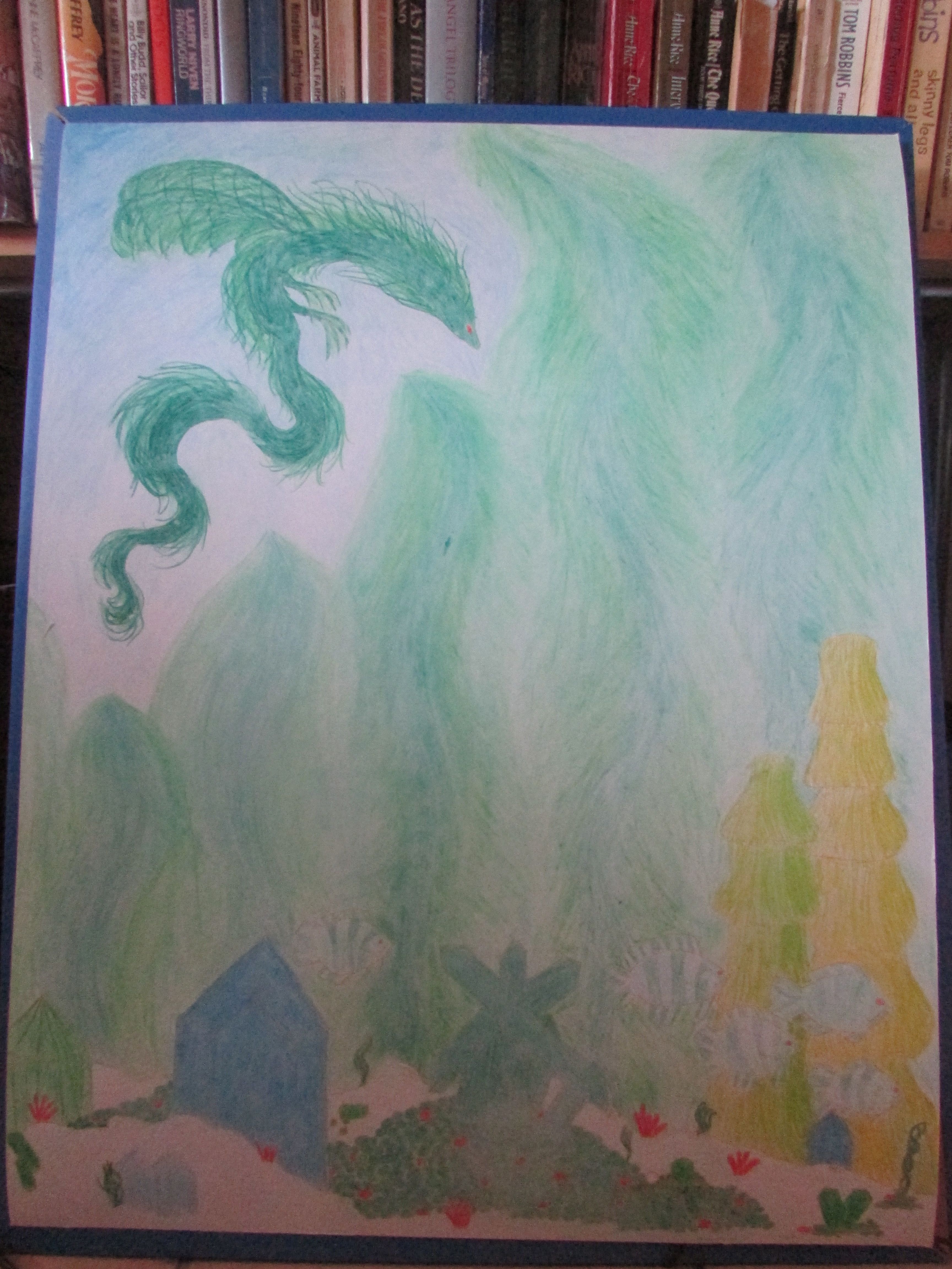
I don’t remember where I first heard the term “Alphabet of Desire,” a magical device invented by artist Austin Osman Spare, but it was something that synchronistically popped up here and there, until it occupied a firm space in my mind. I went so far as to sketch out the ideas I would use in my own Alphabet of Desire, and would find them every couple months or so.

The first initial cap for my acrostic novella. The wood symbolizes the Tarot wands and the concept of generation. A sprouting stick signifies new beginnings and earthly ventures. The snake represents the mystic male generative principle.

The first initial cap for my acrostic novella. The wood symbolizes the Tarot wands and the concept of generation. A sprouting stick signifies new beginnings and earthly ventures. The snake represents the mystic male generative principle.

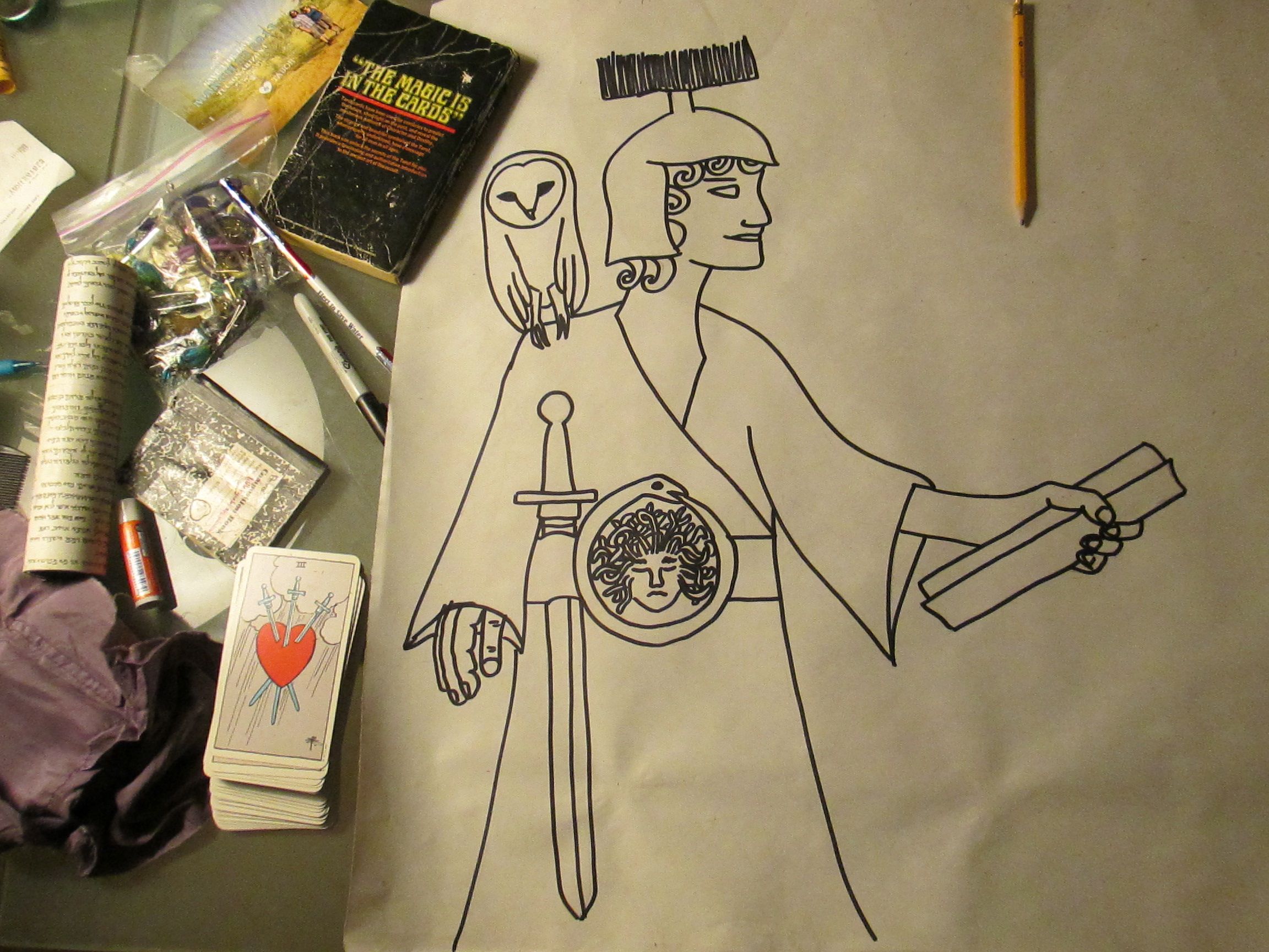
At the same time, I had also been long kicking around an idea of writing a story whose plot was based on the Tarot’s journey of the Fool (i.e. a work of twenty-two segments, each based on a Major Arcana).

For every chapter of the Alphabet of Desire, I also do a page of hand drawn letters in various fonts, which serves as a centering exercise.

For every chapter of the Alphabet of Desire, I also do a page of hand drawn letters in various fonts, which serves as a centering exercise.

Mandalas Are Magic Part 3

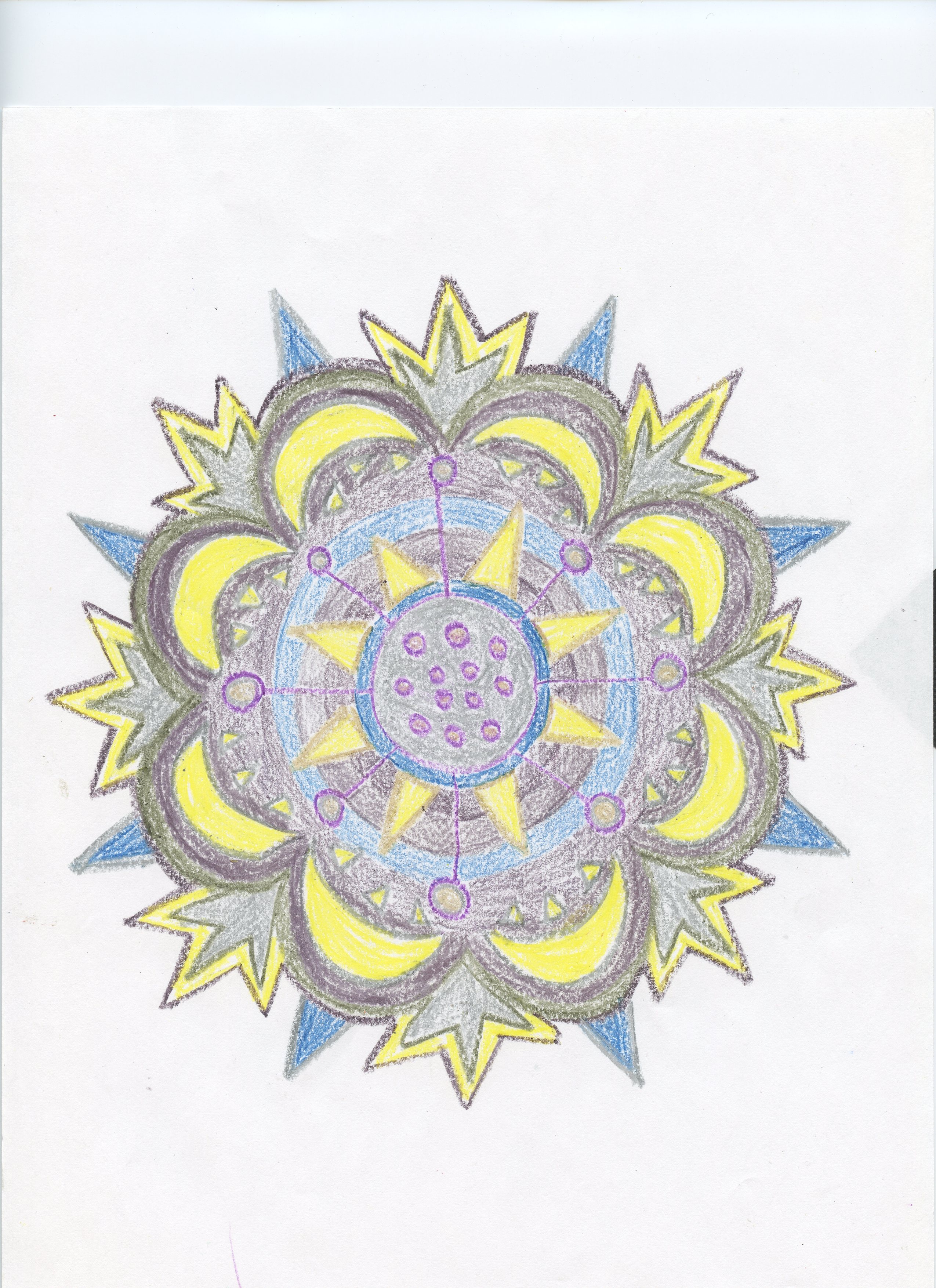
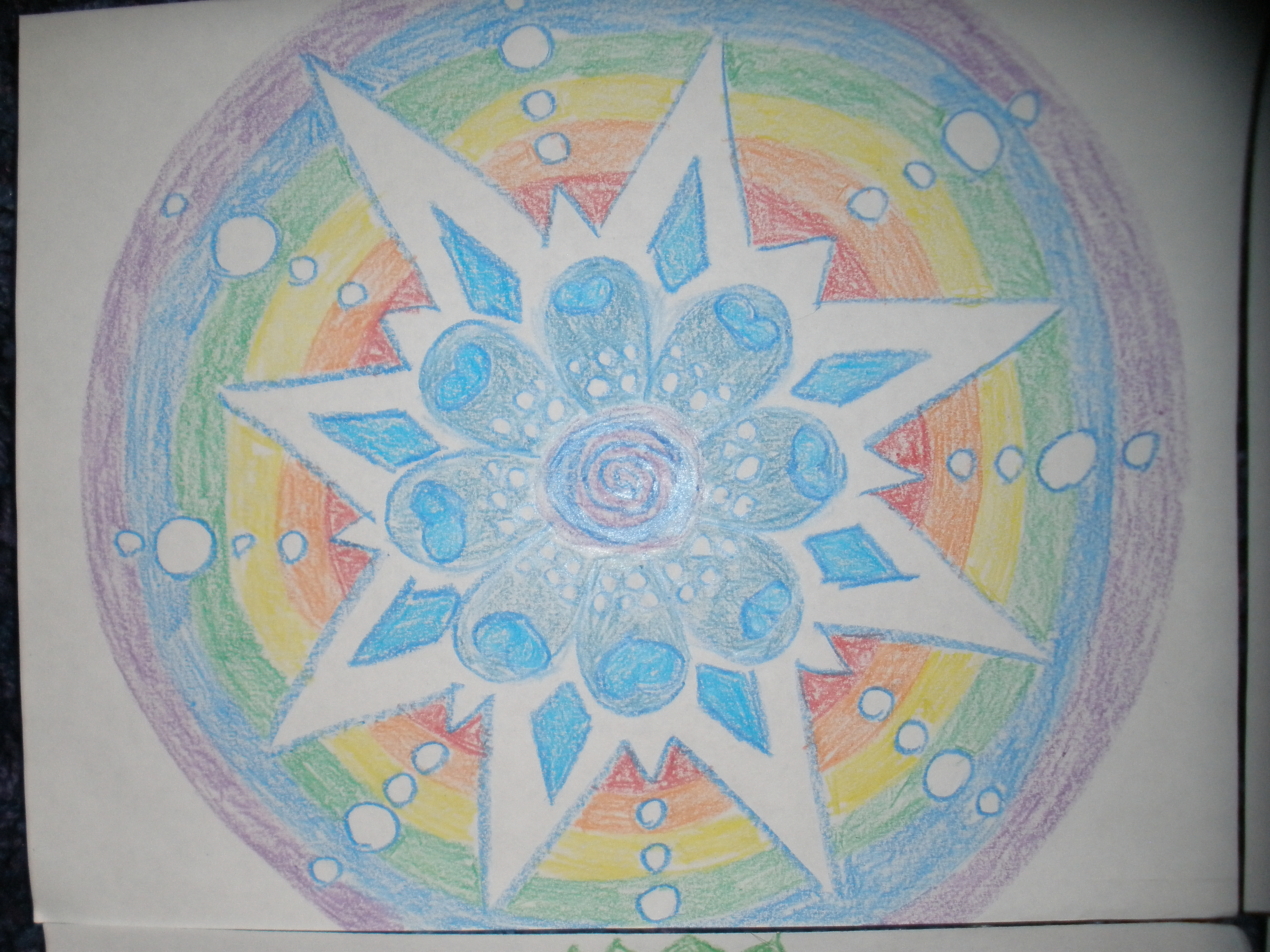
This whimsical punk mandala was inspired by a visit to the Hot Topic store at the mall

This whimsical punk mandala was inspired by a visit to the Hot Topic store at the mall

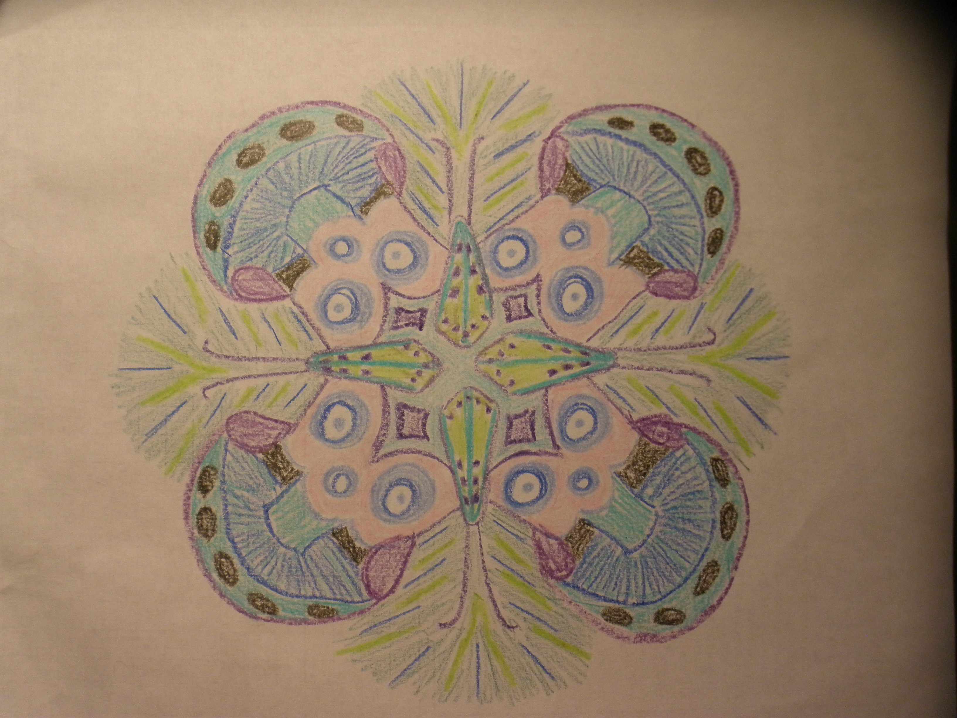
One thing I don’t worry about when I draw mandalas is perfection. Another think I don’t worry too much about is symmetry. My soul is clearly not perfect. And it is clearly not symmetrical, so why would my mandalas conform to that pattern?

A mandala inspired by satellites

A mandala inspired by satellites

Most of the mandalas in the collection are abstract, but some of my favorite ones are representative. Often, the silly and imperfect ones are the most-eye catching.

Inspired by a burlesque show

Inspired by a burlesque show

I can be serious too. One of the more complicated mandalas represents the emotions I experienced while editing the doctoral thesis of a former friend who refused to talk to me but still seemed to think I was the best copyeditor she knew. She paid me a good rate to work on her long and involved dissertation, but refused to renew our friendship. Another mandala was drawn as my mother-in-law began treatment for breast cancer.

Sometimes, it’s good to be playful about serious things, too.

Most women can probably figure out what serious monthly life event I have amusingly commemorated here.

Most women can probably figure out what serious monthly life event I have amusingly commemorated here.


Mandalas are Magic Part 2

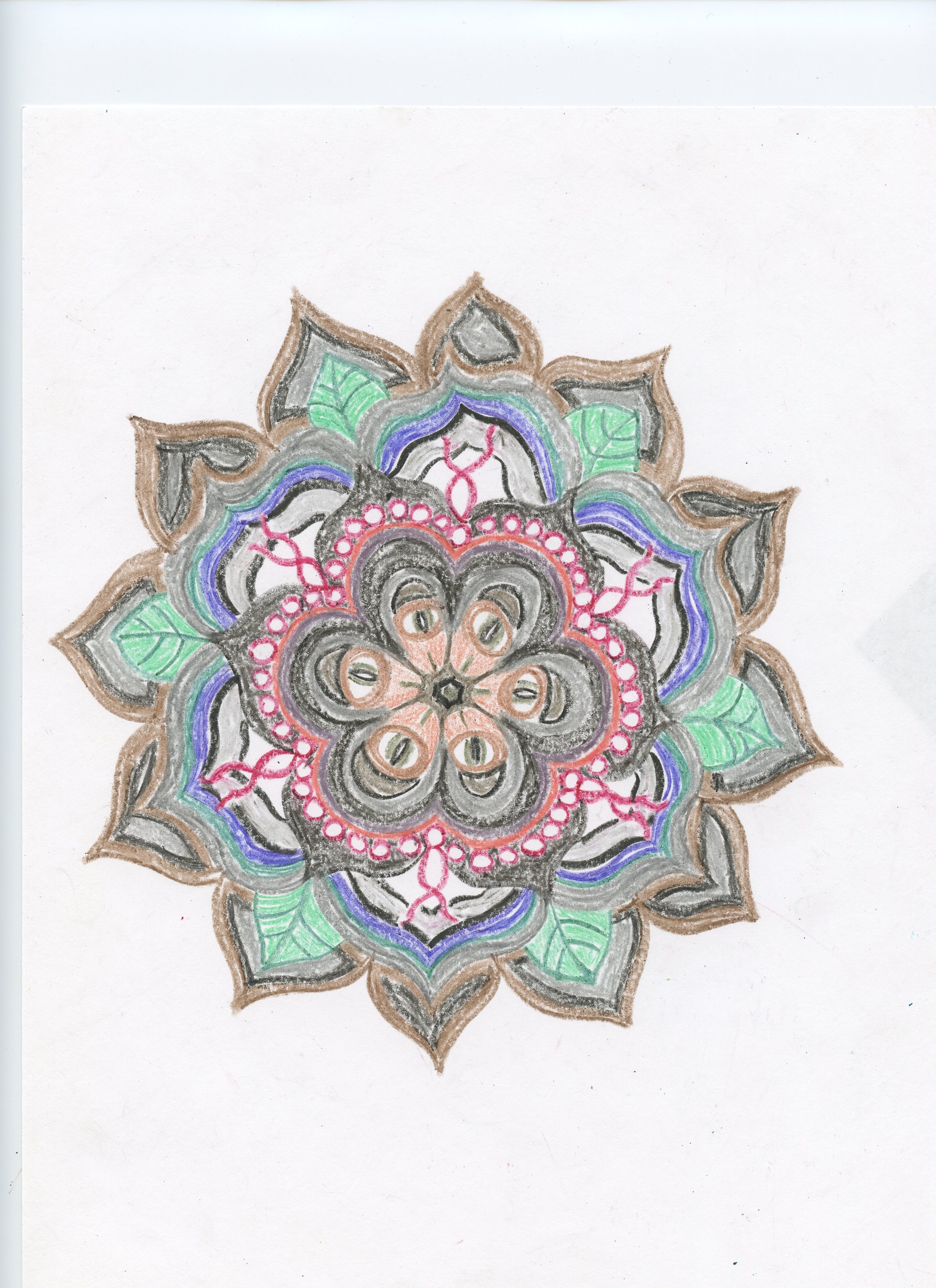
A flower-based mandala

A flower-based mandala

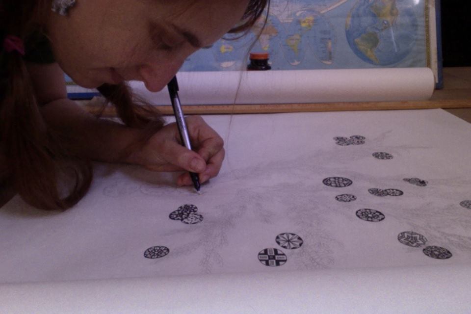
I set out to draw one hundred mandalas to help me find my way as an artist. It took about six months. Part of me thought, “why not one thousand,” but I only got to about one twenty five before other things became more interesting to me. I still draw mandalas sometimes, but it used to be a couple a week.

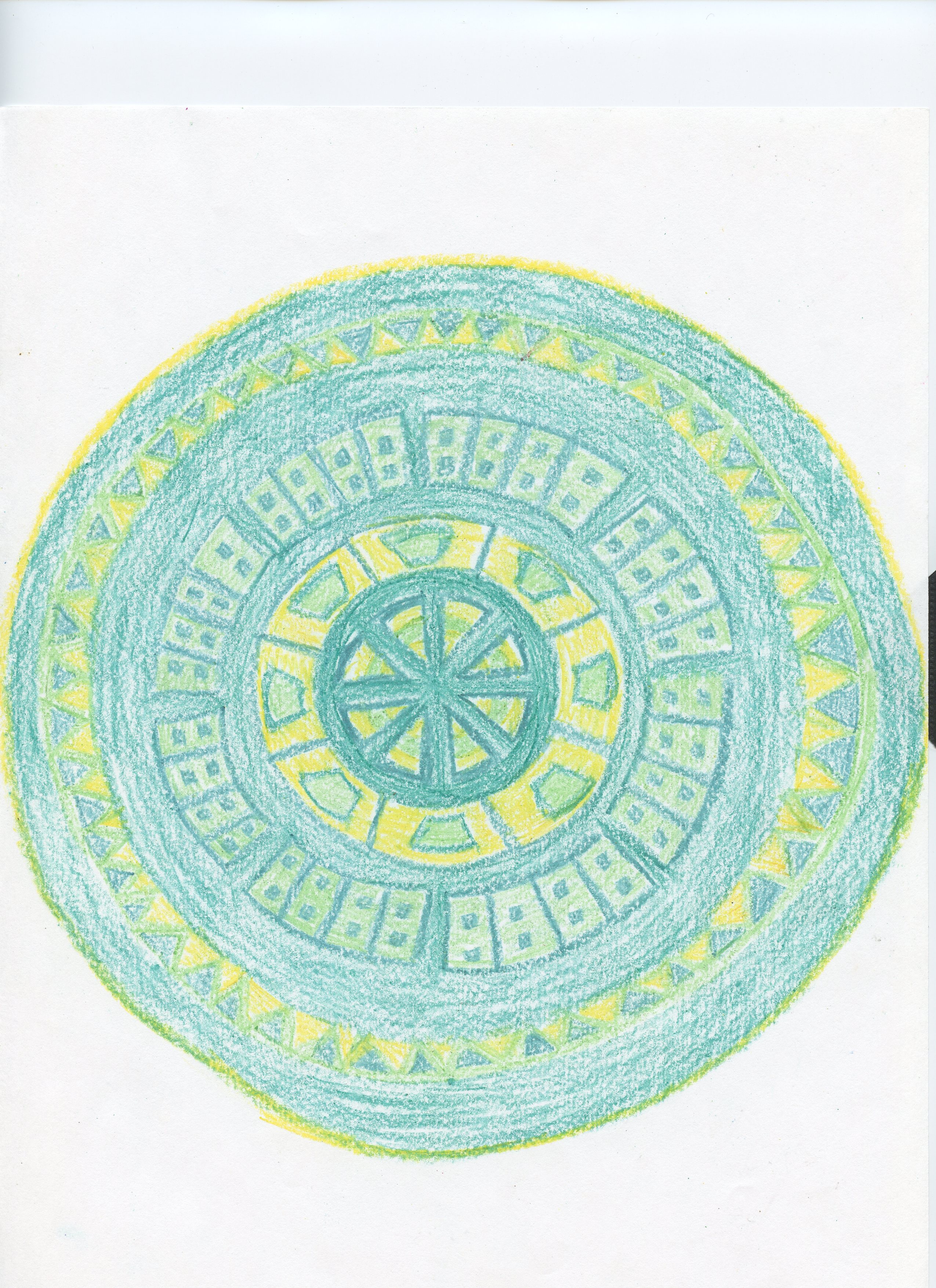
A mandala inspired by Aztec design

A mandala inspired by Aztec design

Patterns started to appear in the mandalas. Although each was different, there were many based on flowers or other plants, many based on crystals. There were mandalas inspired by holidays and mandalas inspired by tragedies. Comedic ones made my smile, perfectly symmetrical ones made my work a little harder.

Too obvious?

Too obvious?

Mandalas Are Magic Part 1

The first of 100 mandalas

The first of 100 mandalas

After my bulletin boards became a regular part of my life, I began to see how visual art made me feel, and how others responded to it. While it was work, it was enjoyable. While I might not be one hundred percent satisfied with the outcome, viewers derived pleasure from it. One day, on a whim, I purchased the Crayola telescoping tower (one hundred fifty colors!) and drew a mandala, something that had interested me in college, but that I had never made a serious study of.

A caddisfly themed mandala for an entomologist friend

A caddisfly themed mandala for an entomologist friend

Mandalas are sort of spiritual maps, or maps of the artist’s soul, if you like. Drawing fast ones had always given me an idea of where I was, balance and focus-wise, and taking more care in creating them helped me see when to take better care of myself, to add more art into my routine.

A monsoon mandala

A monsoon mandala


When We Were Very Young Part 4

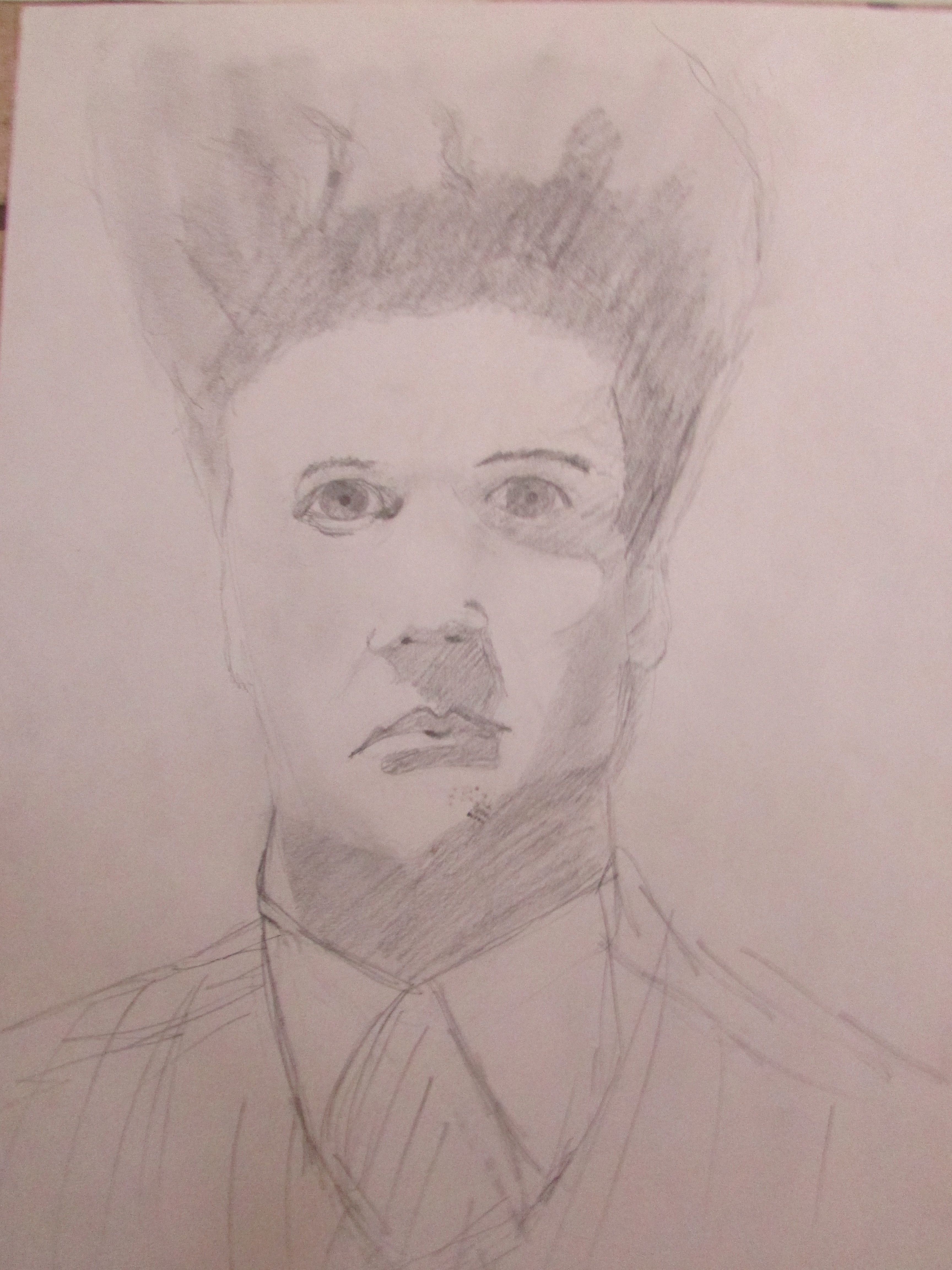
Eraserhead

Eraserhead

It’s unclear to me why this picture exists, since I didn’t enjoy the film Eraserhead in any way. My boyfriend at the time was a huge David Lynch fan. It’s 1991, most likely.

What I like about this next image is the style, where I worked primarily in chunks of gray, rather than lines. The subject was a guy in the year ahead of us at school, on whom my best friend had a bit of a crush. I only ever talked to him 3 or 4 times, but as the image shows, he was pretty cool for a high school senior.

Quentin Shaw

Quentin Shaw

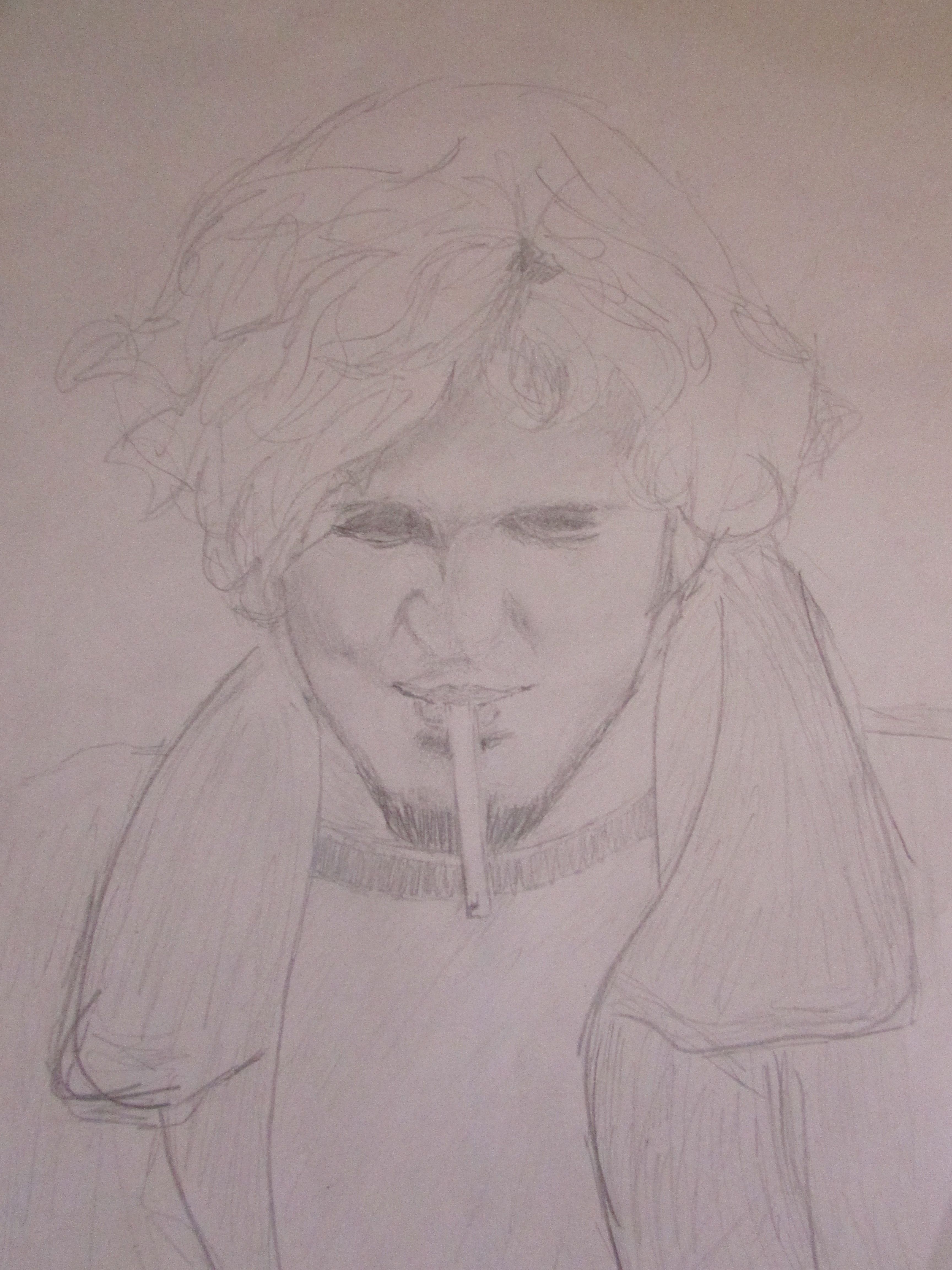
In college, I did a lot of surreal art, often collaborative, with my then-boyfriend. Our style tended toward psychedelic and depended much more on color than anything I had done up to that point. However, I still sketched from time to time. This image is of that boyfriend, so it’s probably about 1993. At one point, I had an even lovelier nude I had done of him in charcoal, but sometime in the last 5 years, I mailed it to his wife, who seemed a more appropriate owner.

Tyson Knowles

Tyson Knowles


When We Were Very Young Part 3

Anthony Kiedis, lead singer for the Red Hot Chili Peppers and all-around topless dude

Anthony Kiedis, lead singer for the Red Hot Chili Peppers and all-around topless dude

I sketched a fair amount in high school and college, and was able to turn out passable portraits that looked like the subject, but they took me a long time and eventually my art was limited to periodic doodles in the margins of things. Writing was my true calling, and doing that at least two hours a day as a teen and four a day as an adult cut into other forms of self-expression.

Trent Reznor, Nine Inch Nails

Trent Reznor, Nine Inch Nails

These sketches were all done when I was a junior or senior in high school, and while I find a number of completed images that I’m pretty happy with, there are also many unfinished portraits, illustrations I gave up on because I just couldn’t get them right.

Who is this? Fairly certain it's another rock star, and that the sketch is good enough that the subject could be identified, but I'm not sure who it's supposed to be.

Who is this? Fairly certain it’s another rock star, and that the sketch is good enough that the subject could be identified, but I’m not sure who it’s supposed to be.

When We Were Very Young Part 2

A western dragon, 1989

A western dragon, 1989

My sophomore year of high school I wanted some dragon posters to hang in my room but simply couldn’t find even one that I loved. I ended up drawing four myself, buying the colored pencils one by one as I required particular colors. This was probably the biggest art project of this period of my life.

A sea serpent, 1989

A sea serpent, 1989

When We Were Very Young Part 1

This is the oldest drawing of mine I can lay hands on; my mother probably has something older. It's dated 1986, so I was 11 and in 6th grade.

This is the oldest drawing of mine I can lay hands on; my mother probably has something older. It’s dated 1986, so I was 11 and in 6th grade.

I spent a lot of time drawing as a kid and, at age seven, declared my intention to be an artist when I grew up. My parents bought me some acrylic paints for my birthday, but warned me that they were expensive and that I shouldn’t waste them, because I wasn’t getting any more. As a result, I painted one picture, was unhappy with the results, and never used those paints again, sticking to crayons and water colors (which my parents also would not replace when I asked; when the blue, green, and purple was gone from my paint box, my mother’s response was, “Paint something red.” In fact, my blue period lasted about thirty years, and my mother never understood why I couldn’t just use the other colors) and later, when I was a teenager and rolling in babysitting money, I began investing in more expensive colored pencils.

Flowers, 1987

Flowers, 1987

Even as a very little kid, verisimilitude in my drawings seemed very important. It was frustrating when what appeared on the page didn’t match the image in mind, but in middle school my sketches finally began to feel a little closer to life.

The Human Heart, 1988, Based on this image, my parents began to encouraging me to seek a career in medical illustration. I was only in 8th grade, but it was already becoming clear that getting me excited about their idea of a professional future was going to be an uphill trek.

The Human Heart, 1988, Based on this image, my parents began to encouraging me to seek a career in medical illustration. I was only in 8th grade, but it was already becoming clear that getting me excited about their idea of a professional future was going to be an uphill trek.

The Breezeway Part 4

Spring 2014, Here again I had the idea for the design first and then found an appropriate quote later

Spring 2014, Here again I had the idea for the design first and then found an appropriate quote later

It’s important to photograph these images as soon as they’re posted. The colors do fade very quickly, and every once in a while, the kids deface things. This one not only got sun-bleached in a week or two, but also got scribbled on by someone who clearly was too young to hold a magic marker. It’s still very beautiful to me. These letters were all cut out freehand.

Spring 2012, the teachers really seem to like the poetry boards

Spring 2012, the teachers really seem to like the poetry boards

More freehand letters, plus I cut every one of those leaves out by hand. Sort of wish I had planned the layout a little better, but it’s still fairly striking.

And here is my last bulletin board of the 2013-2014 school year. Anyone who lives in southern Arizona has seen the sky like this: during the monsoon, if it rains in the afternoon, sometimes it clearly slightly afterward. The clouds are all lined up like this, with sun tumbling through the breaks and spilling down over the mountains, which glow gold, red, and purple, depending on the time of day.

Summer 2014, the monsoon sky

Summer 2014, the monsoon sky

This sampling of a dozen images represents most of my favorite, and maybe about half of the designs I’ve done since 2009, when I first started. Looking back, it’s not an insubstantial body of work!


The Breezeway Part 3

Spring 2011, a Tree of Knowledge

Spring 2011, a Tree of Knowledge

I’m interested in the idea of dimensionality. Some of the previous bulletin boards used layers to create depth, but I experiment with other methods of making the images pop. For this tree, I actually constructed a number of little books and then attached them at various angles to showcase the third dimension.

Summer 2012, a Sonoran Desert Mandala

Summer 2012, a Sonoran Desert Mandala

Here, I used multiple layers and curled the edges of the flower using the blade of a pair of scissors to create the 3D effect. The species represented in this image include saguaro, prickly pear, ocotillo, palo verde, yucca, fishhook barrel, cholla, and bird of paradise.

It’s always a challenge to create holiday bulletin boards that reflect our local culture while remaining nondenominational.

Winter 2013, Another Ofelia Zepeda quote, paired with my take on the beautiful Mexican tin lanterns. I used layers and string for dimensionality here.

Winter 2013, Another Ofelia Zepeda quote, paired with my take on the beautiful Mexican tin lanterns. I used layers and string for dimensionality here.