Tag Archives: cut paper

Brave Back-to-School Bulletin Board

IMG_3143

The great thing about this is that, the more you doubt it, the truer it is. Theoretically.

Once or twice a year, my insomnia gets so bad that it comes full circle and after a week of falling asleep around dawn, my circadian rhythms get pushed back so far that I literally miss my window of opportunity for that night and never get to sleep at all. Last night hurt. Probably by 10 a.m. or so I could have slept, but at that point it makes more sense to power through for another 12 hours and get back onto a schedule that puts me in alignment with the majority of humans.

But I had to make a bulletin board! On zero hours of sleep! Fortunately, I had hung the orange background Friday and cut all the letters Monday, so I just had to reinforce the background, space and attach each individual letter, and then get some graphic elements. Due to the no-sleep, walking-around-basically-hallucinating situation, the lion cubs somehow came out half the size they were intended to be but by that point my brain was done. I scarcely felt competent to hold scissors, let alone pilot a car, and I really needed to use the reserve for the driving part, since The Man randomly stopped by, hung out for a while, and then left the Girl in my keeping.

So, I feel like this design could have been 10 times better but I also feel like it’s good enough, and if I get tired of looking at it I can change it later. School starts Thursday in my district (the kids to the south went back last Thursday; the kids to the north, including the Boy and the Girl, start next Thursday). The teachers all seemed to like it.

Normally this is a weird color combination for me. I don’t care for orange unless it’s food and typically I only like secondary colors if they’re right next to their primaries, but it’s just as with the mandalas: I forced myself to choose a different color (orange, to go with the yellow lions) and then convinced myself that purple would stand out against orange, and it really did.

Cut Paper Creatures on Cards

Screen Shot 2016-03-08 at 11.53.41 PM

For when you want to sit on something soft as a bunny.

Been so caught up in comic and scrambling to figure out what to do when life leaves little time for comics that my RedBubble shop has been totally neglected. This week I also made 2 greeting cards in similar styles with different subjects for very different occasions. Giving art away is great, because it leaves you room to make more art, and with the flatbed scanner, I need never leave a new design behind. That is to say, these 2 new animal images are now available on a wide variety of fine products in my shop.

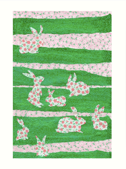
First, we have Bunnies in the Clover, in green and pink. An assortment of rabbit silhouettes meander around the cool green meadow. They look pretty adorable on this pillow, although the square products cut off designs sized for T-shirts. You can see the entire design in this print.

Screen Shot 2016-03-08 at 11.54.39 PM

A rectangle of rabbits reside on this range

You can get it in its original card format, or as a sticker, or a pair of leggings, or a drawstring bag. There’s something like 37 products now, including clothing, home decor, and, print products.

Screen Shot 2016-03-09 at 12.06.34 AM

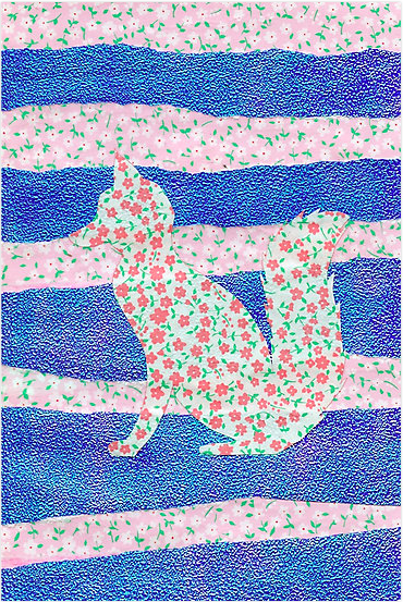
Feeling foxy?

The second designs features a woodland creature that would happily eat the bunnies depicted in the first design. It’s the Fox in Clover, and you can see how it strikes you as a pillow, a pencil skirt, an iPad case, a poster, and plenty of other fun products.

Anyway, that’s what I’ve been doing this week in addition to all the stuff I normally do.

Tomorrow will be a more productive day.


Making Mistakes: A New Year’s Bulletin Board

IMG_8965

It’s not perfect, but I learn as I go.

For the first bulletin board of 2016, I knew there would be flowers. The quote came afterward. Monday, I went in just to get the background up, and it took all of Tuesday and Wednesday afternoon to finish the project.

Originally I planned to make an assortment of very different 3-dimensional flowers, but I started with the big one, and it ended up taking me almost 3 hours and it didn’t even look exactly how I wanted it (it would be better with twice as many petals) so I ended up experimenting with another method of getting a (smaller) flower with many petals and some dimensionality, and then, at the very end, I threw on a bunch of simpler (but still complicated) really small ones in the same color scheme.

IMG_8960

You can really see the dimensionality.

For the quote I was thinking of Anaïs Nin: “And the day came when the risk to remain tight in a bud was more painful than the risk it took to blossom.” But then it seemed like Nin could possibly be a little racy for an elementary school if some impressionable young person decided to look her up. Or if some grownup decided she was inappropriate. It’s really an outside possibility but people can be pretty touchy about literature, and she’s strongly associated with erotica, so I decided to err on the side of caution and go with Gaiman. We have 2 of his books in the library: Coraline and The Graveyard Book. I edited the quote just a bit for length. It’s still so long that there was no  time to cut out the letters.

IMG_8963

You can tell where my hand got tired at the end. 

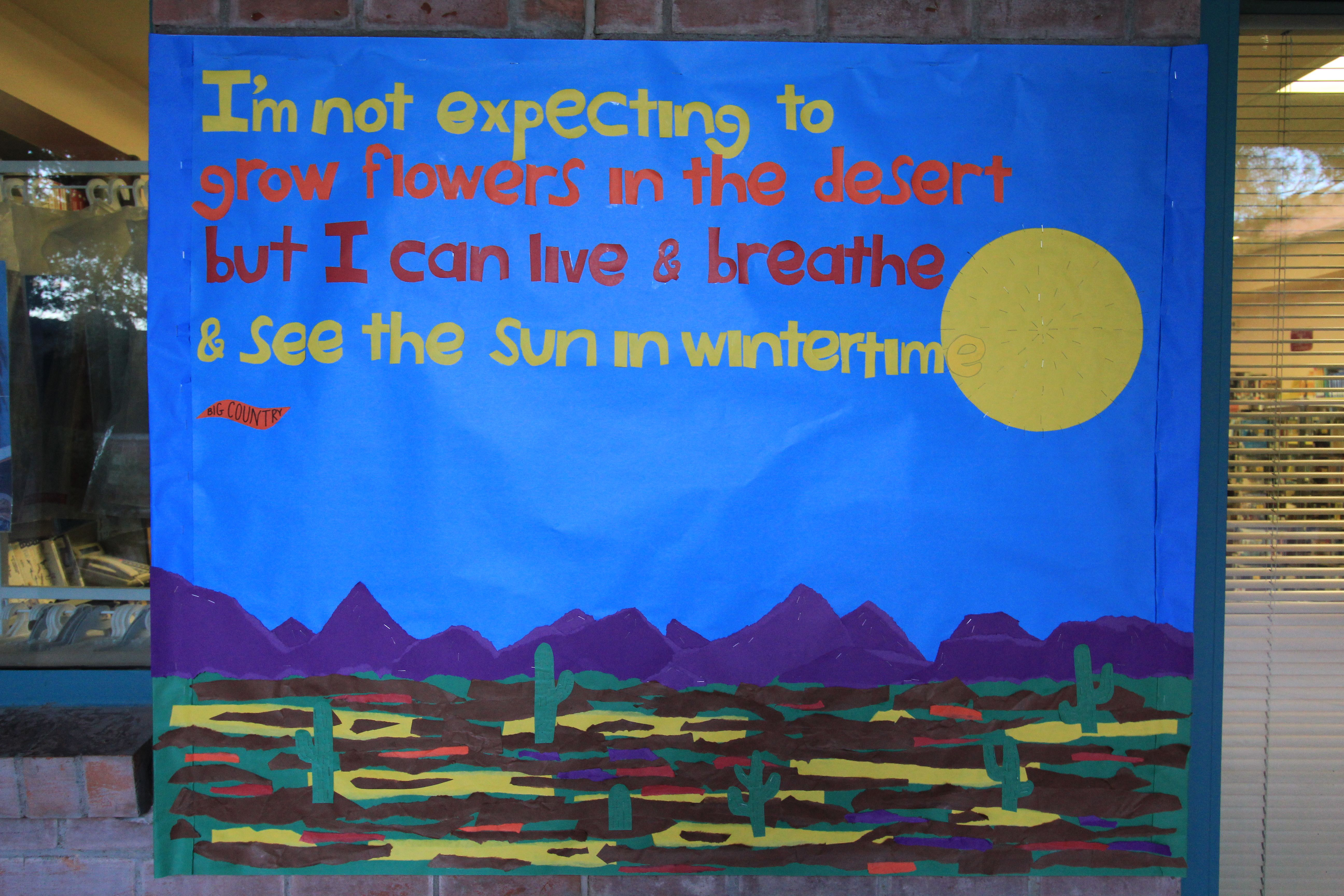
Flowers in the Desert Bulletin Board

Remember kids, measure twice, cut once.

Remember kids, measure twice, cut once.

If you don’t recall the New Wave band Big Country and their hit single “In a Big Country,” go ahead and familiarize yourself with this seminal work of early ’80s pop music. It’s got a catchy beat and a good message. If you’re not familiar with ’80s music, don’t get freaked out by the intro. Just go with it.

Yesterday, I wrote down some quotes that I thought of using for the holiday bulletin board, and I stuck them in my wallet, and then I left my wallet at home when I came back and couldn’t remember the quotes. This song gets stuck in my head sometimes, though, and the clock was ticking. Long story short, because nothing got started yesterday, this one really came down to the wire. I didn’t have any extra time, and ended up going 45 minutes over my budgeted time, which explain why I screwed up the text so badly. I can’t believe that last E got stuck on the sun. It’s really upsetting. There are like 12 things I could have done differently to avoid that situation, but there it is. When you don’t schedule properly, and you rush, things don’t come out as well. All of the Es are too big, and I knew they were, but these were from the second batch and I was too frustrated to make a third, and now I regret it.

So full of regret was I that I forgot I already had a blog post for tonight and started a comic, which is now finished, to I have tomorrow’s post as well. Bonus, I guess.

Also today: an article I wrote one Panels.net about Angela: Queen of Hel.

Black Cat Bulletin Board

A cat is watching

A cat is watching

Happy October! My funny little black cat, who has been the subject of at least two other blog posts, gets her chance to shine in the spotlight, or rather, glower in the shadows. I knew I wanted to do a black cat bulletin board this year, and I was trying to figure out how that would look on a black background. At the same time, after searching for relevant text, I found this Rainer Maria Rilke poem:

"Black Cat" by Rainer Maria Rilke

“Black Cat” by Rainer Maria Rilke

Ah, “invisible.” That was the key. I went in yesterday and blocked out the poem, then inked it with a silver metallic Sharpie, which died halfway though, so I had to run out to the nearest Walgreen’s and buy their last silver Sharpie, but even so, the text didn’t take that long. Maybe an hour. I went back in today to put it together. I had some big ideas about making the eyes sparkle with the gold and bronze Sharpies, but it didn’t look as great as I thought it would, and the bronze Sharpie was dying, even though it was new in the package. Anyway, yellow is more striking.

My kitty is fierce.

My kitty is fierce.

I used black construction paper for the ears, nose and mouth (the background is black butcher paper, so it’s a subtle difference) and the whiskers are the silver Sharpie again. Very minimalist, which took a lot less time than usual, but I did spend quite a while on the eyes.

How to Fly Higher Than an Eagle

You are the wings beneath my wings.

You are the wings beneath my wings.

This Isaac Newton quote probably refers most particularly to the work of 2 great scientists who came before him: Johannes Kepler and Galileo Galilei. Although Newton is still regarded as one of the greatest scientists to ever live, having made major contributions to the fields of mathematics, optics, celestial mechanics, and of course, the study of gravity, over 300 years ago, he had to acknowledge that his leaps would not have been possible had he not studied the foundational works of those who came before.

In other words, read a book.

A crow riding an eagle

A crow riding an eagle

As for the image, there are fairy tales that involve smaller birds flying higher and farther than stronger birds by riding on their backs, and there are several sets of photographs of this phenomenon which you can Google at your leisure. It’s a documented fact that little birds sometimes hitch a ride on bigger birds.

IMG_6211

Close up on the wing. Somehow, my freehand drawing shortened the back wing considerably, which I didn’t notice until after I cut it out, andI ended up having to add 2 pieces to make it big enough, but that was OK, since eagles have those layers of feathers anyway. it looks better this way.

The kerning on this one is off, because I only had a really limited time to work (I actually wanted to put in clouds, but as it was it took 30 minutes longer than I wanted) and didn’t measure properly. The letters were cut pretty haphazardly, no guidelines, no rulers. I just counted the occurrence of the individual letters and cut them of folded paper, so I only had to do each shape once.

In addition, I spilled a 1/4 bottle of rubber cement all over my shirt/the cement without noticing. That’s a first for me.

Back to School Bulletin Board: (Another) Turtle!

Yep, summer vacation is over.

Yep, summer vacation is over.

I know I just did a turtle, but this is a different turtle. The green sea turtle is, of course, a saltwater creature, whereas this turtle is a freshwater type. Originally, it was supposed to be a red eared slider, a turtle that is a popular pet and, as a result, one of the most invasive species on the planet, but they are native to this region and not considered a nuisance here. However, I didn’t bring a reference photo of a slider, so what we have here is a sort of generic painted turtle. Painted turtles also live in this region. The concept of this bulletin board is from a nearby park called Agua Caliente, where, until recently, natural springs kept everything very lush. I believe the springs have recently dried up, and I haven’t been back in a while, but I’m sure you can still see palm trees, aquatic turtles, and fish there, even if some of the lagoons are drained.

A fresh canvas!

A fresh canvas!

Last summer’s design had help up pretty well; it’s always a particular shame to take the old one down when it still looks good, but they can’t really be repurposed, due to the fact that they’re completely full of open staples and therefore sort of dangerous to touch. Plus, there’s no way to rehang them unless you go and bend all the staple closed, and I use hundreds of staples in a typical bulletin board.

I get my paper from the source!

I get my paper from the source!

I think yellow is a cheerful, but unusual background color. I probably would have gone for blue, to better represent water, but they hadn’t ordered any more butcher paper and no blue was to be had.

Incidentally, I don’t think I’ve ever shared a photo of this giant rack of paper, from which I get most of my colors. (Some of them–the construction paper colors–also come from the supply closet in the office, but the butcher paper is just kept out in the hallway on this rolling rack. It’s never in precisely the same spot, but it’s easy to find. It took me a while before I could effectively use the (blunt) cutting edge against which you have the pull the paper to effectively create a straight rip. It’s very joyful. Sometimes the kids can get paper, if their teachers tell them to, but for me I still feel a little frisson of power knowing that I can have any color paper I want. Bwoo ha ha ha.

Any color except blue, apparently.

Measure a lot of times, paste once.

Measure a lot of times, paste once.

I drew the shell first, then traced its edge to get the letters to fit on its back. Then I traced the edge again to get the letters to fit on top.

Very, very welcome.

Very, very welcome.

From there, I glue everything to the board. It’s sort of a rote operation. I add a few staples for insurance, and then I go back over the design and add a bunch of staples for accent (and security). Here you can see how the staples add texture and dimensionality to the turtle’s head.

That is a face only another turtle could love.

That is a face only another turtle could love.

When the turtle and the text were finished, there was still a lot of blank space and the whole thing looked kind of threadbare. First I added some palm trees, then some fish and some river rocks, and then a few more fish. I go back and glue anything that isn’t lying flat again.

I did this!

I did this!

Truthfully, I meant to start this yesterday, but instead I spent the entire day obsessing about how filthy my office was and totally forgot what I had planned to do. Needless to say, I have not yet started cleaning my office. However, I have created and uploaded some new art, so my conditions from yesterday were still fulfilled. This isn’t my favorite design–it feels like it needs a lot more background–but I only had one day to do it if there was going to be a new bulletin board when the kids came back and it’s 104 degrees out (this bulletin board is outside) and there’s a fire on the mountain, so I feel like the 5 hours I put in today was all I had for this project. It’s cute and it looks OK. So, success.

Flying Sea Turtle Honeymoon Express Leaves Vancouver on Schedule

Everybody climb aboard the Flying Sea Turtle Honeymoon Express!

Everybody climb aboard the Flying Sea Turtle Honeymoon Express!

At last I can reveal what I’ve been doing with every free second in which I had the ability to focus during the last 10 days! It’s a mosaic collage for my sister and brother-in-law! The had a civil ceremony on Tuesday, and their big wedding is going to be tomorrow. I haven’t given them this gift yet, but I can’t imagine my sister will be spending a lot of time on the Internet the day before she gets married.

I had a bunch of other ideas for their gift, but everything fell through and making something cool was the only reasonable option. I chose a sea turtle because I know they like turtles, and a Vancouver-inspired backdrop because that’s where they live.

You can't really see my pencil marks but I assure you I wasn't making this up as I went along.

You can’t really see my pencil marks but I assure you I wasn’t making this up as I went along.

I started out by purchasing a bunch of origami paper and this 11×14 board. I sketch out the islands in pencil, tore up the blue paper, sketched out the turtle on notebook paper (you can see a bit of it in the upper right hand corner) and generally chose colors for things.

Scenery coming together.

Scenery coming together.

Using matte medium, I began to mount the squares onto the board to form a background representing mountainous islands and their reflection in the water. I used a bunch of metallic and foil papers, which don’t photograph that well, because their colors change depending on the light. I would sort of like to make a shirt out of this design, but I’m not certain how well it will translate.

The turtle isn't mounted yet, but I needed to keep checking that it fit.

The turtle isn’t mounted yet, but I needed to keep checking that it fit.

Then I began the turtle. Using my original sketch, I cut out a silhouette, and then I created stencils for the individual pieces of the turtle by slowing dismantling the sketch. You can see the diminished remains of the sketch to the right. The metallic background paper is orange, with green streaks if you turn it in the light.

IMG_4694

I’m a delightful creature!

Here, the turtle is complete. Just the details on each flipper took about 20 minutes. The turtle itself probably took 4 or 5 hours. It wasn’t as easy to do such fine work as it used to be; my body doesn’t want to sit for that long at a stretch, and my eyes don’t want to focus on tiny details, and my hands tire easily, especially cutting small pieces like the skin texture. Now the sketch is in 50 pieces scattered all over the office.

Somehow I neglected to photograph the process for the man and woman riding the turtle, but if you scroll back up you can see them, although I wonder if their colors ought to be brighter and more contrasting. Well, like everything, I learned a lot. If I did it again, it would be different and possibly better, but there’s no way I could do this again. Maybe another animal.

So, all in all, the completed project probably took close to 20 hours. I lose track of time when I’m working. Sometimes I have to keep Netflix playing, even though I’m not watching, just so I have a way to mark the passage of time and remind me how many hours I’ve been sitting there.

Congratulate my sister on her nuptials if you know her!

Summertime and the Cuttin’ is Easy Bulletin Board

Summer sunset bulletin board

Summer sunset bulletin board

It’s the last week of school for Arizona kids, at least the ones attending TUSD and Amphi, and I put together this dazzling summer sunset bulletin board to send them off (and for the summer staff and camp kids to enjoy). Up until about 90 seconds before I started making it, I had no idea what I was going to do.

This one took 2 days; the first day I just put up the background. There was nobody else around and I had a couple hours, so I thought I’d attempt a rainbow sunset. If I were to do this again, I think I might try to cut all the layers of paper at the same time. It felt a bit lopsided to me. For whatever reason, the school doesn’t stock purple butcher paper, so I had to tape a few pieces of construction paper together to do that layer, and it was harder to work with.

Day 1: just the sky, mountains, and sun

Day 1: just the sky, mountains, and sun

The next day I sketched out the cactus and the birds on black paper and cut it all out as a single piece, mostly using scissors, but getting the scalpel in there for some of the fiddly bits. I used my wedding invitations as a reference. A designer put the image together for me from a few pictures; this was before I knew Photoshop, or I probably would have done it myself and been even more impressed with the result, but we were pretty happy to get invitations that more or less looked the way we wanted.

Detail from our wedding invitations.

Detail from our wedding invitations.

The next day I sketched out the cactus and the birds on black paper and cut it all out as a single piece, mostly using scissors, but getting the scalpel in there for some of the fiddly bits.

I used my wedding invitations as a reference. A designer put the image together for me from a few pictures; this was before I knew Photoshop, or I probably would have done it myself and been even more impressed with the result, but we were pretty happy to get invitations that more or less looked the way we wanted.

Anyway, the silhouette was simple to draw; the hardest part was actually making out the pencil marks on black paper so I could accurately see what I was cutting. It all came out nicely and actually took a lot less time than many of the less complex bulletin boards take, about 4 hours max, although part of that is because there isn’t any text on this one. As per usual when the bulletin board is cactus themed, I used a lot of staples for spines, and also to keep the thing in place. It needs to be extra durable to last through the monsoon.

The silhouette.

The silhouette.

Last I did the stars, which would have been a lot easier had the principal not kicked me out of the library so she could hold an interview there, because it was super windy in the breezeway and I spend half my time chasing bits of paper around, but in the end it seems to have worked out pretty well.

A Hot Spring Bulletin Board

Volcano bulletin board

Volcano bulletin board

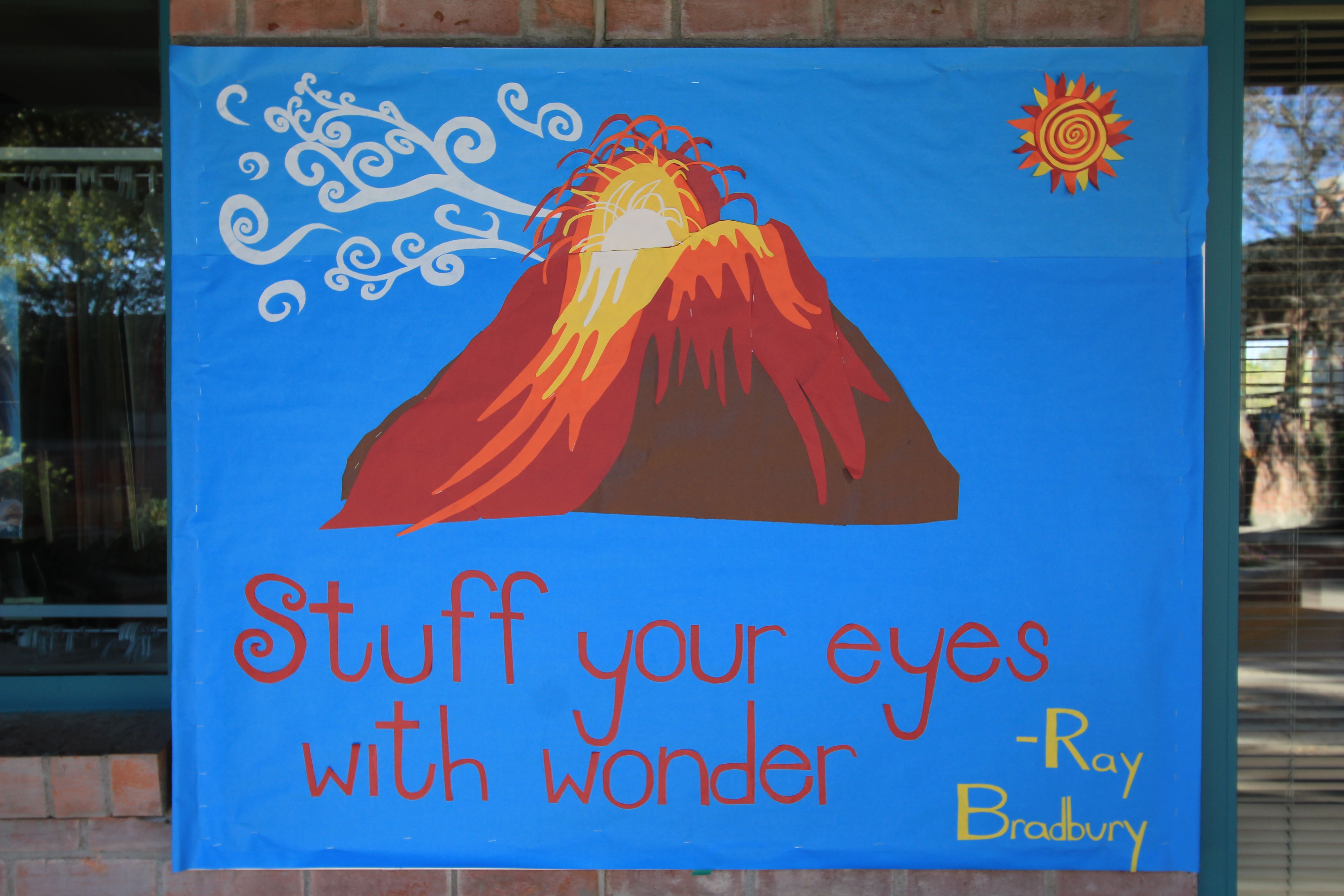
This dazzling gemstone celebrates the coming of spring and the heating up of the world. The idea of the volcano had been stuck in my mind for a while so I just went with it even though I didn’t have any idea of what that had to do with education or reading or springtime or really anything else. Of course, it’s the same volcano from Dragon Comics 65, which in turn is based on a pretty common photograph, but I can’t find the attribution.

Closeup on the smoke

Closeup on the smoke

Once the volcano was up, there was a lot of extra space, so I made the crazy sun and the smoke. Time consuming but fun.

This piece took 3 days; the first day I did the background, the second day the volcano, and the third day was the sun, smoke, and text. I picked the quote the second day after making the volcano; really had no idea what words I would use until pretty late in the evening. The text is from Ray Bradbury’s Fahrenheit 451. 

Closeup on the crazy sun

Closeup on the crazy sun