Tag Archives: cut paper

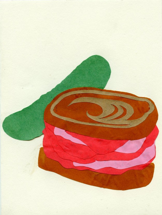
Pastrami on Pumpernickel Rye Swirl with a Dill Pickle

pastrami

Probably could have added a little paper fancy toothpick, but this sandwich is glued together and unlikely to fall apart.

Last week I attended a retirement party for a woman who’s worked at the school where I do bulletins boards since the Reagan administration or something. Like pretty much every educational administrative assistant I’ve ever met, she liked to project a gruff and unyielding persona, covering up her sweet side to prevent people from bothering her unnecessarily, but really, she’s very nice. She used to live in the town where spent my uncomfortable adolescence, and always wanted to reminisce about this particular diner, which my mother told me has long since closed.

She recalled, rapturously, the sandwiches at this place, but my memories are quite different, and I only have one. I never actually ate there; there was a cheaper and better deli closer to my house, but one day, my friend the Vampire Bat took me there. We were in high school and she had a crush on a busboy who worked there. We went in around 3 pm, when there were few customers. The busboy apparently had a crush back, because he greeted her effusively, sat us at a table, and, at her request, brought us ice water, pickles, bread, and butter. No sooner had we laid in to our ill-gotten feast than the manager noticed that we were not paying customers, but freeloaders dirtying a table and distracting the busboy, and promptly threw us out. This was one of many establishments from which the Vampire Bat got us ejected when we were in high school.

To celebrate the AA’s retirement, I painstakingly crafted a paper pastrami sandwich on pumpernickel rye swirl with a Kosher dill pickle. She was appreciative. I’ll probably get this design in my RedBubble store.


Sexy

IMG_20170402_191604

With a little touch up in Photoshop, this could be a RedBubble design.

This is a card I made for a friend’s lingerie-themed bridal shower. The dark red edging around the letters is Sharpie and the rest of the design is cut origami paper, some leftovers from my 1000 paper cranes project. The word “sexy” is also cut paper. It was almost one contiguous piece but I ripped it the tiniest bit while cutting it out, and then ripped it again trying to fix it.

I’ve been mostly working on another project while obsessing over the future of humanity. Part of me felt defeated by reality and overwhelmed with helpless terror, but then I read this New York Times article and thought about what Rabbit keeps reminding me about samizdat and it’s like—yeah, one tiny voice against a hurricane, but also, a million tiny voices against a hurricane. Some people think Trump wanted Bannon off the security council because he resented the media’s implication that Bannon was pulling the strings. I drew this comic after being tagged in a Facebook status that suggested cartoonists portraying Bannon as a puppetmaster could help limit his influence by appealing to Trump’s grandiose sense of being the most (only?) important person in the world.

I’ll draw webcomics again, I guess, but 4-5 a week isn’t going to happen at least until I finish the other project. In case you’re wondering, it’s called “Close Encounters of the ∞ Kind.” I didn’t name it; it’s a collaboration. I should probably talk about about it later.

When Life Gives You Lemons…

IMG_5794 (1)

If you lived in Arizona, you’d know what I mean.

If you’re on the east coast, or somewhere up north, this image might not make sense, but today in Tucson it’s into the 90s, and the entire city is infused with the scent of citrus blossoms. It’s really wonderful. The Kids’ grandmother gave us a bag of lemons and we’ve already finished our first pitcher of lemonade of the season, spring in Tucson being more similar in disposition to summer in most of the country.

Knocked this one out in just under 4 1/2 hours; it’s much easier when there’s no text, and I think the image speaks for itself.

Happy as Kings Bulletin Board

img_4992

Presumably, successful kings of prosperous countries who are beloved by their people and enjoy a reign free from war or internecine conflict.

Look what I made while I was almost too depressed to stand up! Except for the placement of the attribution it’s almost perfect. Good thing the “ALL” is in caps. It sort of mitigates some of the bitter sentiment here. We should all be happy. There’s plenty of stuff for everyone. I’m sure of that.

The quote–or poem, rather, as this is a poem in its entirety–comes from Robert Louis Stevenson’s A Child’s Garden of Verses. I didn’t remember it from my childhood, but came across it in my copy of the book, which the Girl was reading for her English class poetry unit. That’s the whole sentiment. My copy of the book belonged to my mother as a child. She wrote her name and address on the frontispiece when she was a little girl. So that’s wholly sentimental.

The black letters are based on the Minya Nouvelle Regular typewriter-style font. The other letters are, of course, of my own devising. The chalkboard letters were created by hand-tearing each letter rather than cutting.

This piece took about 4 days, working an average of 2 1/2 hours a day. I hope it doesn’t blow away like the last one did.

E Pluribus Unum

img_4315

Of course, she did much more than most people, with much less than most people. 

Usually, my holiday bulletin boards are sort of cheerful and joy-themed, but last night, while considering my intentions, I decided that there was a message that everyone needed to hear. E pluribus unum; one nation, indivisible, a house divided against itself cannot stand; we are one. If we can’t find a way to come together, to heal the rifts between people that brought us the most polarizing and depressing election of my almost-42 years on this planet, we can’t expect to achieve much of anything.

After settling the theme of “unity,” I researched for a while and found a lot of wonderful quote, most of which were a bit sophisticated for my primary audience, a number of whom are still learning to read. This Helen Keller quote summed up the intention in words that your average 8-year-old can understand.

Before anything else, I had already decided I wanted to go font-heavy, to use fancy lettering, which takes 4 times as long, but used to be a mainstay of this genre for me. Once I had settled on the quote, I chose the typeface by searching “19th century fonts” and “victorian fonts.” These letters are based on  Longdon Decorative. I smoothed out a few of its peculiar bumps, but otherwise feel like this cut letters are pretty faithful representations.

No visual imagery really jumped to mind, except maybe hands, reaching or helping. Maybe I’ll go back tomorrow and add a picture if one comes to mind, but I doubt it. Had I more time, I could have come up with something, but I was already 45 minutes late to help the Girl with her report about Jane Goodall, plus getting sick due to the overwhelming stench of the laminating machine. Someone said that they might have changed the type of plastic used in this machine, because they’d actually relocated it to the next room and it still smelled twice as bad as when it was behind the library desk. My head still hurts from those noxious fumes. At any rate, it seemed important to have this bulletin board and this blog post available first thing Wednesday morning.

So, what do you think? Can we just try to love each other? And if that’s too much, maybe acceptance? Tolerance, at a bare minimum. Can’t we just tolerate one another?

Brave Back-to-School Bulletin Board

IMG_3143

The great thing about this is that, the more you doubt it, the truer it is. Theoretically.

Once or twice a year, my insomnia gets so bad that it comes full circle and after a week of falling asleep around dawn, my circadian rhythms get pushed back so far that I literally miss my window of opportunity for that night and never get to sleep at all. Last night hurt. Probably by 10 a.m. or so I could have slept, but at that point it makes more sense to power through for another 12 hours and get back onto a schedule that puts me in alignment with the majority of humans.

But I had to make a bulletin board! On zero hours of sleep! Fortunately, I had hung the orange background Friday and cut all the letters Monday, so I just had to reinforce the background, space and attach each individual letter, and then get some graphic elements. Due to the no-sleep, walking-around-basically-hallucinating situation, the lion cubs somehow came out half the size they were intended to be but by that point my brain was done. I scarcely felt competent to hold scissors, let alone pilot a car, and I really needed to use the reserve for the driving part, since The Man randomly stopped by, hung out for a while, and then left the Girl in my keeping.

So, I feel like this design could have been 10 times better but I also feel like it’s good enough, and if I get tired of looking at it I can change it later. School starts Thursday in my district (the kids to the south went back last Thursday; the kids to the north, including the Boy and the Girl, start next Thursday). The teachers all seemed to like it.

Normally this is a weird color combination for me. I don’t care for orange unless it’s food and typically I only like secondary colors if they’re right next to their primaries, but it’s just as with the mandalas: I forced myself to choose a different color (orange, to go with the yellow lions) and then convinced myself that purple would stand out against orange, and it really did.

Cut Paper Creatures on Cards

Screen Shot 2016-03-08 at 11.53.41 PM

For when you want to sit on something soft as a bunny.

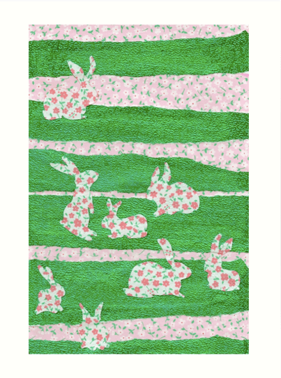
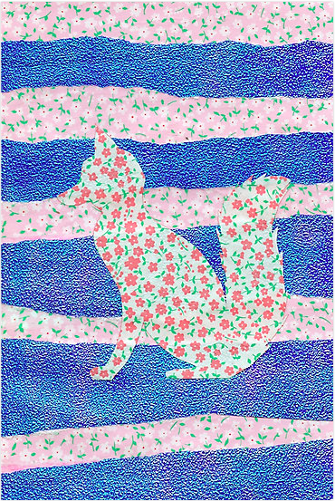
Been so caught up in comic and scrambling to figure out what to do when life leaves little time for comics that my RedBubble shop has been totally neglected. This week I also made 2 greeting cards in similar styles with different subjects for very different occasions. Giving art away is great, because it leaves you room to make more art, and with the flatbed scanner, I need never leave a new design behind. That is to say, these 2 new animal images are now available on a wide variety of fine products in my shop.

First, we have Bunnies in the Clover, in green and pink. An assortment of rabbit silhouettes meander around the cool green meadow. They look pretty adorable on this pillow, although the square products cut off designs sized for T-shirts. You can see the entire design in this print.

Screen Shot 2016-03-08 at 11.54.39 PM

A rectangle of rabbits reside on this range

You can get it in its original card format, or as a sticker, or a pair of leggings, or a drawstring bag. There’s something like 37 products now, including clothing, home decor, and, print products.

Screen Shot 2016-03-09 at 12.06.34 AM

Feeling foxy?

The second designs features a woodland creature that would happily eat the bunnies depicted in the first design. It’s the Fox in Clover, and you can see how it strikes you as a pillow, a pencil skirt, an iPad case, a poster, and plenty of other fun products.

Anyway, that’s what I’ve been doing this week in addition to all the stuff I normally do.

Tomorrow will be a more productive day.


Making Mistakes: A New Year’s Bulletin Board

IMG_8965

It’s not perfect, but I learn as I go.

For the first bulletin board of 2016, I knew there would be flowers. The quote came afterward. Monday, I went in just to get the background up, and it took all of Tuesday and Wednesday afternoon to finish the project.

Originally I planned to make an assortment of very different 3-dimensional flowers, but I started with the big one, and it ended up taking me almost 3 hours and it didn’t even look exactly how I wanted it (it would be better with twice as many petals) so I ended up experimenting with another method of getting a (smaller) flower with many petals and some dimensionality, and then, at the very end, I threw on a bunch of simpler (but still complicated) really small ones in the same color scheme.

IMG_8960

You can really see the dimensionality.

For the quote I was thinking of Anaïs Nin: “And the day came when the risk to remain tight in a bud was more painful than the risk it took to blossom.” But then it seemed like Nin could possibly be a little racy for an elementary school if some impressionable young person decided to look her up. Or if some grownup decided she was inappropriate. It’s really an outside possibility but people can be pretty touchy about literature, and she’s strongly associated with erotica, so I decided to err on the side of caution and go with Gaiman. We have 2 of his books in the library: Coraline and The Graveyard Book. I edited the quote just a bit for length. It’s still so long that there was no  time to cut out the letters.

IMG_8963

You can tell where my hand got tired at the end. 

Flowers in the Desert Bulletin Board

Remember kids, measure twice, cut once.

Remember kids, measure twice, cut once.

If you don’t recall the New Wave band Big Country and their hit single “In a Big Country,” go ahead and familiarize yourself with this seminal work of early ’80s pop music. It’s got a catchy beat and a good message. If you’re not familiar with ’80s music, don’t get freaked out by the intro. Just go with it.

Yesterday, I wrote down some quotes that I thought of using for the holiday bulletin board, and I stuck them in my wallet, and then I left my wallet at home when I came back and couldn’t remember the quotes. This song gets stuck in my head sometimes, though, and the clock was ticking. Long story short, because nothing got started yesterday, this one really came down to the wire. I didn’t have any extra time, and ended up going 45 minutes over my budgeted time, which explain why I screwed up the text so badly. I can’t believe that last E got stuck on the sun. It’s really upsetting. There are like 12 things I could have done differently to avoid that situation, but there it is. When you don’t schedule properly, and you rush, things don’t come out as well. All of the Es are too big, and I knew they were, but these were from the second batch and I was too frustrated to make a third, and now I regret it.

So full of regret was I that I forgot I already had a blog post for tonight and started a comic, which is now finished, to I have tomorrow’s post as well. Bonus, I guess.

Also today: an article I wrote one Panels.net about Angela: Queen of Hel.

Black Cat Bulletin Board

A cat is watching

A cat is watching

Happy October! My funny little black cat, who has been the subject of at least two other blog posts, gets her chance to shine in the spotlight, or rather, glower in the shadows. I knew I wanted to do a black cat bulletin board this year, and I was trying to figure out how that would look on a black background. At the same time, after searching for relevant text, I found this Rainer Maria Rilke poem:

"Black Cat" by Rainer Maria Rilke

“Black Cat” by Rainer Maria Rilke

Ah, “invisible.” That was the key. I went in yesterday and blocked out the poem, then inked it with a silver metallic Sharpie, which died halfway though, so I had to run out to the nearest Walgreen’s and buy their last silver Sharpie, but even so, the text didn’t take that long. Maybe an hour. I went back in today to put it together. I had some big ideas about making the eyes sparkle with the gold and bronze Sharpies, but it didn’t look as great as I thought it would, and the bronze Sharpie was dying, even though it was new in the package. Anyway, yellow is more striking.

My kitty is fierce.

My kitty is fierce.

I used black construction paper for the ears, nose and mouth (the background is black butcher paper, so it’s a subtle difference) and the whiskers are the silver Sharpie again. Very minimalist, which took a lot less time than usual, but I did spend quite a while on the eyes.